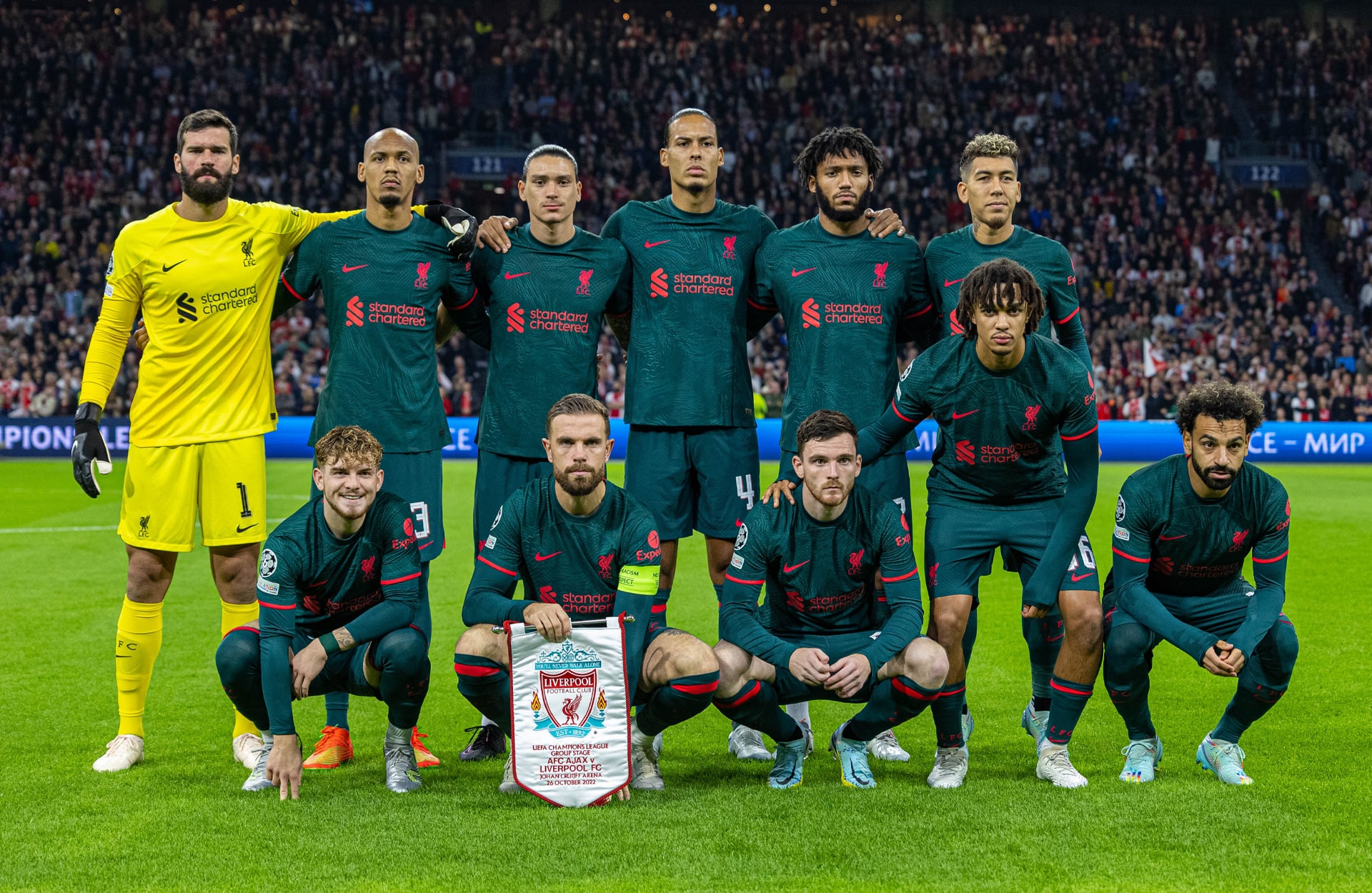
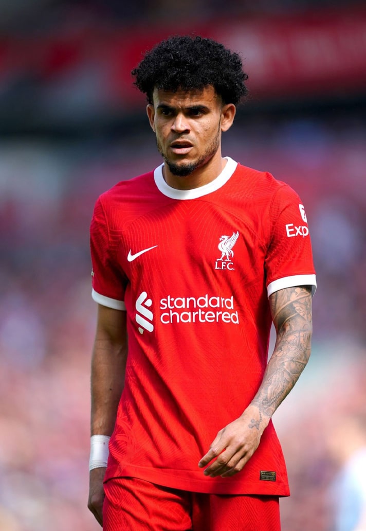
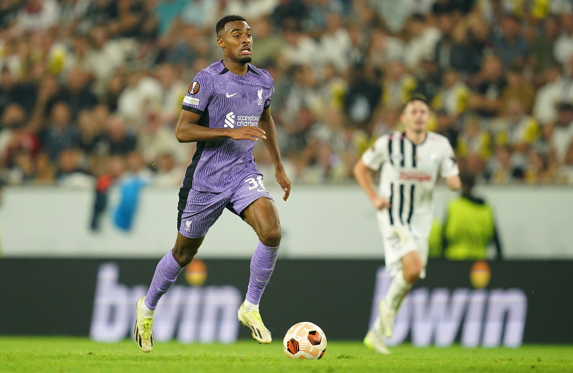
The end is in sight for Nike and Liverpool’s time together following the official announcement that the Reds have signed a partnership with Adidas, which will commence on 1 August 2025. With that in mind, we’re taking a look back at all 15 kits from the last five years of Nike x LFC.
There’s a funny quirk in Liverpool’s recent history. It saw them lift their first Premier League trophy in 30 years in 2020 in New Balance kits, albeit with the agreement to switch to Nike already in place. That meant that their champions badge adorned their first-ever kits from Nike in the 2020/21 season. Now, five years on, and, save an utter catastrophe the likes of which has never been seen, the Reds look set to lift their second Premier League title. But it will be in their last Nike kit of the current partnership, with the club set to rekindle their relationship with adidas, meaning that their champions badge from this campaign will likely feature on their first adidas kit of this latest partnership. It’s a funny old game, so they say.
Liverpool's time with Nike has arguably never quite hit the heights of the hype surrounding the partnership when it was first announced. But in retrospect, when you look over the 15 kits produced throughout their tenure, there's a clear identity, one that undoubtedly defines an era. When looking back on the visual kit history of the club, this Nike period stands as easily identifiable, bold and adventurous at times while also honouring the traditions and history of the club, and you can't ask for much more than that.
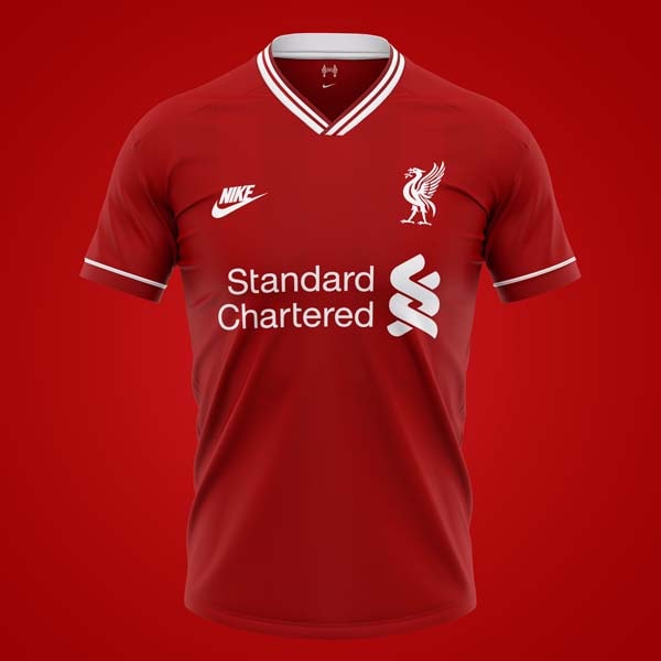
2020/21
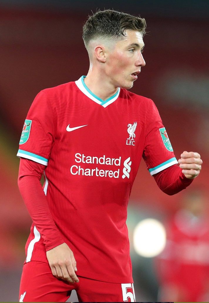
Nike got off to a solid start with Liverpool, reintroducing hints of teal to the home shirt, with it popping through the collar and cuffs. It was a look that harked back to the 93/95 home shirt while also paying homage to the club's crest. There was also a lighter tone to the deeper reds that New Balance had found favour with towards the end of their tenure.
The away shirt was then an indication of what Nike were capable of when the shackles were off. Possibly the peak of the partnership, it once again adopted the teal of the club crest, along with a graphic print inspired by the Shankly gate.
Rounding off the set for their first season on Merseyside, the Swoosh offered up a design inspired by the fans and flags of the Kop and Anfield’s famous atmosphere for the third shirt. Critical injuries, particularly in defence, derailed any hope of a title defence, and the season became more about damage limitation than anything else. The highlight being a winning header from Alisson to boost a top four finish pretty much says it all.
2021/22
If the iconic full red kit of Liverpool represents power, then that power was complemented by the injection of energy in 21/22's home shirt in the form of Bright Crimson pin stripe lightning bolts. The inspiration was that it represented danger, in line with Bill Shankly’s observations and decision to make the kid all red back in 1964.
With its off-white stone and teal colourway, the 21/22 away shirt nodded back to the cult classic kit of the 96/97 season, albeit with the introduction of a collar and the hits of crimson to tie it nicely to the home shirt design.
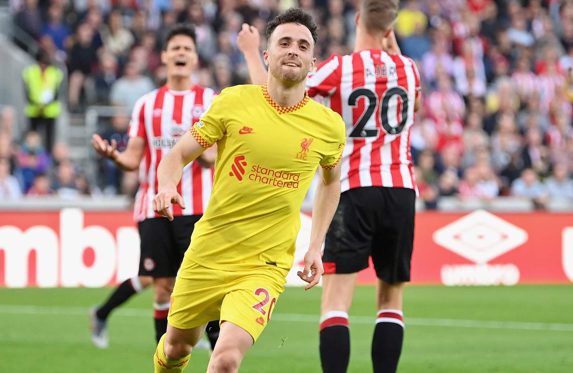
Finally, the third shirt went for a classic LFC look, utilising the yellow that had been a staple of away and third shirts through the immensely successful 80s.
2022/23
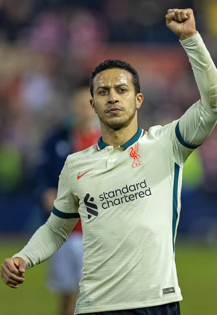
At first, it felt like Nike had just got a bit bored with the home shirts by this stage, with the completely monotone red base joined by minimal white accents this time around. But this one was a grower, with that base allowing the crisp execution of the club crest to really pop, and their were some nice details to it too, such as the ‘YNWA’ sublimation in the cuffs.
But any accusing Nike of taking their foot off the gas were soon eating their words with the introduction of the psychedelic away shirt. The waviest of wavy designs, one of the best aspects of this shirt was not just the fact that it looked like a hypercolour tee brought right out of the 90s… no, it’s that the pattern was printed across the fabric prior to the construction process, meaning that every shirt featured a different element of the pattern.
The third shirt then featured a bold colourway blend of dark atomic and rio teal, with siren red sleeve cuffs, club crest and partner logos, toning things down from the away but still feeling fresh.
2023/24
Again, this home shirt felt like there was minimal effort from the last, with the simple reintroduction of white on the collar and cuffs. That crew neck collar is a look that was prominent for the club back in the 60s and 70s, and it made an appearance again in 1998-00, but hadn’t been used since. It’s unmistakably Liverpool though, and this one paid homage to the legendary Bill Shankly’s last season in charge of the Reds, 50 years prior.
The away shirt paid homage to the iconic 1995/96 away shirt, updating the design with a modernised take that presented the quartered white and green look in a pixelated execution. This was not the first homage to the adidas-produced original, with New Balance having released a similar effort back in 2017/18. But this was unmistakably Nike, the Swoosh putting their stamp on it.
The third shirt arrived in a striking purple ripple pattern with black sleeve cuffs, black collarbone inserts and black side panelling. The club crest and Nike Swoosh logos featured a unique speckled finish from Nike Grind, which is made by transforming manufacturing scrap and end-of-life shoes into new recycled materials. While the home represented the 70s and the away the 90s, this one was for the present day and future.
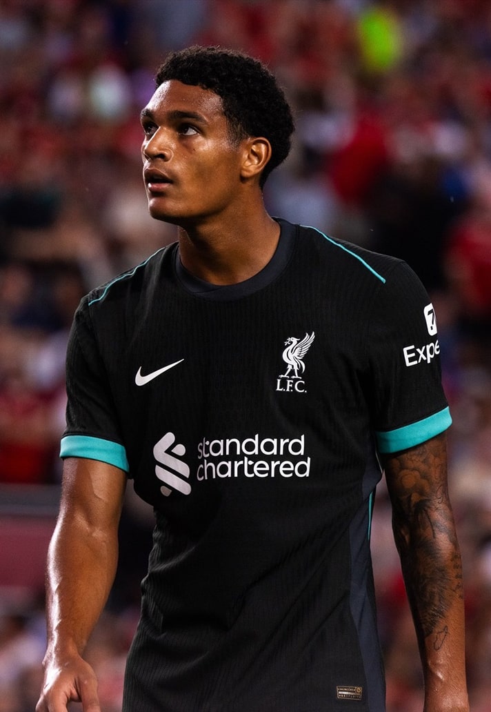
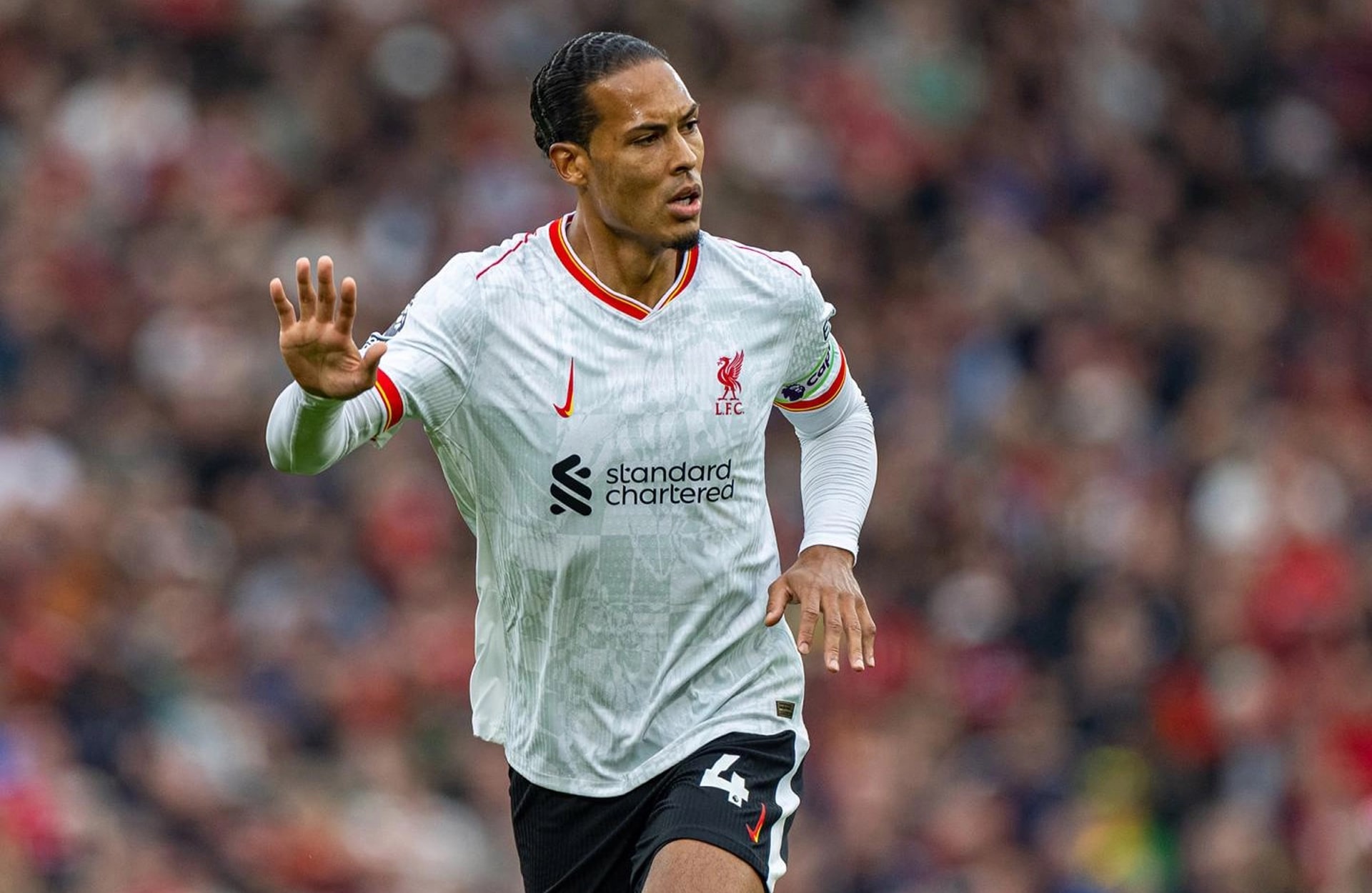
2024/25
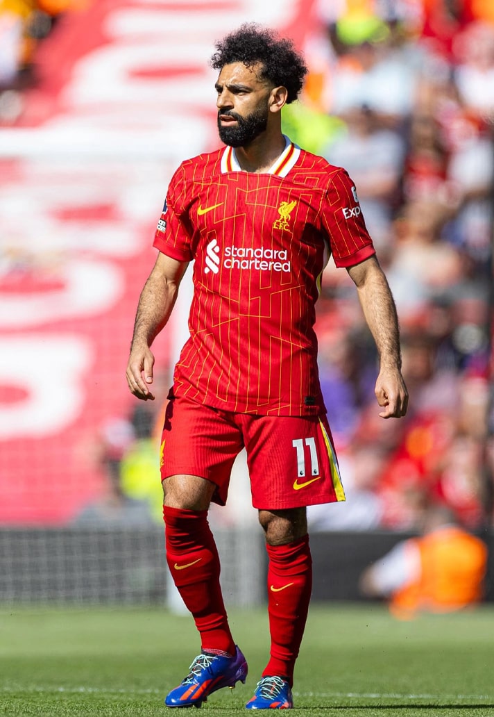
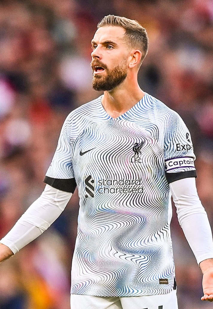
With a retro feel, the 24/25 home shirt featured a pinstripe design at first glance, but when viewed closer it actually revealed a chrome yellow pattern of the club’s YNWA motto etched into the fabric of the shirt. The look harked back to the pinstripe designs of the early 80s, and the retro flavour of the design continued on with the unique collar, which boasted traditional yellow and red detailing. Its presentation was a nod to the iconic collar worn by the ’84 team led by Joe Fagan, who lifted the European Cup in Rome that year wearing this original kit, to complete a treble.
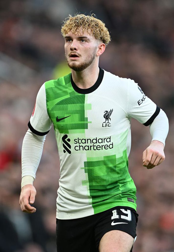
While not as bright and bold as what’s come in previous seasons, the away shirt was a modern revision of the green colourway favoured by the Reds for games away from Anfield. It’s actually quite reminiscent of the third shirt from the 19/20 season, which was produced by New Balance, taking on night forest – an earthy, dark green colour – and anthracite with accents of washed teal and sail on the cuffs and inside panelling.
The final match day design of the current Nike era saw the third shirt arrive as part of a wider marketing move from the brand. It saw the Swoosh branding flipped to a vertical position, while the rest of the design iconic club colours with a loud pattern that paid homage to the city’s fearless female punk artists.
How does Nike's tenure stand up against New Balance? See the latter's kits here.
Shop Liverpool replica at prodirectsport.com/soccer