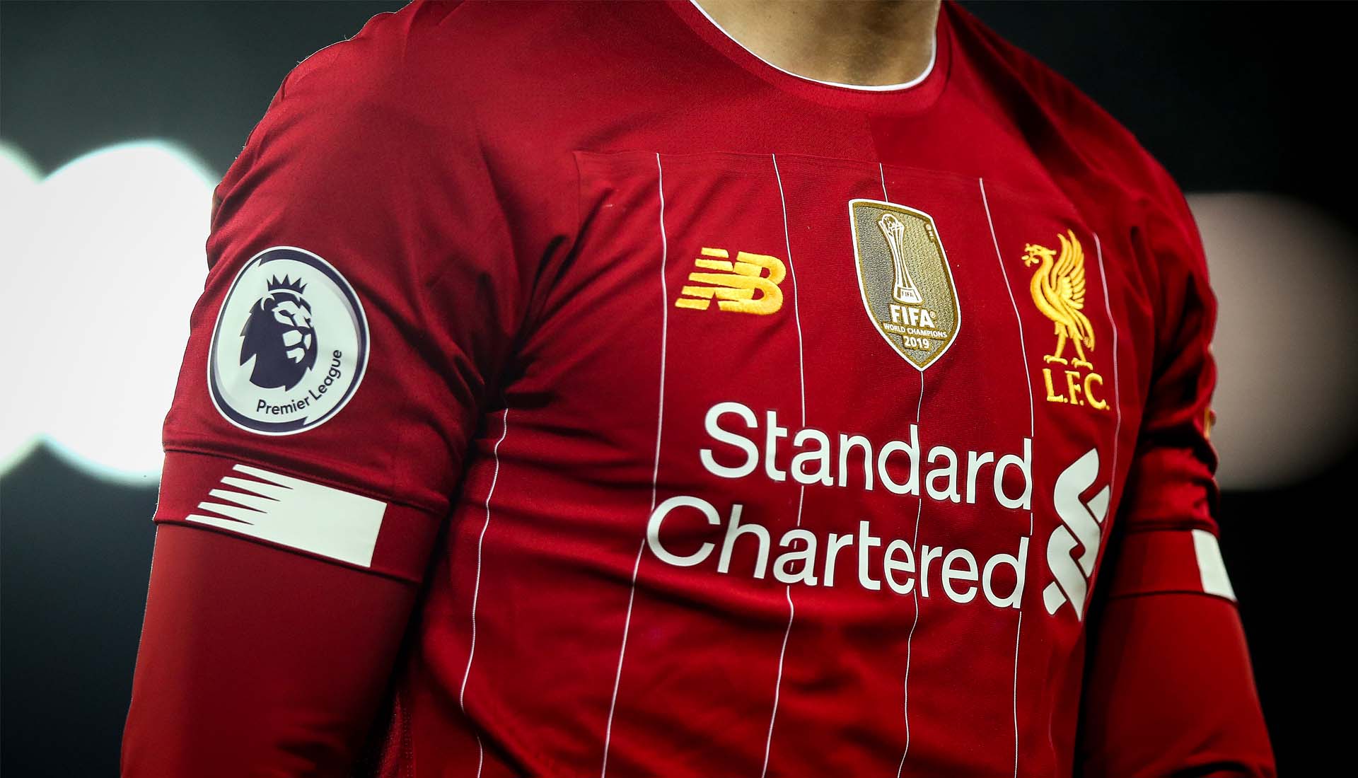
Liverpool’s partnership with New Balance draws to a close at the end of the current season, and it marks the end of a five-year era that has brought great success for club and brand, both on and off the pitch. And so, before the Liverpool x Nike era begins, we look back on the highs and lows of the 15 shirts produced by New Balance.
The end of the 19/20 season will bring a close to the five-year partnership between New Balance and Liverpool football club, with Nike set to take the reigns from August onwards. But despite a possible bitter taste left in the mouth following the protracted conclusion between the brand and club, in retrospect both can look back on what has been an incredibly successful five year period; a period that has seen the development of the club under FSG and the team under first Brendan Rogers and then Jurgen Klopp, taking in Liverpool’s sixth European cup and their first ever club World Club Cup, capped off with the finest flourish of all: winning the Premier League. Seeing the club lift the trophy in New Balance kits on Wednesday night will be a fitting end to a partnership that has kickstarted a potential period of continued success for the club, harking back to the glory days gone by, and that's been mirrored in the designs of their more recent shirts.
Along the way, New Balance have provided Liverpool with some of the most commercially successful and critically well-received kits in recent memory. But it didn’t get off to the best start ever, and the partnership took a while to warm up. Preceding brand Warrior – a subsidiary company of New Balance – had a mixed bag over their three-year stint, with some less than favourable reactions to some of their away and third kits in particular. So when New Balance entered the football market and took on contracts for the 15/16 season, they immediately looked to steady the ship at Liverpool, playing it safe with three fairly routine offerings.
The home shirt saw a sublimated chequerboard jacquard running through the body that supposedly pulled inspiration from the flags and scarves that take over the Kop on matchday, while white detailing through the club crest, sponsor and branding completed the look. New Balance retained the simplified and retro club crest – one of the universally appreciated moves that Warrior had made – and it was used on all shirts going forward.
The away shirt went with a white base and red accents – colourings that weren’t unfamiliar on the team’s secondary kits through the years, and the third shirt saw a minimal black design landing in contrast to the away shirt, with the introduction of a collar as a further point of difference. Completely inoffensive, but not all that daring either.
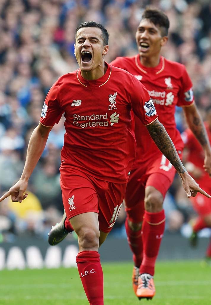
Following that safe start, things arguably got worse before they got better. The 16/17 season home shirt probably goes down as one one of the biggest home misses in New Balance’s tenure. Presenting the club crest, sponsor and branding along with collar trim in a jarring orange colour (was it meant to be gold?) that was first seen on the 13/14 home kit from Warrior. A case of lessons not learnt. The away emulated the third shirt from the previous season, combining the main colour black with silver logos and applications. It had a unique constructed collar and featured four red lines on each side of the shirt. This was the best of the three for the season. Fans probably wish that it had stopped there…
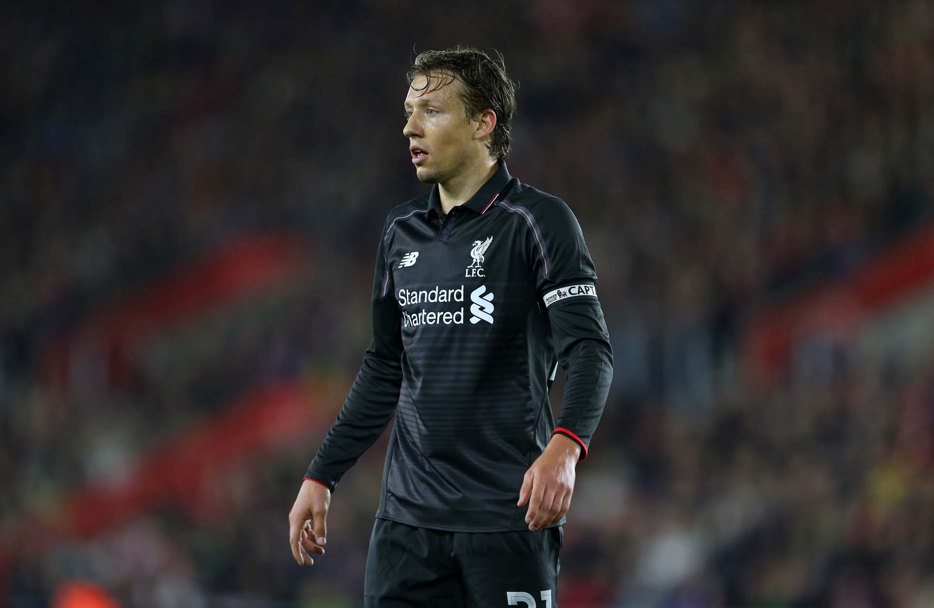
Third shirts as a concept present an interesting arena; they present a chance for designers to let their creative juices flow, free from the constraints of home colours and with slightly more allowance than you’d get on an away shirt. But, as often as that freedom can result in a masterpiece, it can easily go the other way. Case in point with the third shirt for the 16/17 season. Garish green on the body topped off by a drab grey on the shoulders… yeah, not even sure what they were trying to do with this one.
You know the saying “the night is darkest before the dawn”? Well that was completely appropriate here. Coming off the 16/17 offerings – probably collectively the weakest of all the seasons – New Balance found the sweet spot in the 17/18 season, and then some. Paying homage to the club's 125th anniversary the new home shirt featured a new commemorative crest and deliciously retro 80s influences throughout. The shift to a darker ‘Shankly Red’ was joined by that oversized v-neck collar – a strong feature of decades past that made a welcome return to Anfield. And backing that up was the incorporated tonal pinstripes, again, a throwback to the glory days of the 80s, and something that would be revisited with a little more conviction down the line. But this one hit all the right marks for fans and critics alike, and it would’ve gone down in history had Real Madrid not spoilt the party. But still, that was to come…
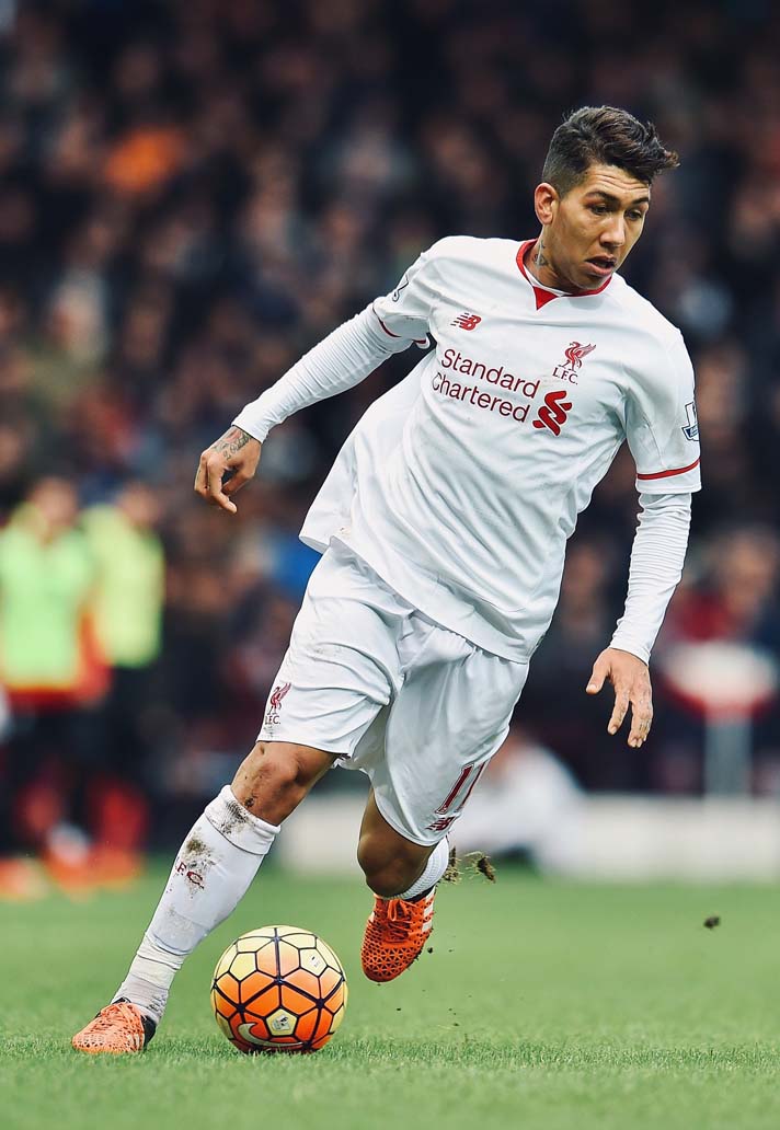
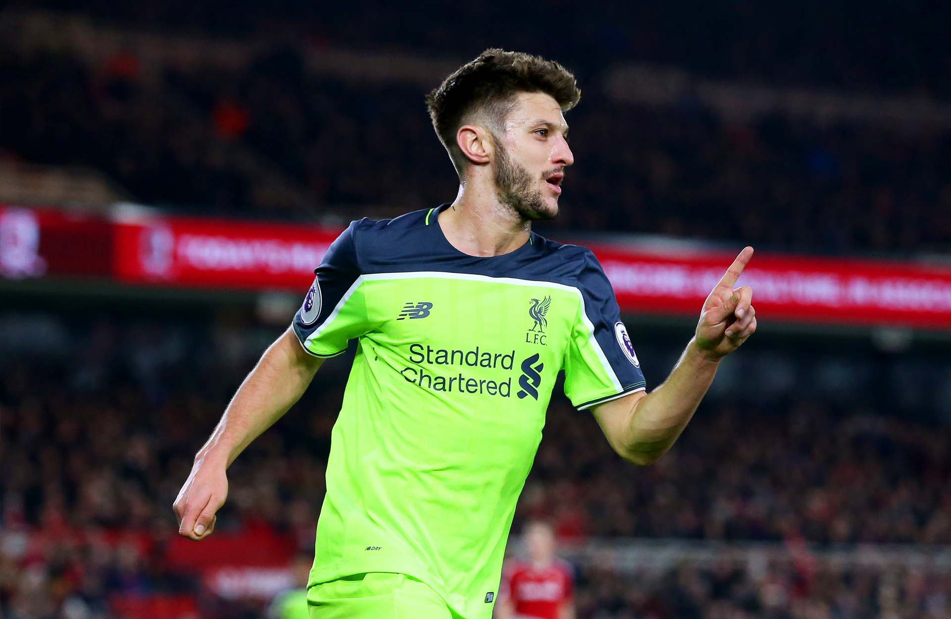
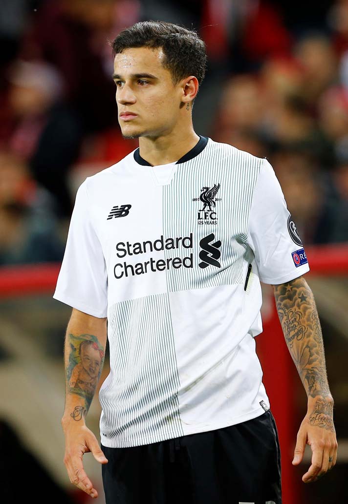
The away shirt for the 17/18 season continued the 125th anniversary celebrations, taking inspiration from the founding jersey worn by the club in 1892 to provide a fresh twist on a nostalgia-laden classic. Switching from the original’s blue (for obvious reasons) the shirt saw a Bottle Green and White colour palette return that was first seen on the 1991/92 away strip and was a notable theme of the 1995 away kit. And then the third shirt just went burn-your-eyes out bright, because, well, just because. Not a lot of meaning behind this one, but an orange final flourish to the trio.
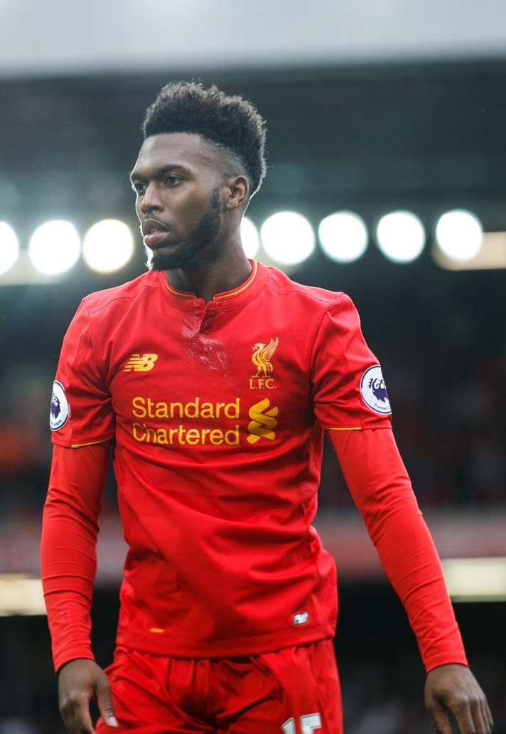
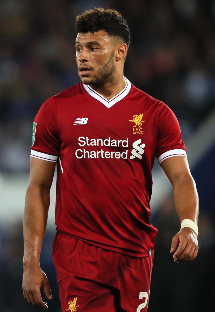
Boosted by the fact that it will forever be remembered as the shirt in which the club won their sixth European Championship, the 18/19 shirt was announced as the highest-selling in the club’s history. Sticking with that deeper ‘Pepper Red’, it introduced a classic one buttoned fold-over collar which, if we’re being totally honest, had a bit of a weird fit. But as if that would hold this one back from being an absolute icon given what the club achieved in it.
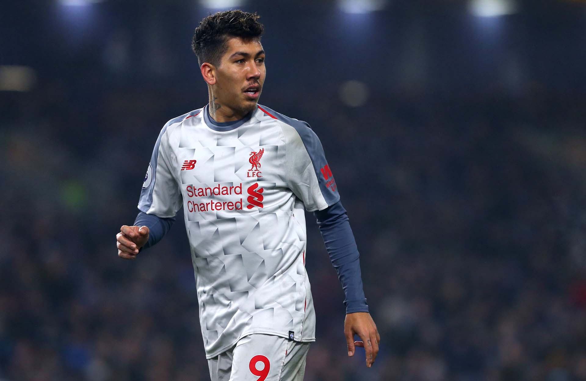
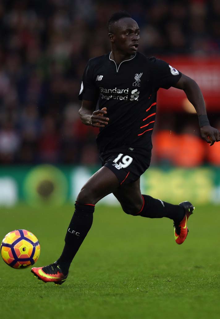
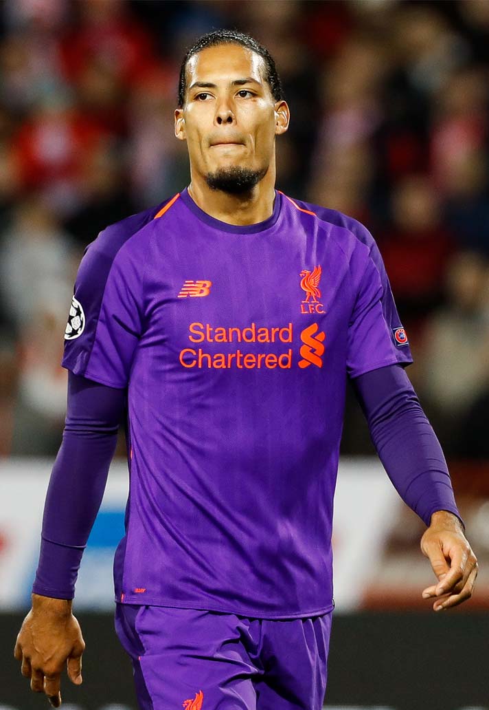
It was joined by one of the more divisive options for an away shirt over the five year period, with many fans arguing that the purple and orange colour combo would’ve been better suited as a third shirt, with the grey third shirt, which attempted to recreate the popular away kits of the late 80s being better suited to being an away shirt. Still with us? Good. The purple away shirt – or Deep Violet to give it its proper colouring – adopted the same jacquard linear graphic to the front body of the home shirt, reflecting the architecture of Anfield’s new Main Stand.
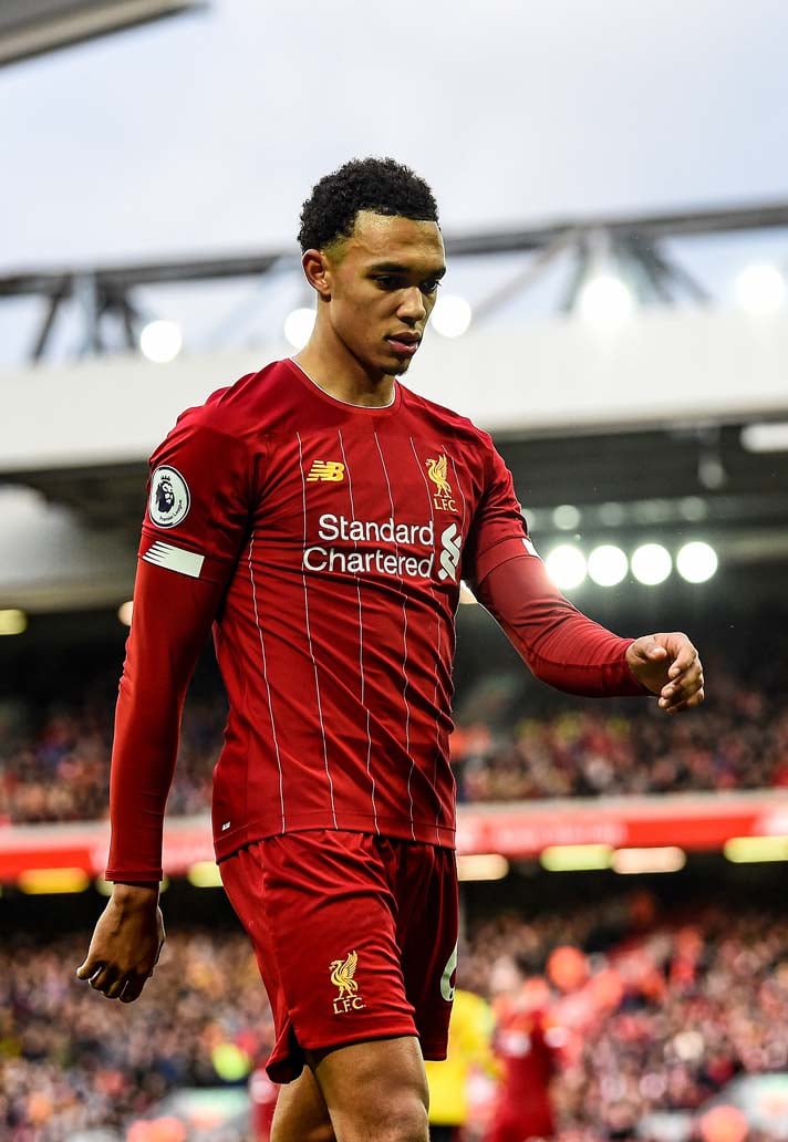
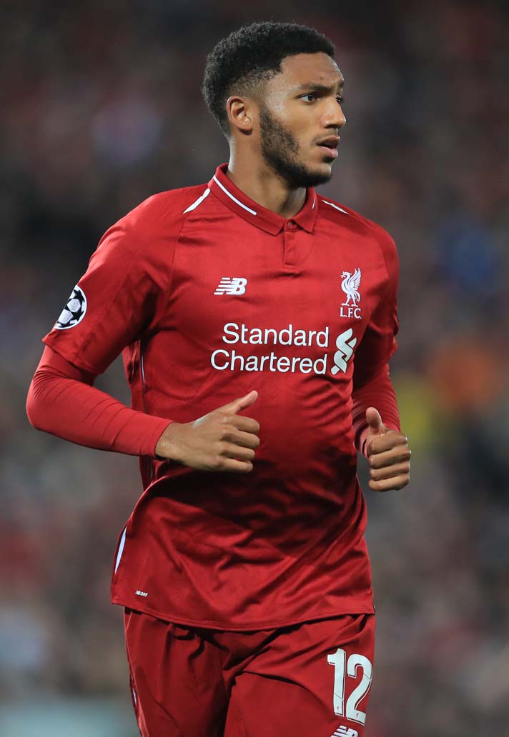
And so we move on to another shirt that will be immortalised as being the one in which the Reds brought home their first league title in 30 years. In a perfect period of synergy, Klopp’s team, like the New Balance shirts over the last three years, had found the perfect balance, striking the right chords to bring the club success. The home shirt once again drew influence from the club’s illustrious past, bringing back an iconic look from the early 80s, and harking back to legendary manager Bob Paisley. The pin stripes were back in full white for the first time since the 82/83 season, the last time Paisley was at the helm.
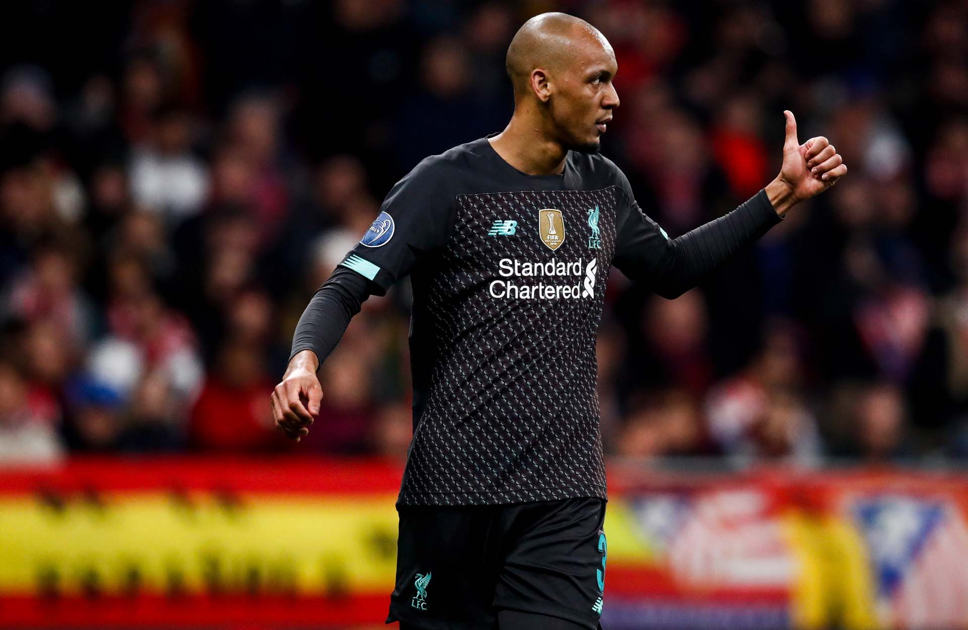
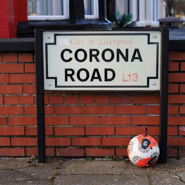
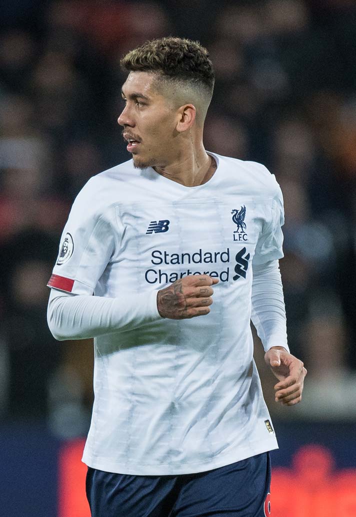
The away shirt added a measure of controversy by adding blue accents – a cardinal sin in the eyes of many Reds fans. But aside from that faux pas, it was a clean design that again paid tribute to Paisley, with a collar construction that was inspired by the Club’s 1977 European Cup winning strip, worn on that victorious night in Rome, when he was at the helm. The third shirt again ventured into the realms of experimentation, with a bold and eye-catching graphic print on the front that was inspired by the shape of Liverpool’s iconic street signs. A strong sign-off for the partnership.
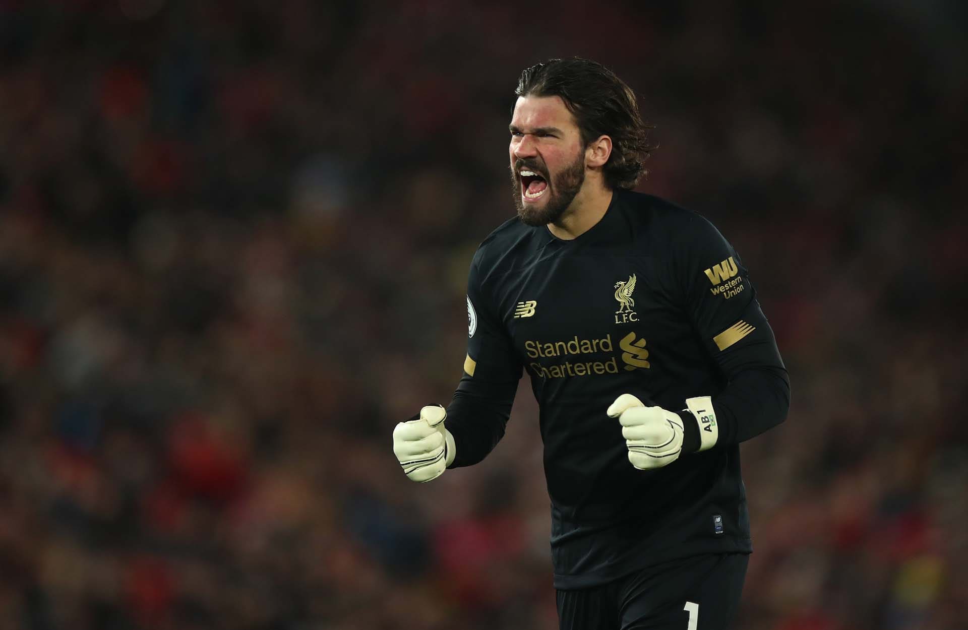
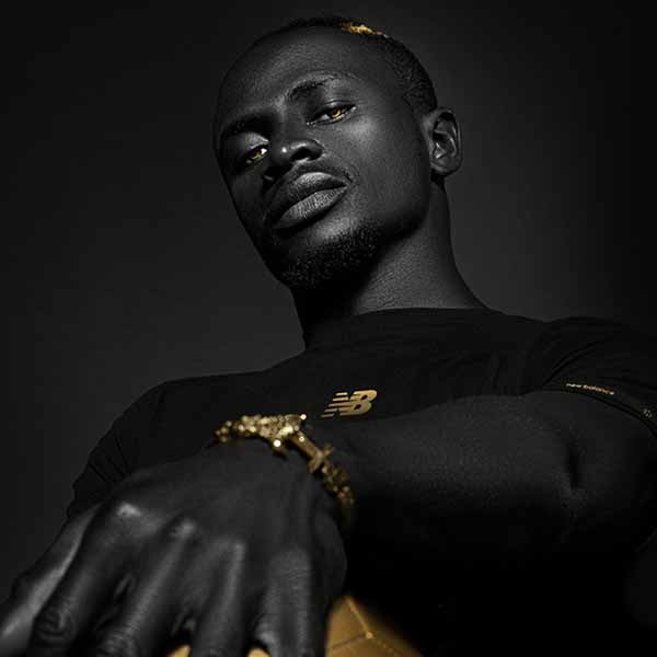
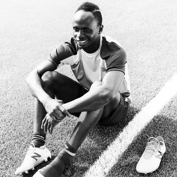
And as an added bonus, special mention has to go out to this season’s goalkeeper shirt, which combined a black base with golden accents. The sleek shirt is so popular that, according to Love the Sales, a retail fashion aggregator, it’s more in demand than most Premier League home shirts. So there you go.
Five years in which New Balance plateaued at perfection. Over to you Nike…