I’ll be honest: I’m a little football-shirted out right now – and I appreciate that’s probably not a particularly popular thing to say in 2026 (and especially on SoccerBible).
But when the football jersey has gone from something you bought once a season to something clubs seem determined to release every other week, it’s true. Home, away, third, fourth, anniversary, lifestyle, pre-match, retro-inspired, archive-adjacent. You get the idea.
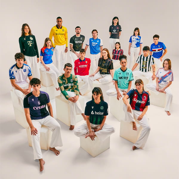
However, the upside of this relentless kit churn is that when something genuinely good does appear – which is quite often, don’t get me wrong – it really stands out. And right now, a suspicious amount of the good stuff has Macron written on it.
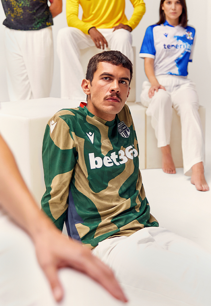
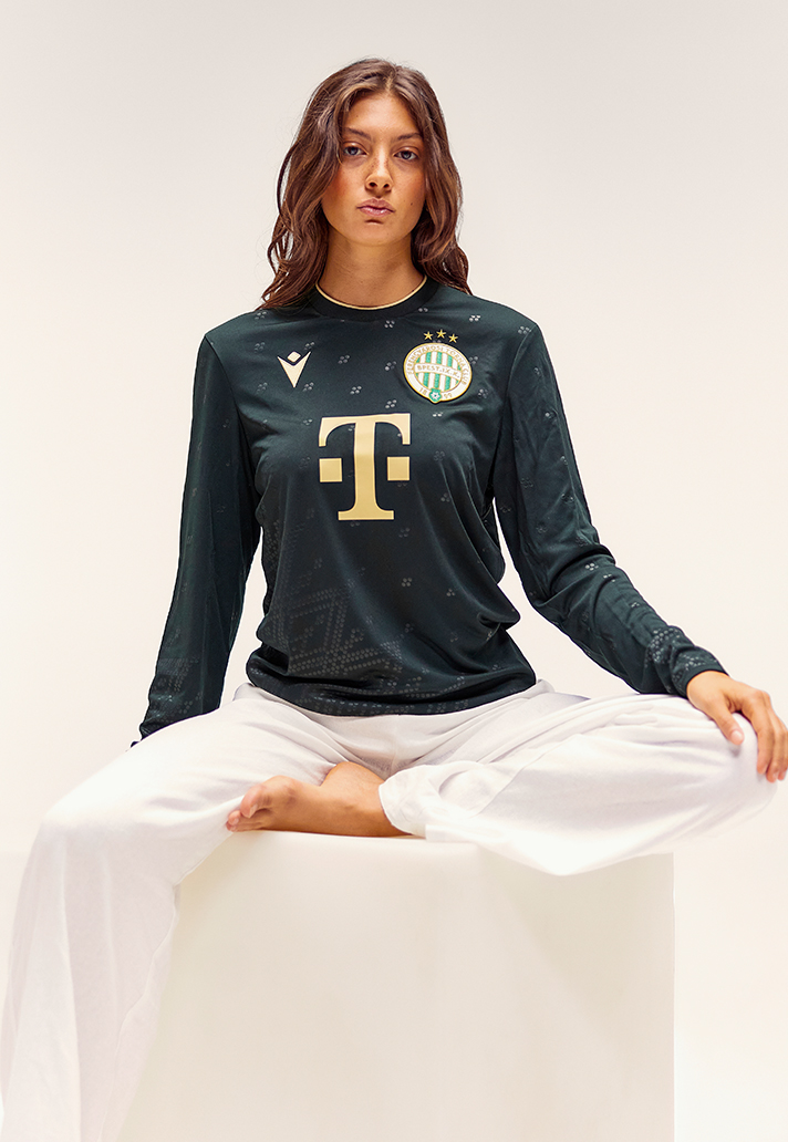
The Italian brand has been responsible for some excellent football shirts for years and, unlike the “bigger” players, it has built much of its reputation around the idea of bespoke design.
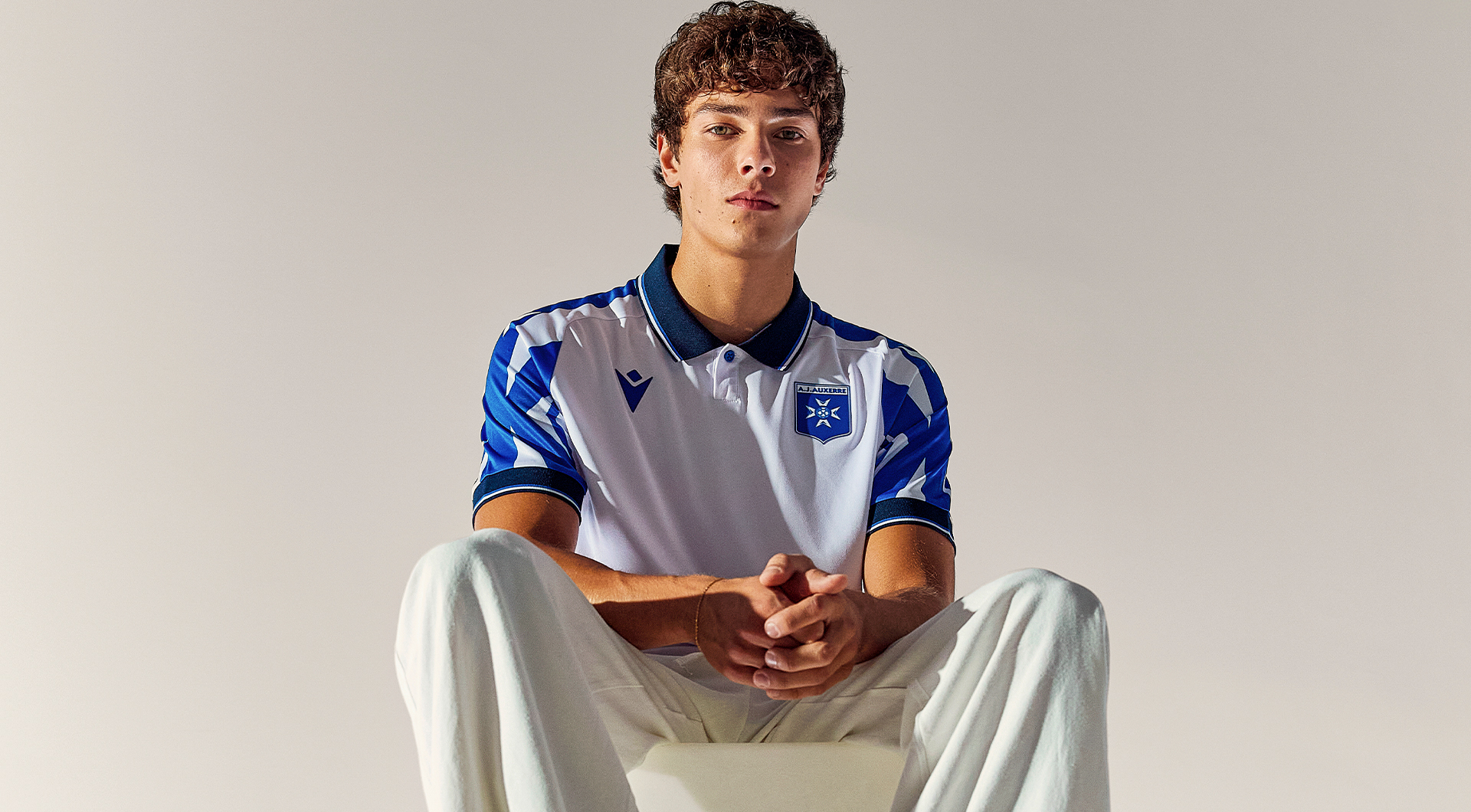
Still, there’s something about its 2026/27 output that feels particularly on point. The shirts are colourful. They’re weird in places. They reference things that actually have something to do with the clubs wearing them.
More importantly, very few of them look like they could have another badge stuck on the chest, which, in modern football, is becoming quite the luxury.
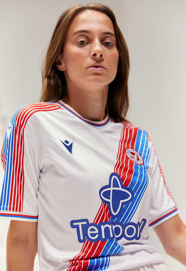
Look at Crystal Palace, for instance. Its new Eagle Sash shirt revisits one of the club’s most recognisable looks, but instead of photocopying an old kit, Macron has played with it. The red-and-blue sash breaks down into progressively thinner stripes as it moves across the body, while the old circular Palace badge pulls the whole thing firmly back towards the late ’70s and ’80s.
Then there’s Wrexham, whose away shirt could barely be further removed from Palace’s. Dark grey, flashes of red, Mandarin collar, and a graphic inspired by the slate quarries of North Wales.
Standard Liège has an away shirt built around black, red and gold that looks almost absurdly elegant. Bolton’s yellow third shirt, meanwhile, goes in completely the opposite direction: navy and red detailing, proper collar, tonal pattern.
This, really, is where Macron is winning. Not because it has discovered the magic formula for making good football shirts, but because it doesn’t actually appear to have one.
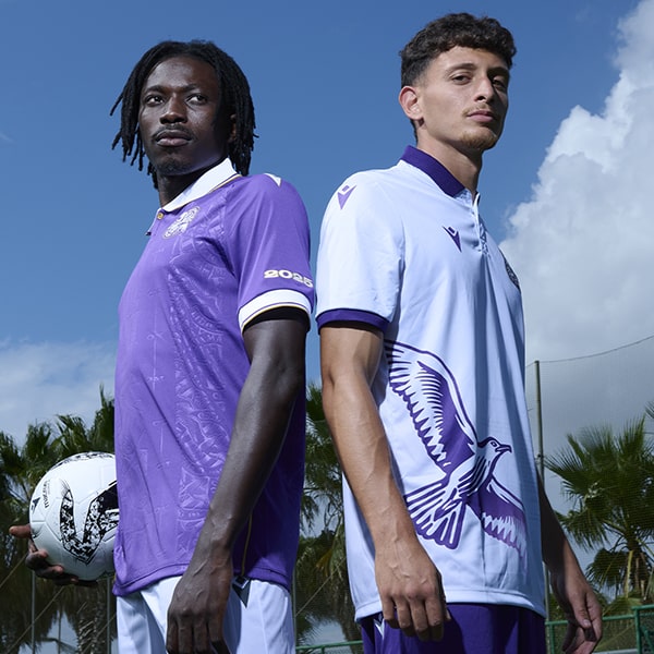
One club gets purple. Another gets mint green. Standard gets black and gold, then sky blue and fluorescent yellow. Viktoria Plzeň gets a shirt inspired by the colours of farmland and harvest. FC Nantes gets elephant skin. Yes, elephant skin. And it works.
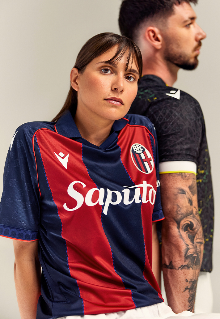
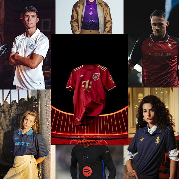
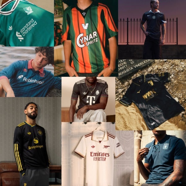
There’s an adventurousness to all of it that feels increasingly rare in a world of global kit suppliers and seasonal design systems. When you’re making shirts for dozens of the biggest clubs on earth, some degree of repetition is inevitable. That’s not to say the bigger brands aren’t making great shirts. They are. adidas, particularly, has produced some very good kits this season while Nike remains capable of moments of genius. PUMA too has its own hits.
But Macron’s stuff just feels a bit more personal. Osasuna’s home shirt includes a pattern inspired by mosaic work from Pamplona’s Plaza del Castillo, Aberdeen’s away kit pulls its tonal graphics from the façade of the Sir Duncan Rice Library, while UD Almería’s stripes arrive with rough, painterly edges and the ancient Indalo symbol worked into the fabric.
None of this is especially revolutionary in isolation. Football clubs have been putting local references on shirts for years. But this is about consistency. Nearly every Macron shirt seems to begin with the question: what could this look like for this club? Rather than: what does this season’s football shirt look like, and how do we make it red?
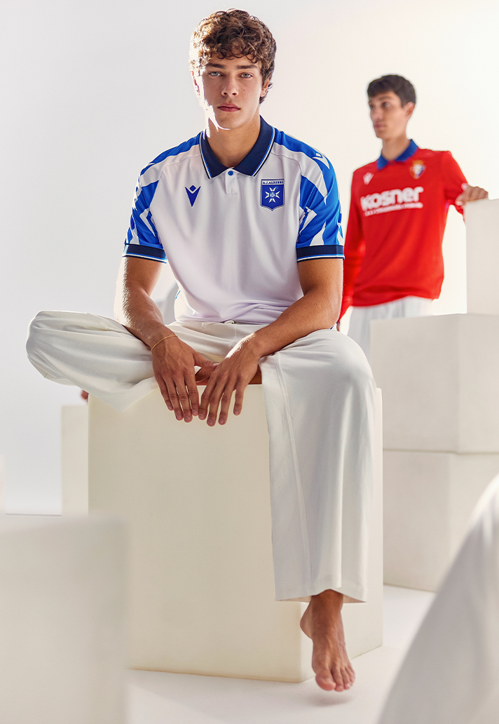
As we know, the jersey has become fashion item, souvenir, collector’s piece, uniform and cultural signifier all at once. People are wearing them with loafers, with tailoring, with skirts and very expensive trousers.
Half the audience buying these things probably cares more about how they look at dinner as how they perform on the pitch. So they need to look good. Really good. Which is all this matters.
All those little things that once felt like kit-nerd minutiae suddenly matter when the jersey is competing with actual clothes. And Macron is on the same page. The clever bit about all this is knowing which club needs what. Perhaps that’s the advantage Macron has right now.
It doesn’t need every team to look part of one enormous brand universe. Bologna can look like Bologna. Palace can look like Palace. Wrexham can look like Wrexham. The manufacturer is present, obviously, but it doesn’t have to make itself the star of every show. Sure, it sounds pretty simple, but in practice, it might be the hardest thing in football kit design.
At a time when the jersey market has never been bigger and more crowded, Macron has made individuality feel like its biggest flex. And this season, everyone else looks a little more boring because of it.