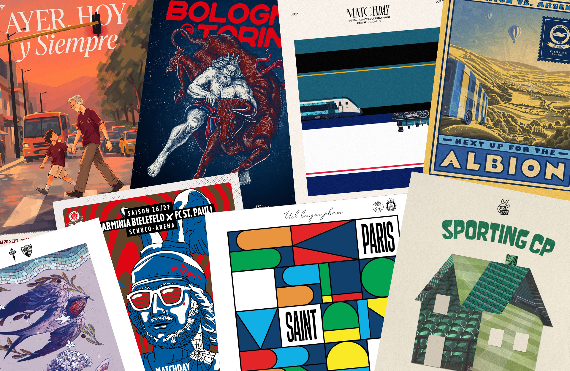
There’s something great happening aesthetically in football’s creative departments at the moment. Among the endless stream of team announcements, transfer graphics and promotional content, a growing collection of beautifully illustrated matchday posters is catching our attention.
Some are hand-drawn, while others take and repurpose notes from vintage advertising. Most, though, are created to promote a single fixture. Yet some of the best examples feel like something I'd happily pop into a frame and hang on my wall.
Take AS Roma, for instance. Ahead of their recent meeting with Como, the Italian side shared a hand-drawn matchday illustration. There’s a charm to its illustrated approach, which – as well as looking the business – serves as a reminder of just how much character a little artistic freedom can bring to something as straightforward as announcing a football match.
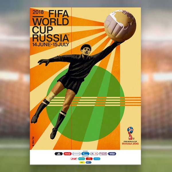
Of course, football's relationship with poster designing isn’t entirely new. Illustrated match advertisements and collectible artwork have existed for generations. Long before Instagram provided clubs with an unlimited digital canvas, artists were finding ways to capture the anticipation surrounding a fixture through type, colour and illustration.
However, what's particularly interesting about the work appearing today is the creative freedom behind it, and the variety of artists being invited to contribute.
In Suffolk, the independent project Call Me Ted has offered one of the most enjoyable examples in recent years. Founded by brothers and lifelong Ipswich Town supporters Steven and Richard Haugh, the initiative initially brought together 19 different artists to create gig-inspired posters for each of the club's 19 Premier League home fixtures during the 2024/25 season.
Drawing from the brothers' experience organising music events, the collection embraces the varied visual language of concert posters. There are bold, expressive illustrations, unexpected interpretations of the club's identity and some particularly lovely references to the town itself.
Artist Kelly Anna, for example, imagined a powerful figure bursting through fragmented Ipswich and Arsenal crests, while Catalina Carvajal transformed the horse from the club's badge into something altogether more fantastical. What began as an independent creative project soon found its way onto official matchday programme covers, into shop windows and eventually into an exhibition.
Further south, Brighton & Hove Albion has also been similarly receptive to a more illustrative approach. Local artist Jamie Eke originally began experimenting with alternative football programme covers before his work caught the club’s attention. His subsequent illustrations for Brighton's Europa League fixtures borrow from the exaggerated characters, dynamic compositions and vivid colours associated with classic comic-book artwork.
The illustrations proved so popular that Brighton began selling the posters separately, before commissioning Eke to create a further series of collectible programme artwork. It's a particularly satisfying example of a personal creative project finding a home within a club's wider visual identity.
It's something we've been enjoying at SoccerBible, too, with our own matchday posters giving us an excuse to interpret individual fixtures through illustration and graphic design. There's something particularly enjoyable about treating a football match as a creative brief, rather than simply another piece of pre-match content. After all, two teams, a date and a kick-off time leave quite a lot of room for artistic interpretation.
And that's perhaps what's most enjoyable about this renewed appreciation for matchday artwork. There isn't one particular style that defines it. Some designers favour elaborate hand-drawn illustrations, others turn to collage, photography or typography, often borrowing references from music, film, local history and the wider visual culture surrounding their clubs.
The common thread is a willingness to experiment with something that could quite easily be produced using the same template every weekend.
There's also something particularly appealing about this work appearing at a time when AI-generated imagery is becoming increasingly difficult to escape. Not because every football poster needs to be drawn by hand, but because it's refreshing to see the personality of individual artists and designers coming through in the finished work. Their references, their humour and the little creative decisions that make the artwork unmistakably theirs.
For all the content football clubs are expected to produce nowadays, it's encouraging to see some still treating even the smallest creative briefs with genuine care. The matchday poster has been around for generations, but its latest interpretations are a welcome reminder of just how expressive football's visual culture can be. Long may it continue.