Football supporters have a curious relationship with change. Give them a new manager and they'll debate it. A new signing and they'll judge it. A new kit and they'll inevitably buy it. A new badge, however? That's where things get emotional.
Change, in itself, is not the problem. Clubs should be allowed to evolve, experiment and apply real creativity to the symbols that represent them – provided they understand what those symbols mean in the first place.
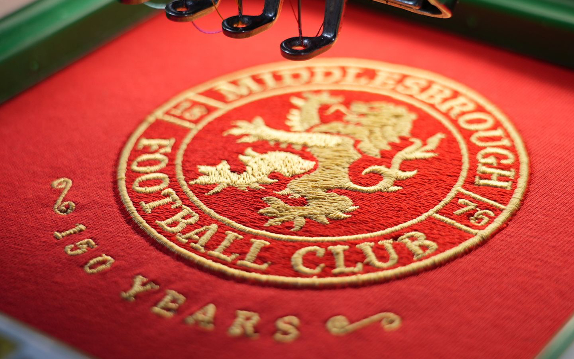
Recently, Middlesbrough reworked their badge ahead of their 150th year, while West Ham United have begun consulting supporters on whether their crest should evolve for the next chapter of the club's story.
Salford City have also introduced a new crest ahead of the 2026/27 season, pairing it with a supporter-backed return to orange as the club's primary colour. Portuguese side Sporting CP, meanwhile, introduced a sweeping new brand system to mark their 120th anniversary, as have Olympique de Marseille, whose new crest forms part of a wider identity refresh developed internally, combining historical references with a contemporary graphic structure.
What I’m saying is that, across Europe, clubs are beginning to ask themselves the same question: does our identity still represent who we are today? And judging by the response online, you'd think the answer should always be no.
Football discourse loves a redesign horror story. Every updated crest is apparently evidence of traditions being abandoned, history being erased and clubs transforming themselves into soulless corporations.
But here's the thing: most supporters aren't actually against change. They're against bad change – and the proof is in the numbers.
Last year, when Middlesbrough first explored a new badge ahead of their 150th anniversary celebrations, the club surveyed more than 21,000 supporters. The result wasn't some overwhelming rejection of modernisation. It was quite the opposite. Fifty-seven per cent backed a redesign, while only 19 per cent opposed it.
The loudest voices aren't always the most representative ones. And that's because most fans instinctively understand something that often gets lost in these conversations: football identities are living things.
Take Sporting CP's recent rebrand, for instance. Rather than throwing everything out, the Portuguese champions looked backwards. Developed alongside agency JKR for the club's 120th anniversary, the new identity draws heavily from Sporting's iconic 1940s crest.
The lion has been refined and sharpened, the stripes have been elevated, references to the famous Porta 10-A entrance remain embedded within the wider identity. It's not a rejection of history. It's an editing exercise.
Middlesbrough offers the best example of all. Their new roundel feels familiar at first glance, but look closer and there are subtle nods to Teesside woven into the design. The River Tees and Roseberry Topping are integrated into the lion itself. A modern badge, yes, but one built around local identity rather than detached from it.
Salford City is another interesting example, because the change isn't just about making the badge cleaner. It is part of a wider attempt to reclaim a more distinctive sense of self.
After supporters voted to return the club's primary colour to orange, the new crest follows that same logic: a circular mark built around the lion and rose, with references to Salford's industrial roots and local character.
For a club so often viewed through the lens of its ownership and wider Manchester football context, it gives Salford something that feels more like Salford.
And that brings us to the bigger point: football clubs aren't operating in the same world they were twenty years ago. A crest today has to do far more than sit on a shirt. It has to work as an Instagram avatar, a TikTok profile image, a gaming asset, a stadium graphic and a retail mark.
It needs to exist across hundreds of digital touchpoints that simply didn't exist when many current badges were created. The point is, clubs aren't designing for matchday programmes anymore, they're designing for culture.
That's why we're seeing shapes simplified, details refined and identities streamlined. Not because clubs suddenly want to become fashion brands, but because modern communication demands clarity.
The most successful brands in the world understand that recognition happens instantly, and now football increasingly is operating by those same rules. Fact is, clubs no longer want to be perceived solely as football clubs. The ambition now stretches across multiple commercial, cultural and community spaces.
Some supporters hear that and recoil. Personally, I think it's exactly why thoughtful redesigns matter. The clubs thriving in 2026 aren't simply building teams, they're building worlds – or trying to, at least.
They're producing documentaries, launching collaborations, exporting culture and attracting supporters from every corner of the globe. Whether we like it or not, a football club's badge now sits alongside some of the most recognisable visual identities on the planet.
And if that's the game football is playing, standing still feels like a greater risk than moving forward.
Of course, not every redesign works. Some miss the point entirely. That's why supporter consultation matters – which is exactly why West Ham's ongoing review process may ultimately prove as important as any new crest that emerges from it.
Stoke City’s recent identity refresh is an example of a slightly alternate approach, but one that suggests that keeping the fans happy is arguably the most important thing.
Their new badge isn't some radical Silicon Valley-inspired logo designed to upset traditionalists. It's a modern interpretation of a historic crest used between 1977 and 1992, bringing back the Staffordshire knot, a kiln and the club's founding year.
More than two-thirds of supporters voted in favour of the change. That's not a club abandoning its roots; it's a club reconnecting with them.
Ultimately, a badge belongs to a club, but it also belongs to the people who carry it. Although what football often forgets is that the crests we defend so passionately today were once redesigns themselves.
They weren't born as tradition; they became it. And that's the point. Tradition isn't about preserving the past behind glass, it's about ensuring it survives long enough to mean something in the future.