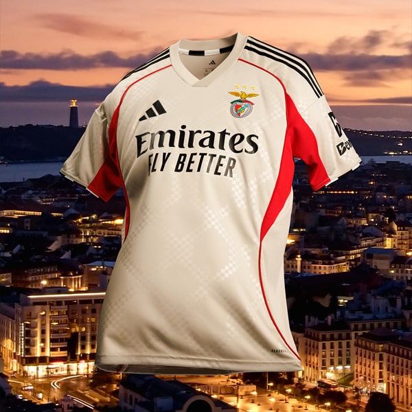
Some shirts don’t need reinvention. They need precision.Benfica’s 25/26 home kit sits firmly in that space.
A piece built on one of football’s most iconic identities, refined rather than reimagined. The red is unmistakable. Deep, saturated, alive with history. But what defines this shirt isn’t just the colour, it’s the control within it.
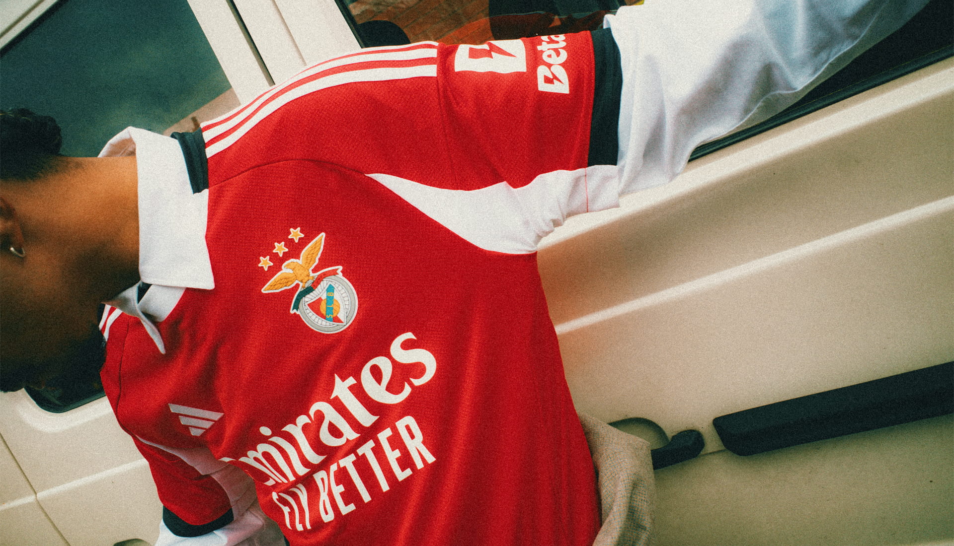
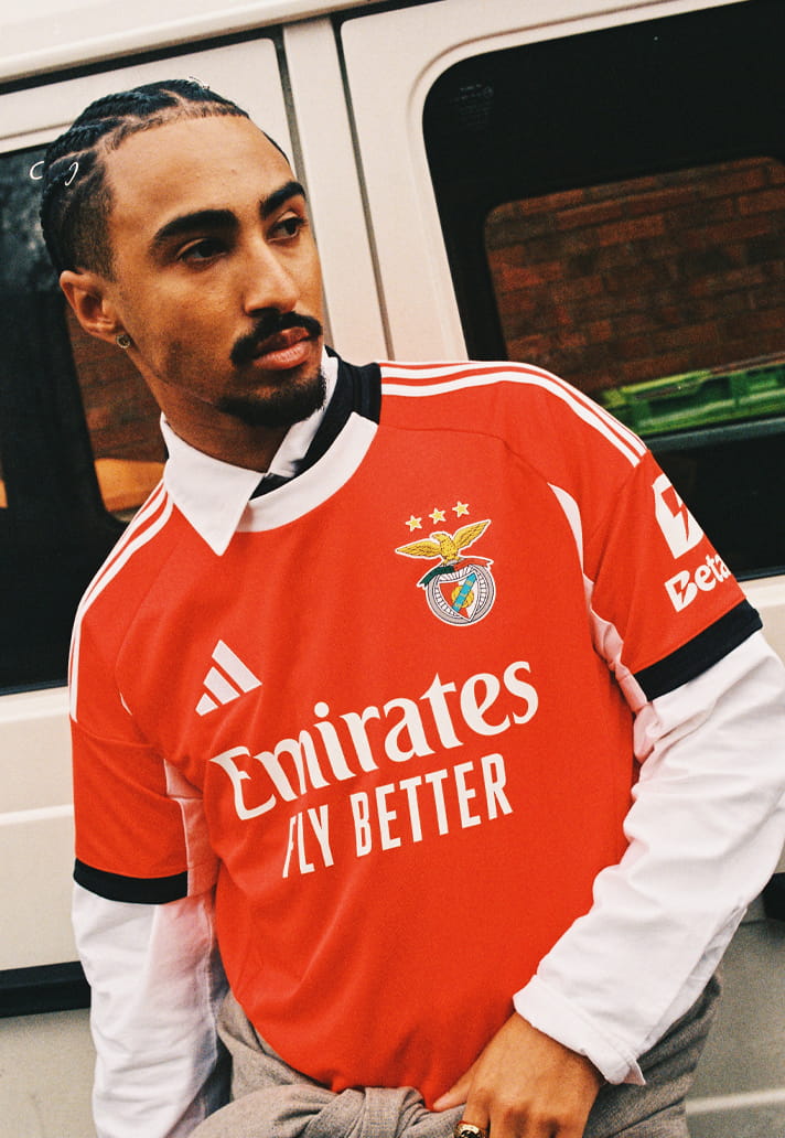
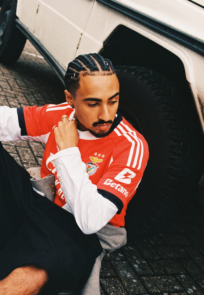
Because this is tradition, sharpened. The structure is clean. Strong shoulders, subtle paneling, black accents that frame the body without distracting from it. The crest sits proud and detailed, symbolic, untouchable. Above it, the three stars carry weight. Legacy made visible.
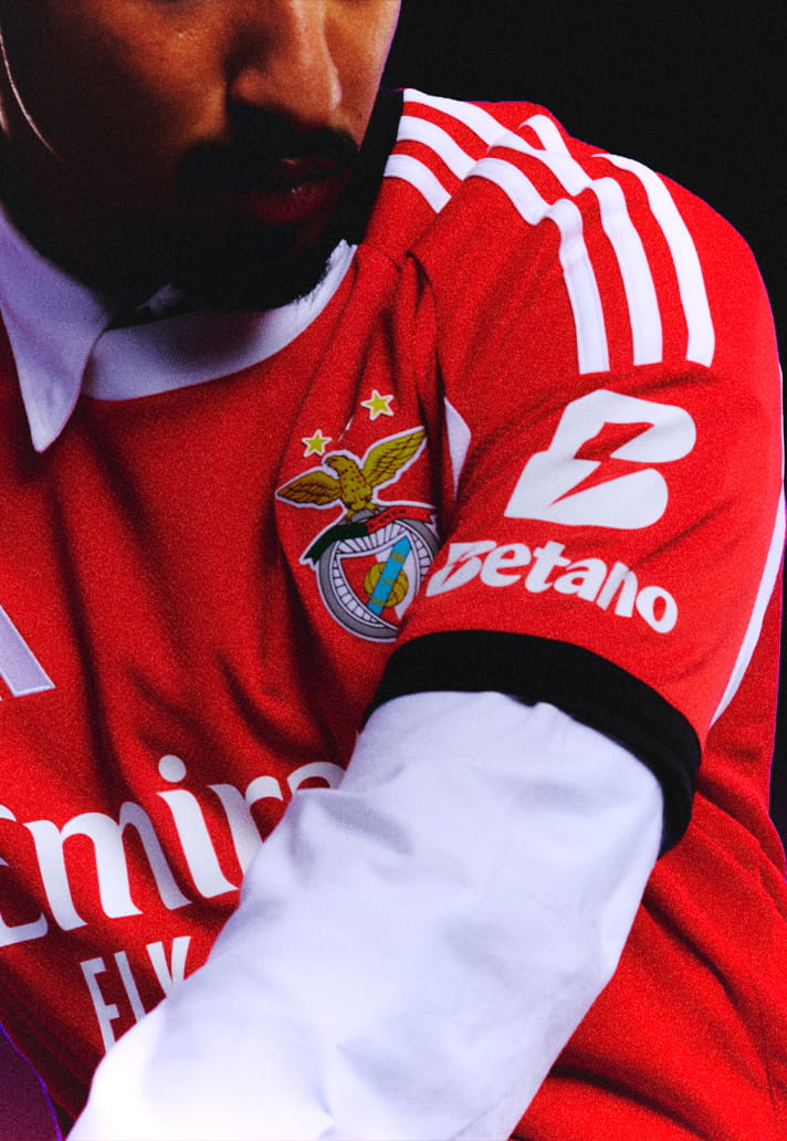
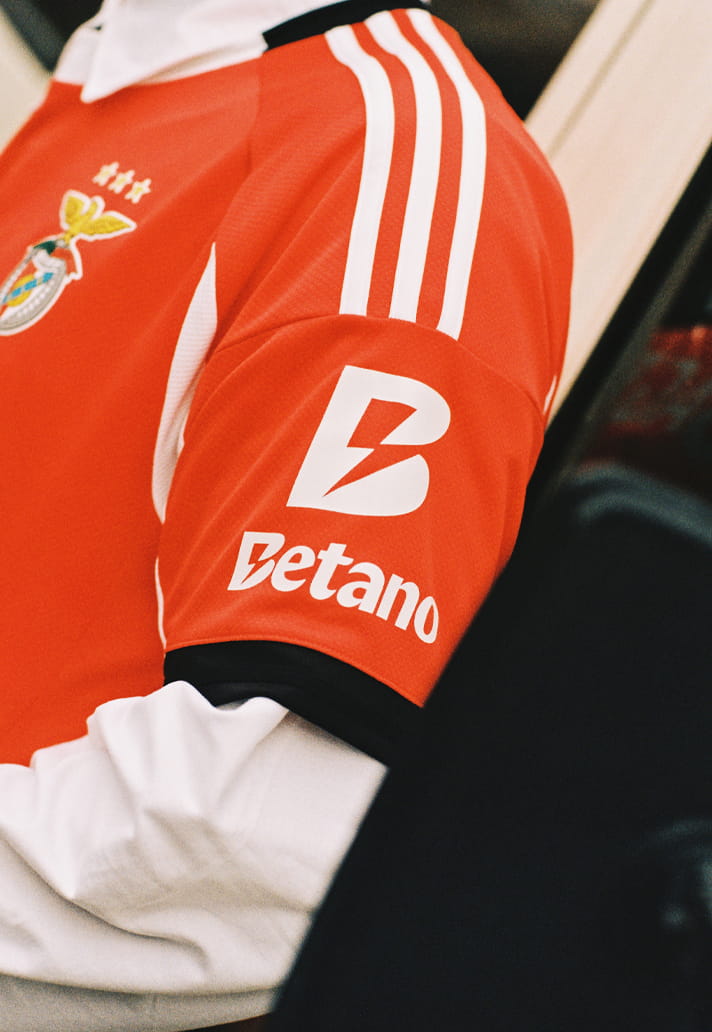
And within that framework, every element has to earn its place. The central sponsor: Emirates. It holds the chest with authority, but it’s the secondary layer where things become more interesting. The Betano mark, positioned on the sleeve, operates with a different kind of intent.
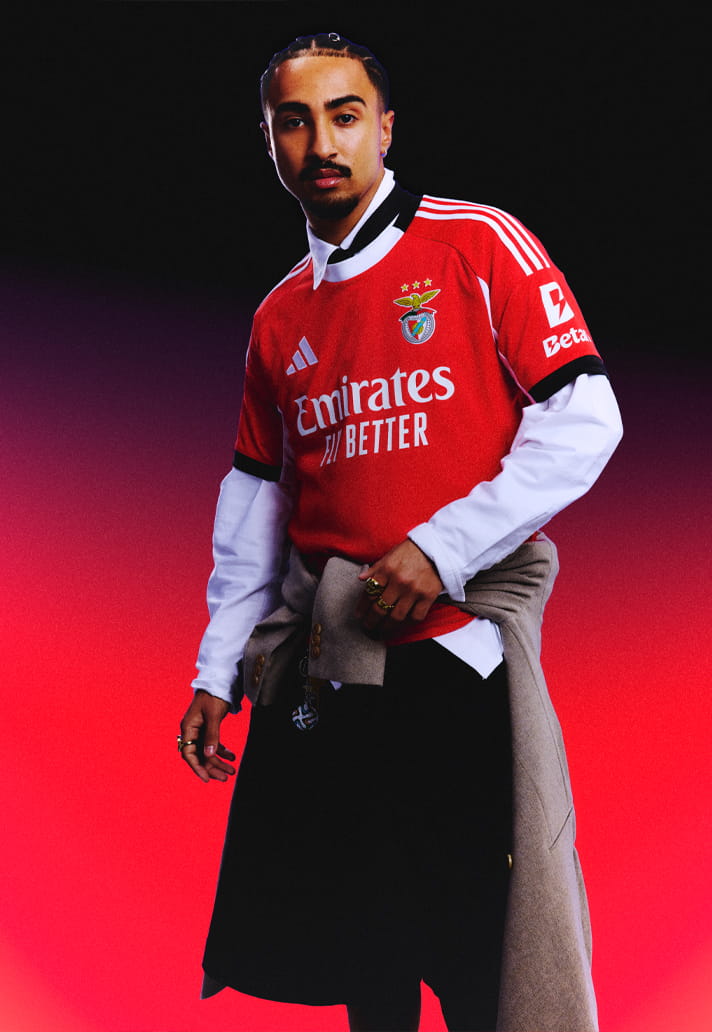
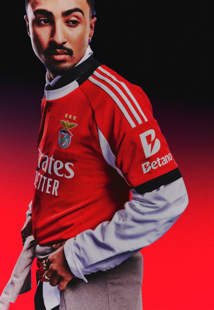
It’s not there to dominate. It’s there to complete. Rendered in crisp white, the Betano logo mirrors the adidas detailing and aligns with the broader graphic language of the shirt. It doesn’t compete with the primary sponsor, it supports the overall composition. It becomes part of the structure, part of the rhythm.
That’s where its value lies. Because on a shirt as culturally loaded as Benfica’s, disruption isn’t an option. Every addition has to feel like it belongs like it’s always been there. The sleeve placement allows Betano to integrate without interfering, adding another layer of authenticity without breaking the visual hierarchy.
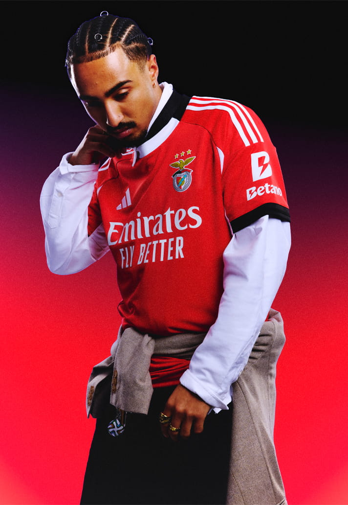
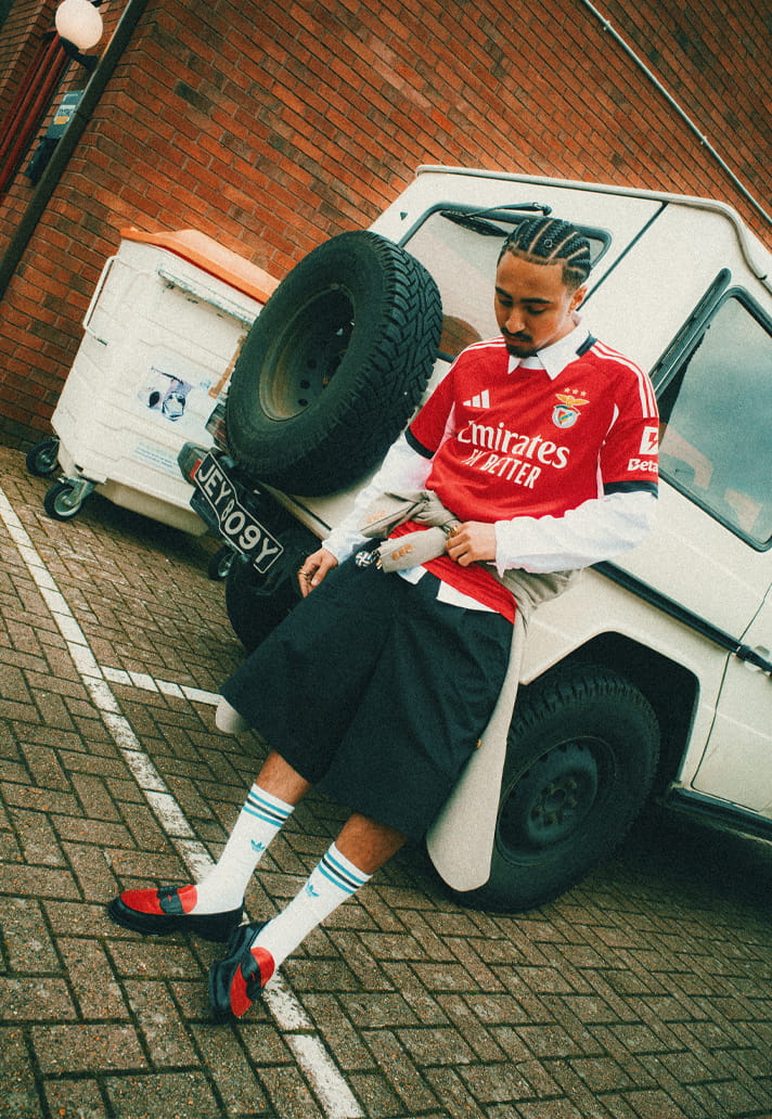
It’s a subtle move. But a powerful one. That balance plays out naturally. Styled in real environments, layered with everyday pieces, the shirt moves beyond matchwear. It becomes part of a wider cultural uniform. And crucially, every sponsor mark holds its integrity within that space.
Nothing feels forced. Nothing feels excess. Because when a shirt is this iconic, restraint becomes the most important design tool.
Step back and it resolves into something timeless: Red foundation. Black framing.Crest and stars. adidas. Emirates. Betano on the sleeve. Each element in its place. Each decision considered.
Benfica’s 25/26 home kit is a reminder that the strongest designs don’t shout for attention, they carry it naturally. And when a sponsor understands how to exist within that legacy, it doesn’t just fit the shirt. It honours it.
Photography by SoccerBible.