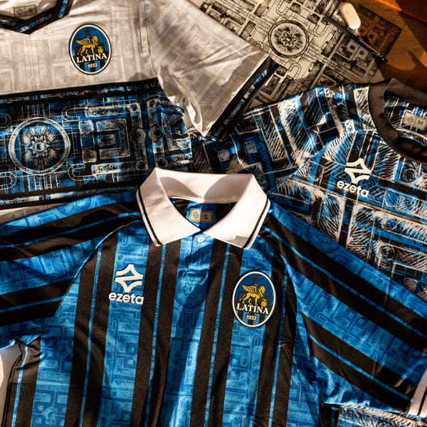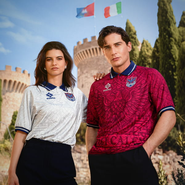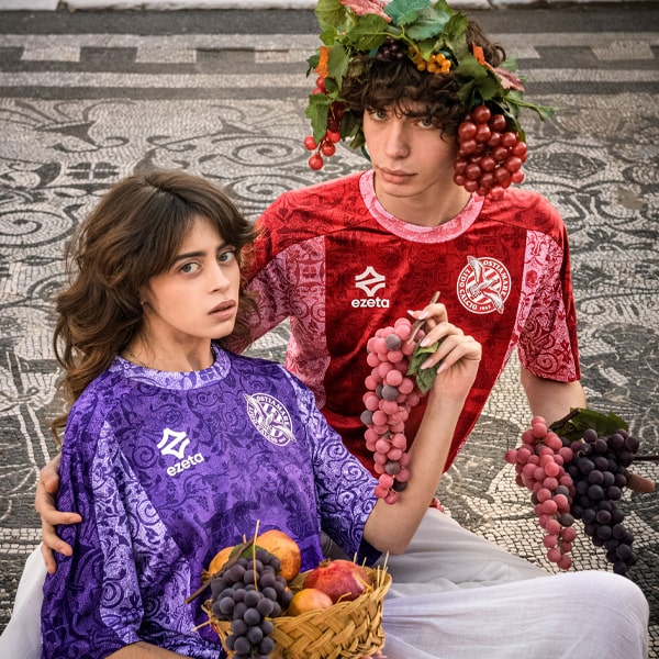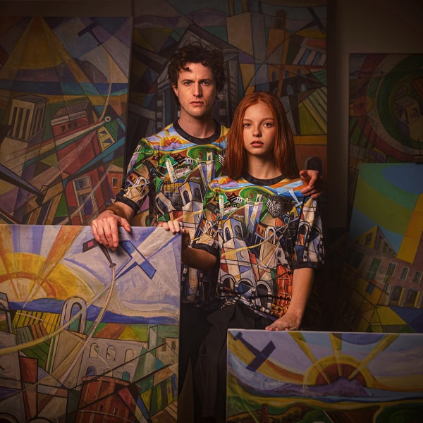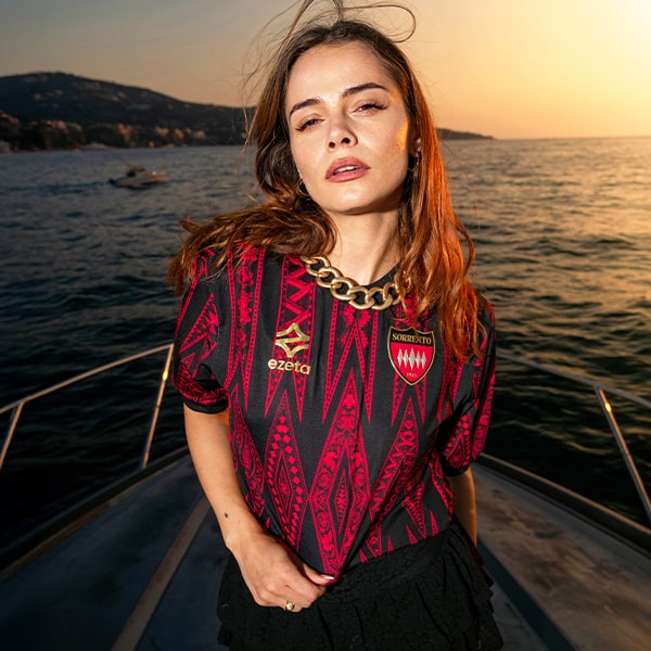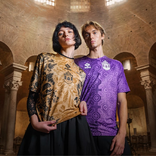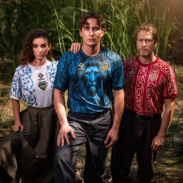
At a time when much of the industry seems to be moving towards stripped-back aesthetics, minimalist templates and retro-inspired simplicity, Ezeta continue to march confidently in the opposite direction. While others chase trends, The Italian brand remain committed to doing what they do best: telling stories through design. The result is a catalogue of jerseys that feel genuinely bespoke.
Their latest creation arrives courtesy of Portofino FC, and it might just be one of their most picturesque efforts yet. Portofino hardly needs introducing for anyone chasing the sun in Italy. For more than a century, the small fishing village on the Italian Riviera has become synonymous with the Dolce Vita lifestyle, attracting visitors with its postcard-perfect harbour, colourful waterfront facades and effortlessly elegant charm. It's one of Italy's most recognisable destinations, and now it's also the inspiration behind a football jersey that captures that same sense of place.
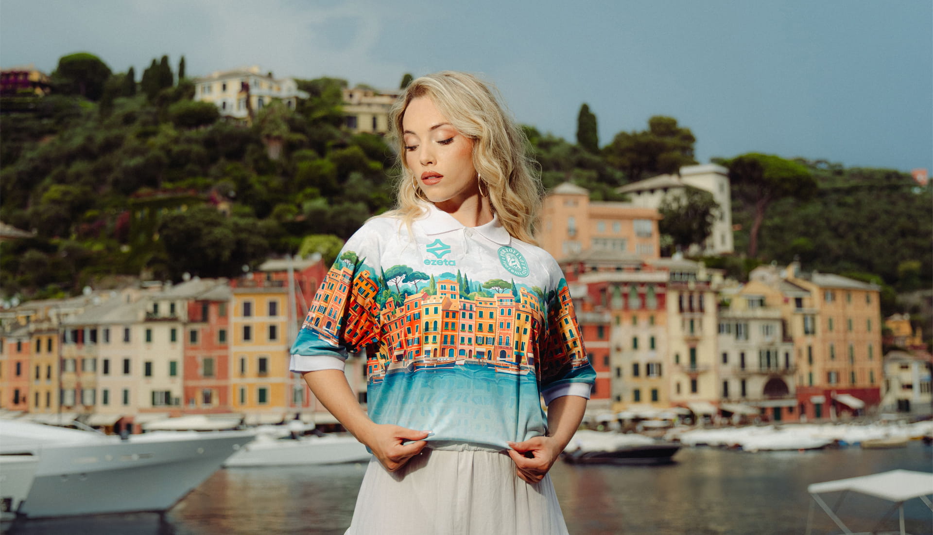
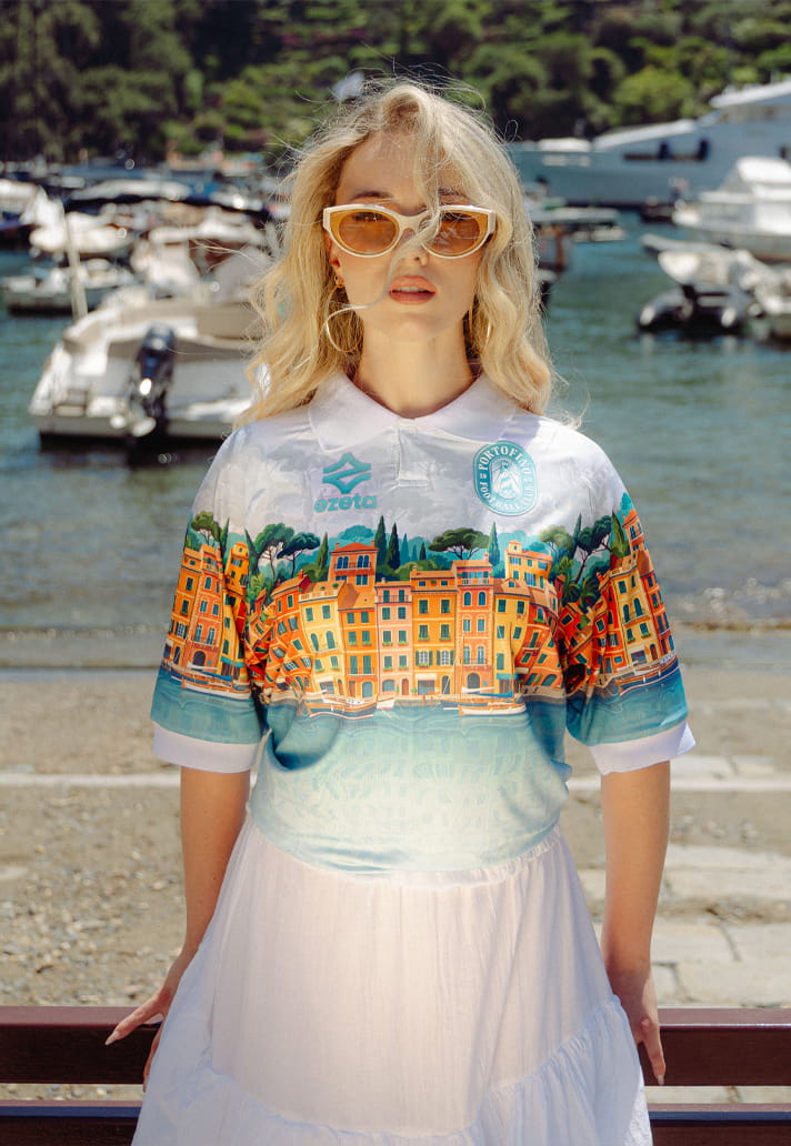
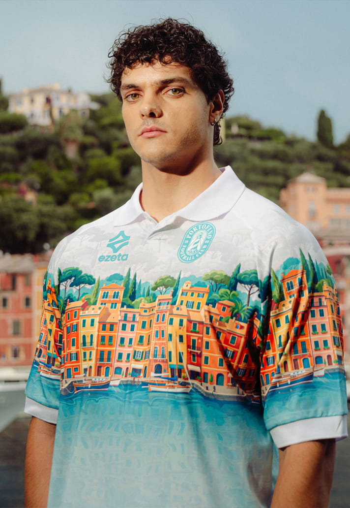
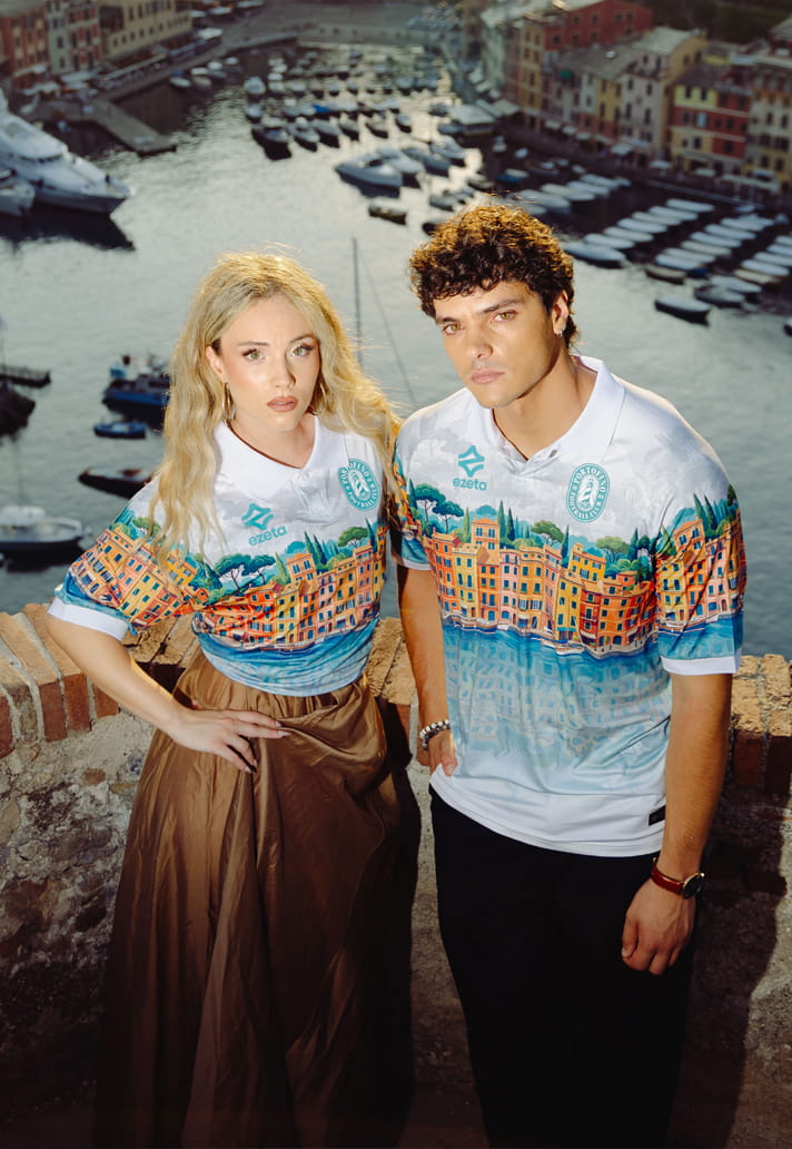
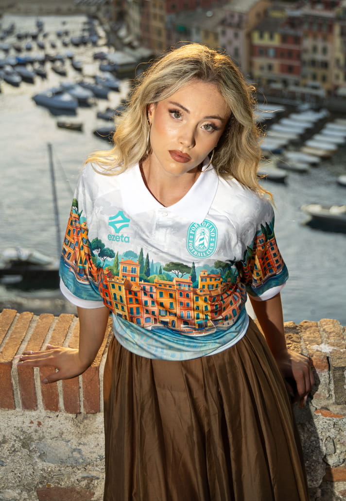
The new Portofino FC Special Jersey transforms the Italian Riviera into wearable artwork. Drawing directly from the famous Piazzetta di Portofino, the design incorporates the destination's iconic pastel-coloured buildings, Mediterranean vegetation and shimmering reflections from the harbour, blending them together into a sweeping panoramic illustration across the body of the shirt.
The lower portion of the jersey is dominated by the colours of the Ligurian Sea, with turquoise and aquamarine tones reinterpreted through an intricate graphic pattern inspired by the crystal-clear waters that surround the coastline. It's vibrant without feeling overwhelming, detailed without becoming cluttered – a balance that Ezeta have become particularly good at striking.
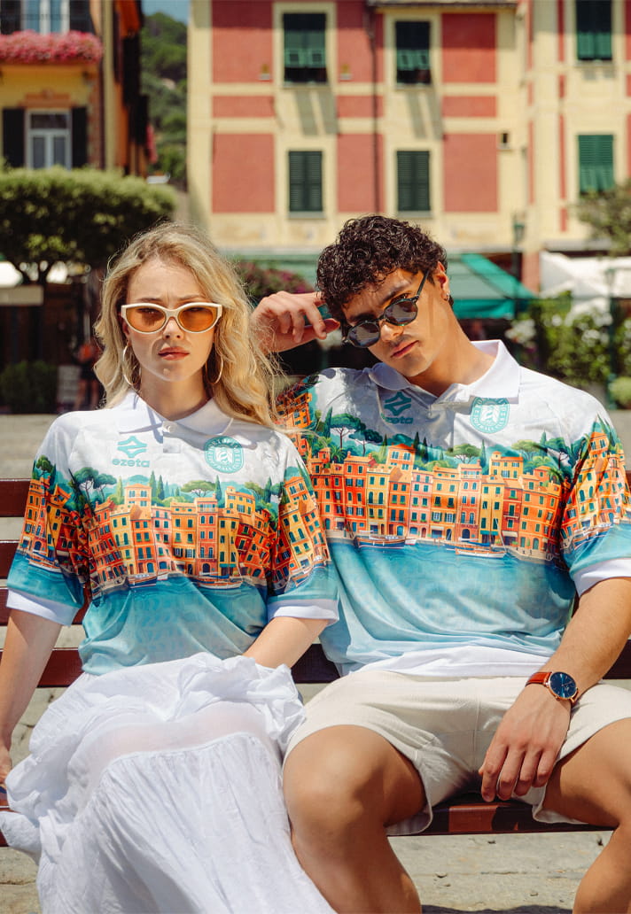
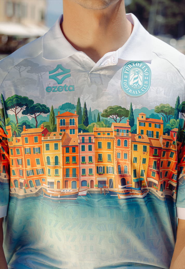
In contrast, the upper section adopts a more restrained approach. A subtle tone-on-tone texture references the morning mist that rolls across the Riviera, providing a cleaner backdrop that allows Portofino FC's new crest to command attention. It's a thoughtful piece of design, where every element feels deliberately placed to communicate something about the location being celebrated. And that's exactly why Ezeta continue to stand out.
Whether you love every design or not, there's something refreshing about a brand that refuses to compromise its identity. While the wider football shirt landscape this season has leaned heavily into clean and understated looks, Ezeta remain dedicated to building jerseys around culture, geography and storytelling. Each release feels like a one-off project rather than another colourway applied to a stock template.
It's what makes releases like this so enjoyable. The Portofino jersey doesn't just represent a football club; it represents a destination, an atmosphere and a way of life. That's becoming an increasingly rare quality in modern football apparel.
Perhaps the biggest compliment you can pay Ezeta is that their work leaves you wondering what might come next. If they can transform somewhere as visually rich as Portofino into a football shirt, you'd love to see what they could do when given the keys to one of European football's true giants. Imagine the stories, landmarks and cultural references they could weave into a design for one of the continent's historic heavyweights.
For now, though, Portofino is the latest destination to receive the Ezeta treatment. And once again, they've delivered something completely their own. In a football shirt market that can often feel increasingly homogeneous, that's worth celebrating.
Shop the Portofino special edition jersey at ezeta.it