In a football shirt landscape that's increasingly dominated by clean templates this year, heritage-inspired simplicity and subtle detailing, Ezeta continue to carve out their own lane, once again supplying Latina Calcio 1932 with a beautifully bespoke set.
If there's one thing we've come to expect from Ezeta, it's that they're never going to take the easy route. Every release feels rooted in a specific place, culture or story, with designs that go far beyond simply applying a club's colours to a standard template. Their latest work with Latina Calcio 1932, for the 26/27 season, is another perfect example of that approach in action.
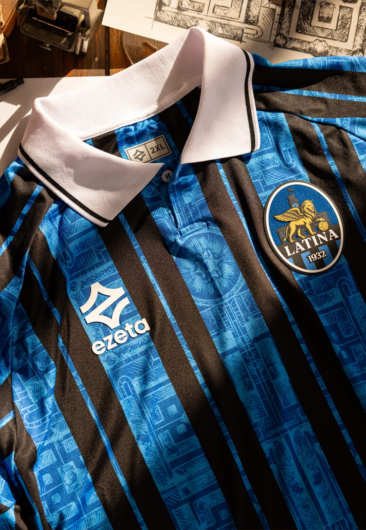
Unveiled as the club's new Home, Away and Pre-Match collection for the 2026/27 season, the range draws inspiration from one of the city's defining landmarks: Piazza del Popolo, the symbolic heart of Latina and a key feature of the city's original urban plan, designed by architect Pierluigi Bossi. It's the sort of source material that most brands would probably overlook. Ezeta, meanwhile, have built an entire collection around it.
The standout feature across the range is the geometric layout of the square's gardens, which has been reinterpreted through a contemporary design lens. The result is a collection that connects architecture, local heritage and football identity in a way that feels uniquely Ezeta.
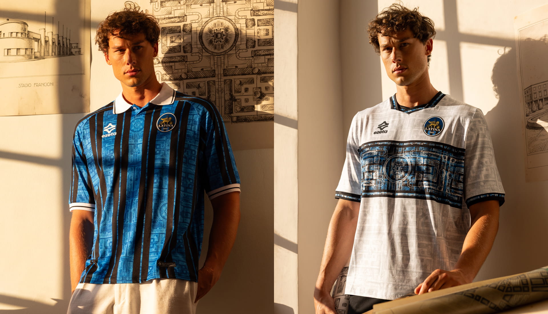
The Home shirt sees those geometric patterns woven directly into Latina's traditional black and blue stripes. It's a clever execution that manages to preserve the club's established visual identity while simultaneously introducing something fresh and deeply connected to the city itself. Rather than competing with the stripes, the architectural detailing sits comfortably within them, adding layers of meaning to a familiar look.

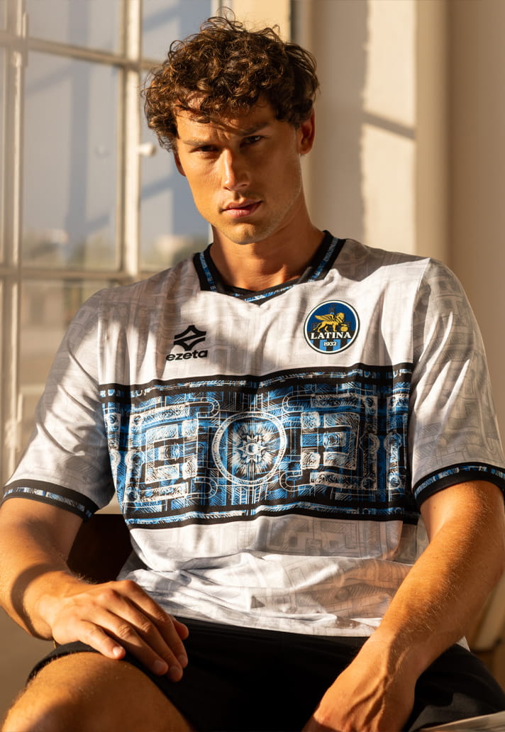
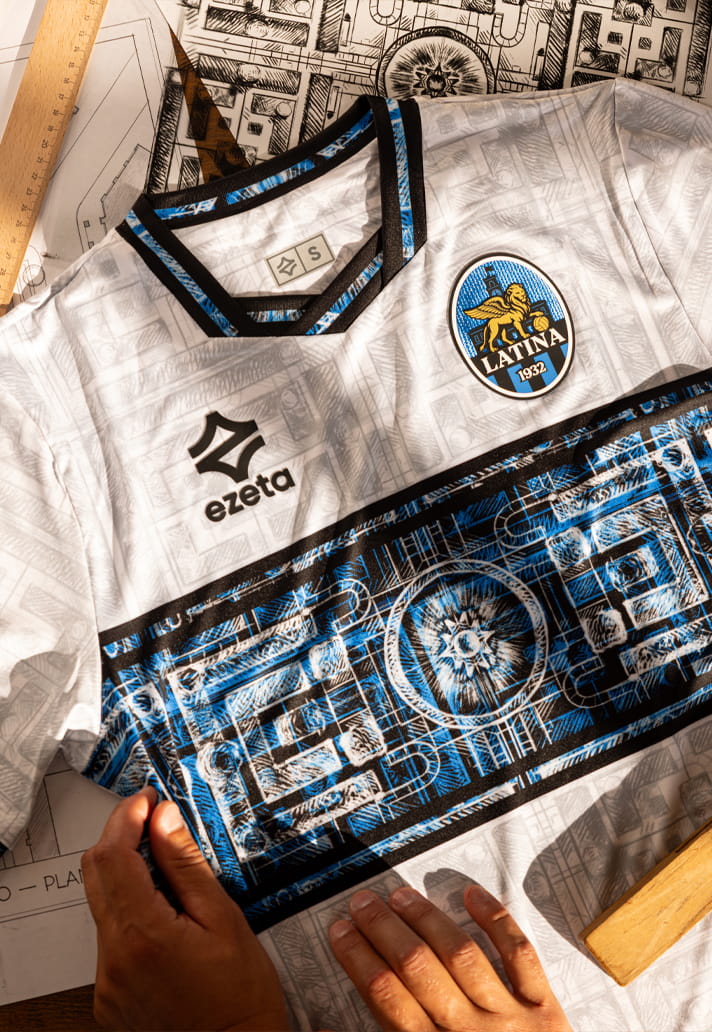
The Away jersey takes a more overt approach. Here, the full layout of Piazza del Popolo is brought to life through a contrasting central panel, with a subtle tone-on-tone pattern extending across the rest of the shirt. It rewards a closer look, revealing more of the architectural references the longer you spend with it.
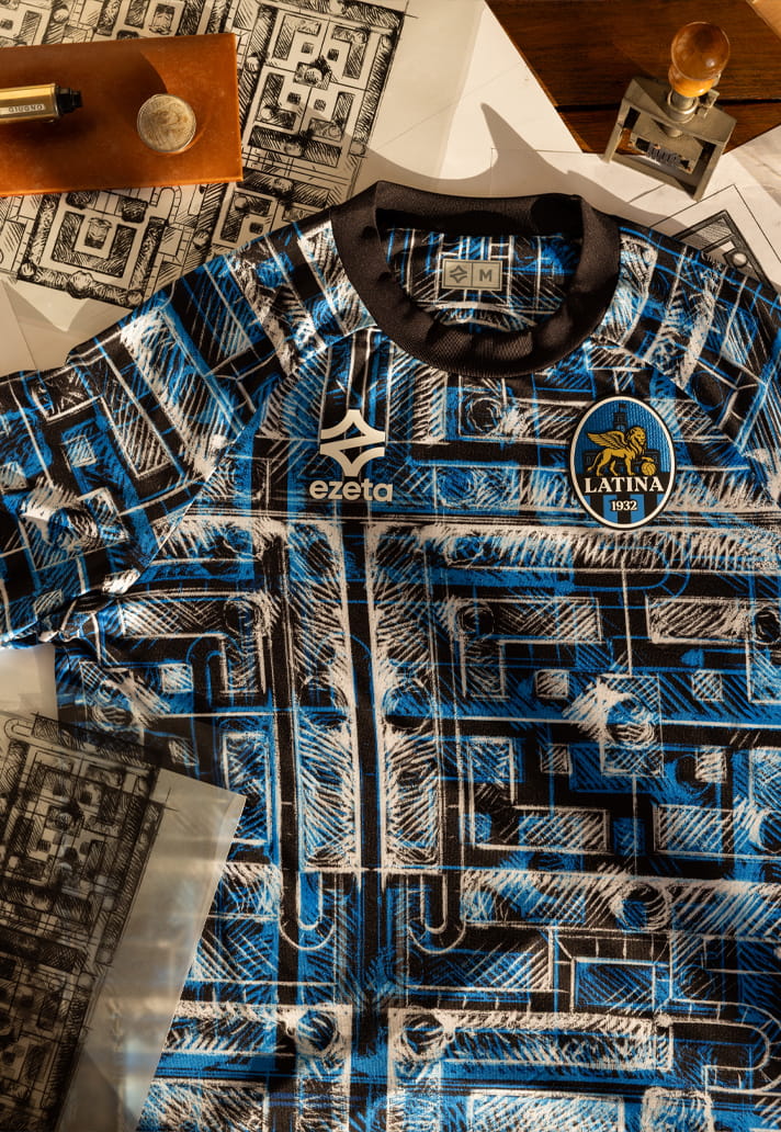
Then there's the Pre-Match jersey, which arguably gives Ezeta the most freedom to fully explore the concept. Drawing inspiration from the Gardens of Piazza del Popolo, the design transforms the square's layout into a bold all-over graphic made up of layered lines, geometric forms and architectural references. The resulting visual creates an almost three-dimensional effect, bringing movement and depth to a design that's every bit as eye-catching as you'd expect from the Italian brand.
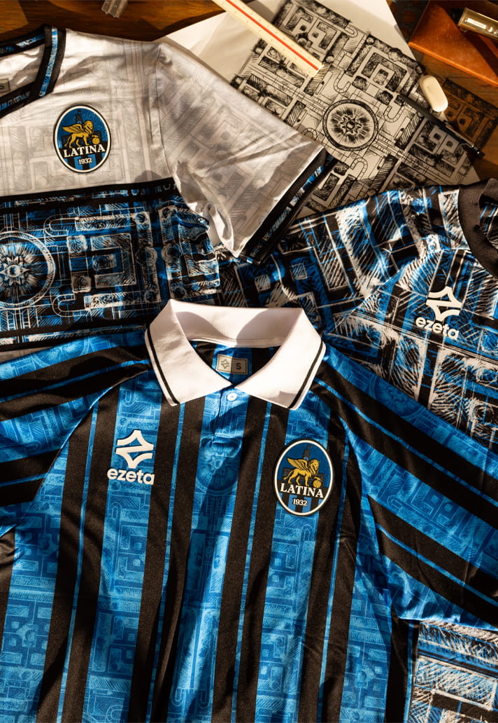
What makes the collection particularly successful is that it never feels like architecture for architecture's sake. The references are meaningful, rooted in the story of the city and reflective of Latina's identity. That's been a consistent theme throughout Ezeta's work, and it's a big reason why the brand continues to stand apart from much of the market.
At a time when many football shirt designs are leaning towards constrained, Ezeta remain fully committed to their philosophy of storytelling through design, and it's always nice to have that point of difference. Every release feels crafted specifically for the club wearing it, drawing from local history, culture and landmarks rather than simply following whatever trend happens to be dominating the wider industry. The result isn't always subtle, but that's kind of the point.
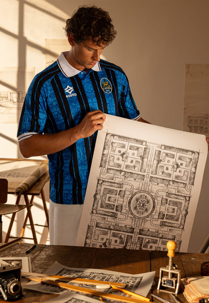
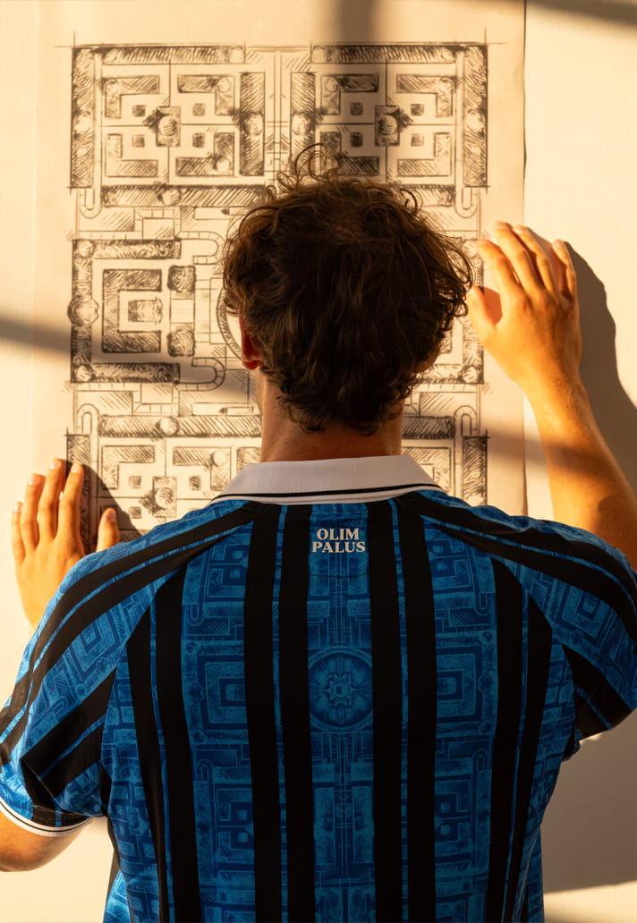
Football shirts should mean something. They should say something about where a club comes from and what it represents. That's exactly what Ezeta have achieved with Latina's 26/27 collection, transforming the city's Rationalist architecture and urban heritage into something that players and supporters can wear with pride.
Another club, another story, another reminder that when Ezeta design a football shirt, they're rarely just designing a football shirt.
Shop the Latina Calcio 26/27 collection at ezeta.it