There’s something pretty satisfying when a football kit actually means something, isn’t there? Not just a slick colour swap or a trendy pattern thrown on for the sake of it, but a design that genuinely taps into the identity of the club. That’s exactly what FC Porto and New Balance have gone for with the club’s new away shirt for the 2026/27 season. And honestly, it’s a really nice touch.
Let’s start with the inspiration, because it’s one of those “how did we not think of this before?” moments. Port wine – yeah, the stuff Porto is famous for – originates exclusively from the Douro Valley in northern Portugal, eventually making its way to the Atlantic via the city itself. When you connect those dots, it suddenly makes perfect sense to build a kit around that heritage.
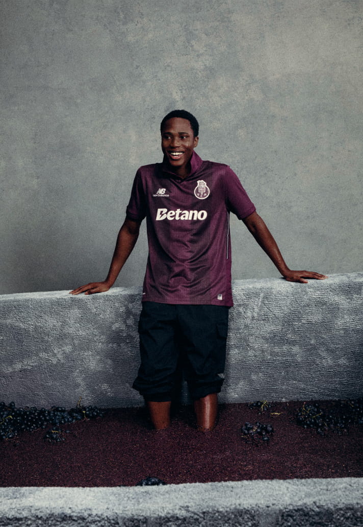
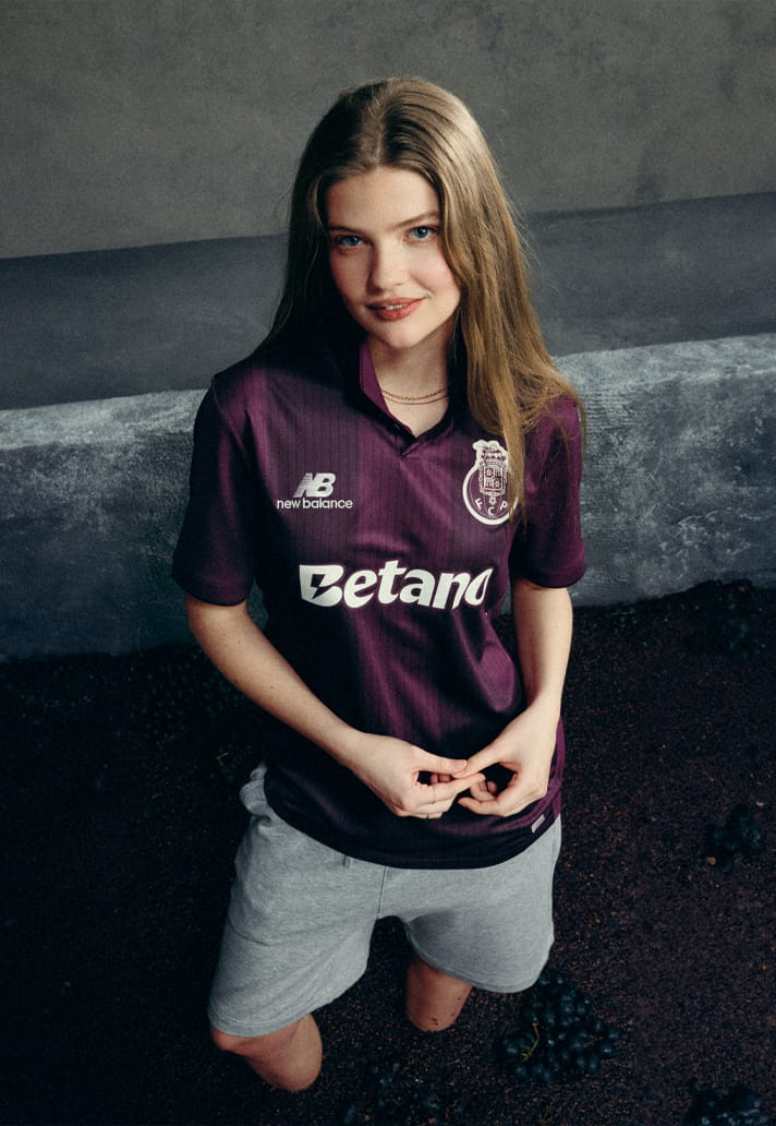
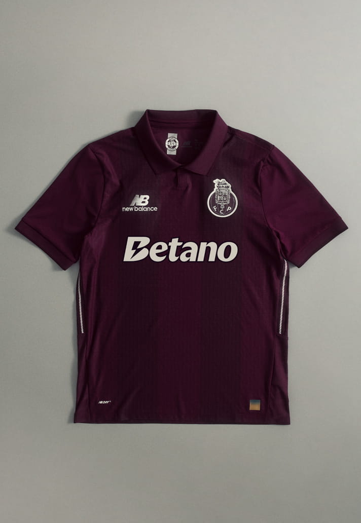
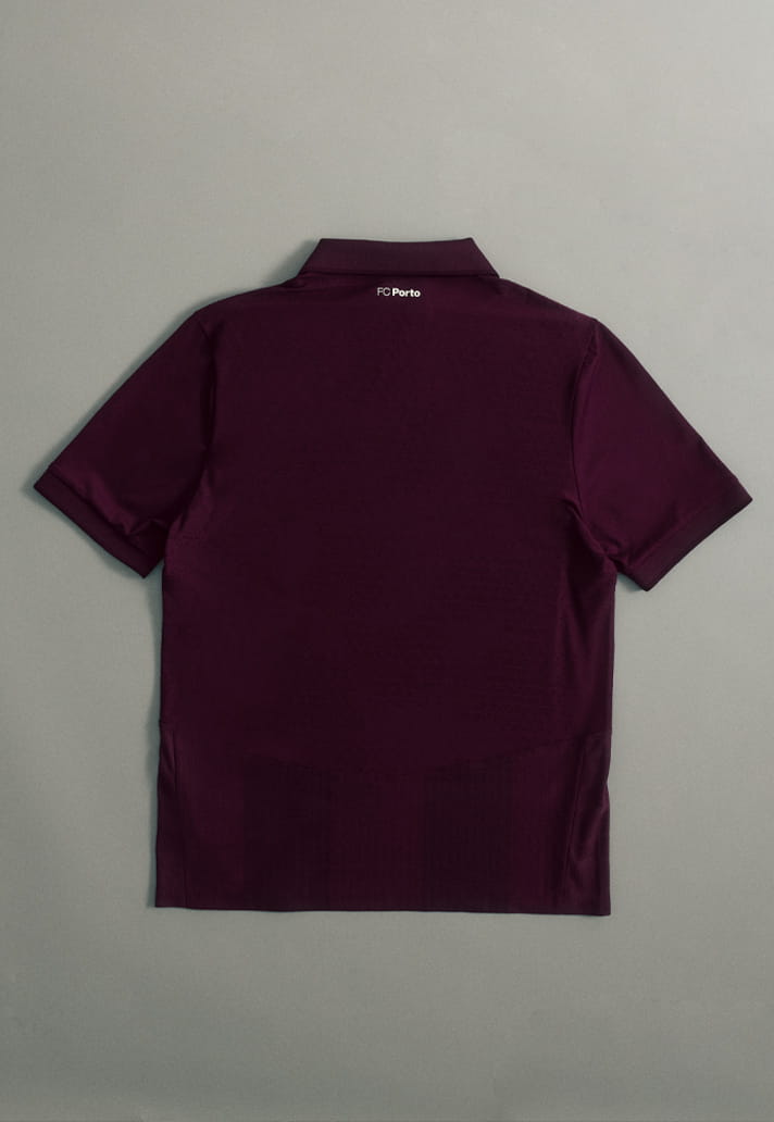
So, the shirt lands in a deep purple base, directly nodding to the rich tones of Port wine. It’s a bold choice in a world where away kits can sometimes feel a bit safe or over-designed. This one stands out straight away, but in a way that feels grounded in something real rather than just chasing attention.
The execution is clean, too. You’ve got subtle tonal striping running through the fabric, which adds texture and depth without overcomplicating things. It keeps that classic football shirt silhouette intact, which is always a win. No unnecessary noise, just thoughtful detailing that rewards a closer look.
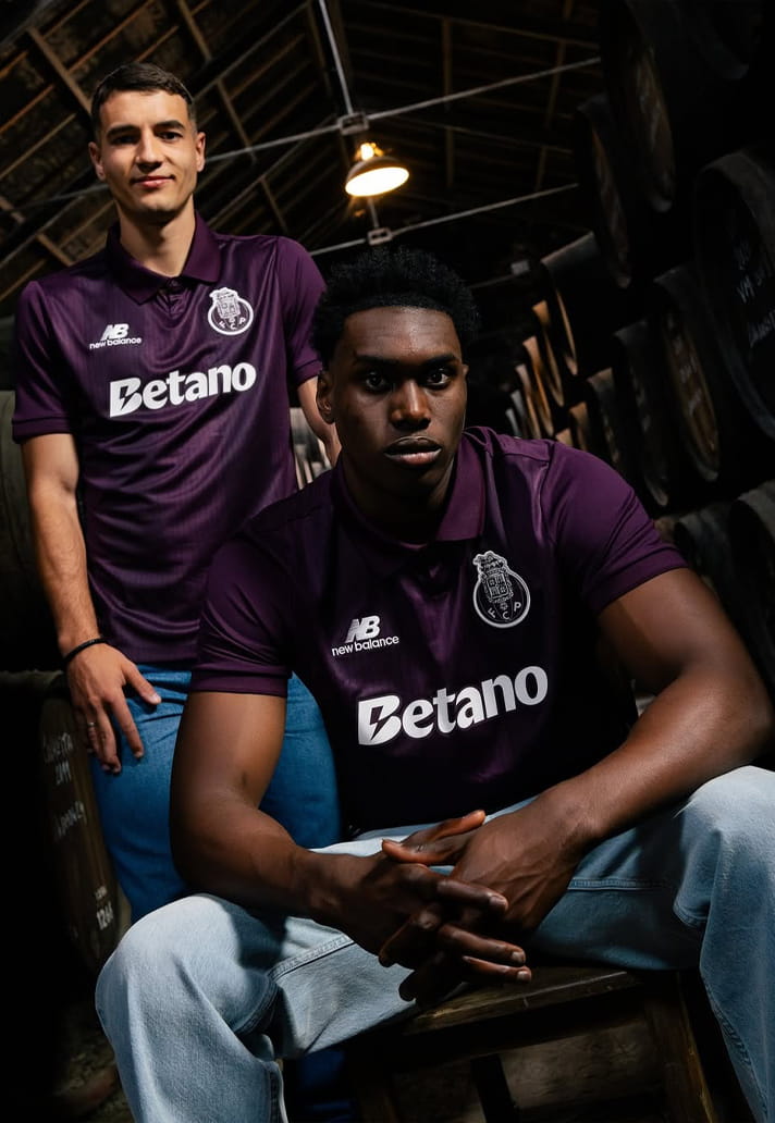
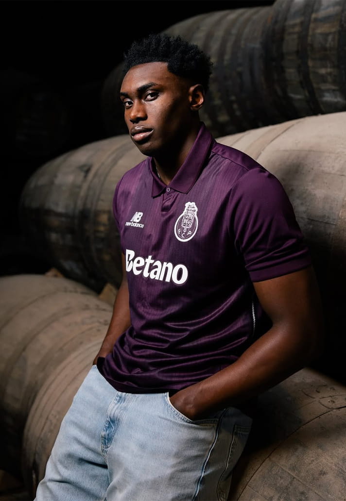
One of the nicest touches is the monochromatic club crest, sponsor and branding. It dials everything into that modern, almost premium aesthetic that New Balance have become pretty good at. Instead of competing with the base colour, it blends into it, giving the whole shirt a sleek, unified feel. It’s understated, but in a way that feels intentional rather than muted.
And when you step back, the story behind the shirt goes beyond just the colour. The design reflects the journey of Port wine itself, from the Douro Valley out to the wider world, which mirrors FC Porto’s own identity as a club with deep local roots and a strong international presence. It’s that blend of tradition and global ambition that gives the shirt a bit more weight than your standard away kit.
And that’s kind of the takeaway here. This isn’t just a nice-looking shirt (although it definitely is that). It’s one that tells a story, connects to place, and still manages to feel fresh in a jersey landscape that can sometimes lean a bit repetitive.
All in all, it’s a strong entry for 26/27. Let’s all raise a glass to FC Porto…
The New Balance FC Porto away kit is available to purchase from newbalance.com