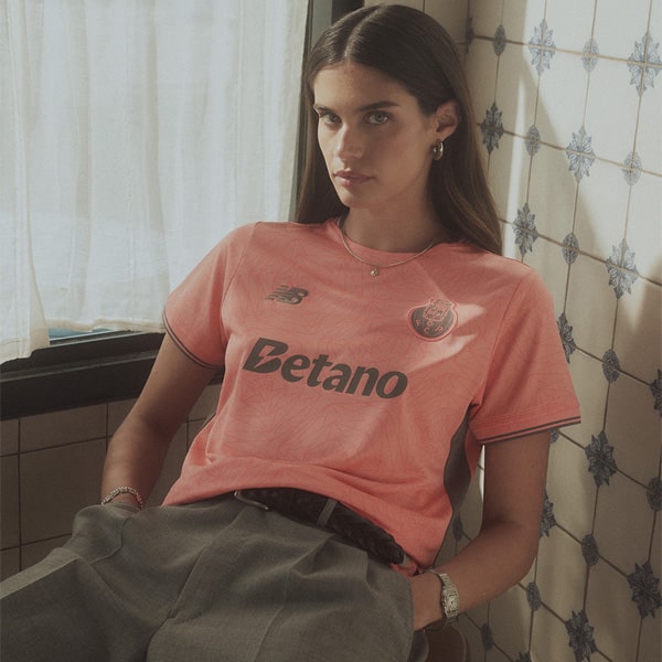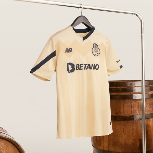
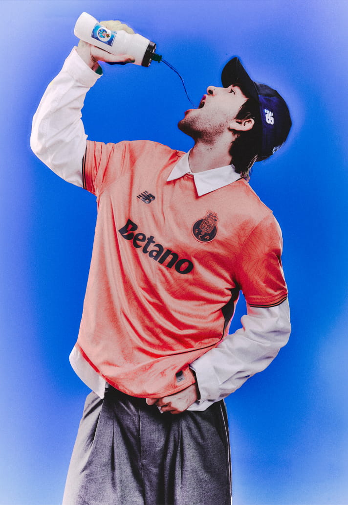
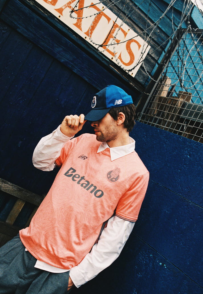
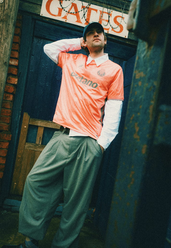
Not all statements need to be loud. FC Porto’s 25/26 away kit arrived with a tone that feels unexpected at first glance. A washed coral, sitting somewhere between heat and calm. It’s a departure from tradition, but not a rejection of it. Instead, it reframes identity through texture, pattern and precision. Because beneath the surface, this shirt is anything but simple.
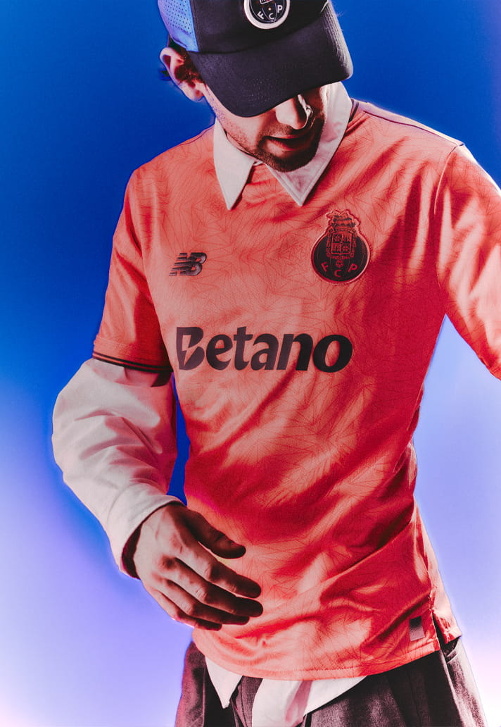
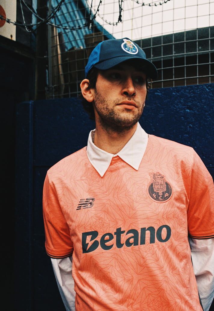
Look closer and the fabric reveals itself. A geometric, almost fractured pattern runs throughout. It’s subtle, tonal, but full of movement. It gives the shirt a sense of energy without overwhelming it. The coral base becomes a living canvas, shifting in light, catching detail as it moves. And in the middle of that controlled complexity, the sponsor has a job to do. This is where Betano finds its balance.
Executed in a deep, grounded black, the wordmark cuts cleanly through the warmth of the base. It doesn’t try to compete with the pattern, it stabilises it. The weight of the typography anchors the shirt, giving the eye a place to land amidst the layered detailing. It’s contrast used with intent, not excess.
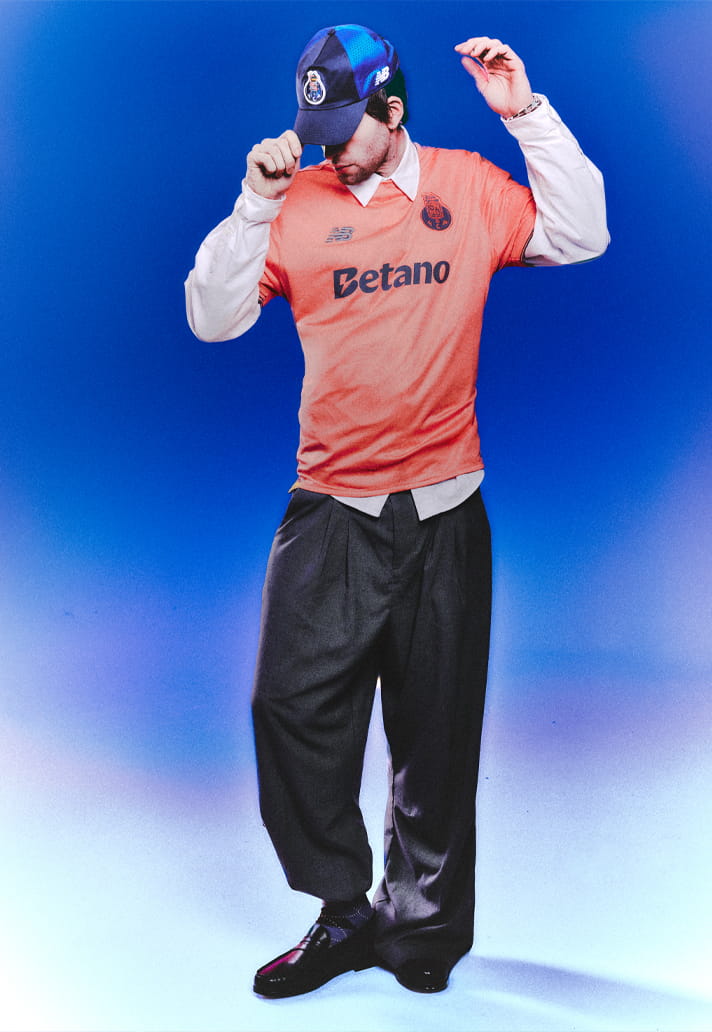
Because on a shirt like this, clarity is everything. The crest follows suit. Slightly muted, refined to sit within the palette rather than jump off it. The New Balance mark mirrors that restraint. Even the sleeve trim and side panels carry a darker tone, framing the shirt and reinforcing structure.
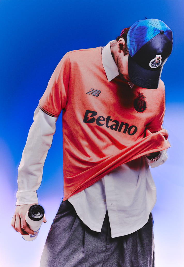
Nothing is accidental. There’s a quiet tension at play here. Between movement and control, between pattern and simplicity. The sponsor sits right at the centre of that exchange. Not overpowering, not disappearing. Just present. Just right.
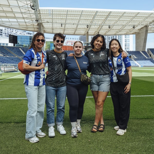
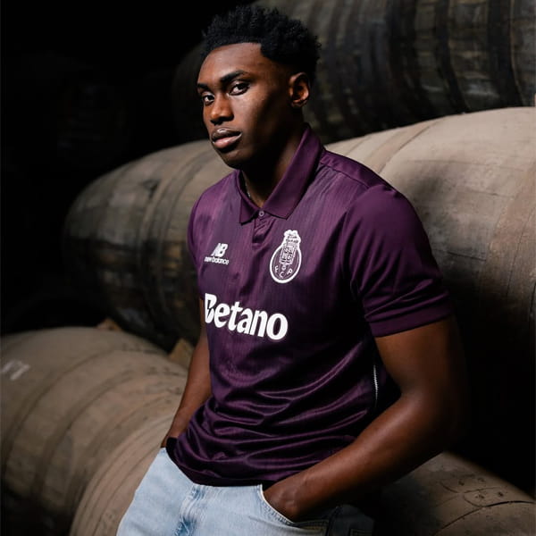
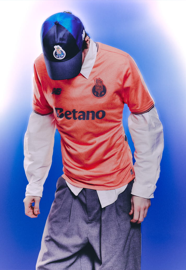
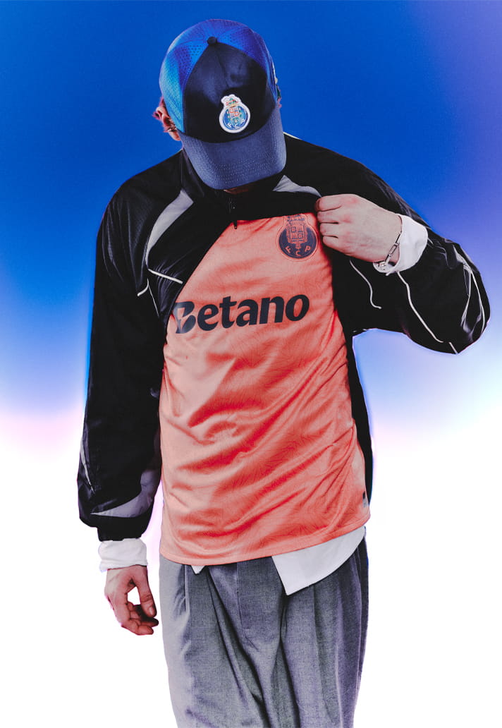
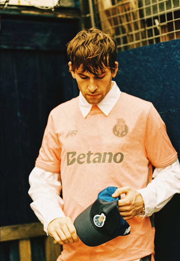
In our editorial framing, that balance becomes even more apparent. The shirt holds its own in isolation, the pattern revealing itself under light, the sponsor maintaining its clarity regardless of styling. It transitions effortlessly beyond the pitch into something more cultural, more considered.
That’s the real measure. Because when a shirt carries this much visual information, the sponsor has to adapt. It has to understand when to speak and when to step back. Here, Betano does exactly that, grounding the design without flattening it.
Step back and the composition resolves: Coral base. Layered geometry. Muted crest. NB mark. Betano in black. Energy, held together by precision.
FC Porto’s 25/26 away kit is proof that bold doesn’t have to mean chaotic. And when a sponsor understands how to work within that framework, it doesn’t disrupt the design. It completes it.
Photography by SoccerBible.