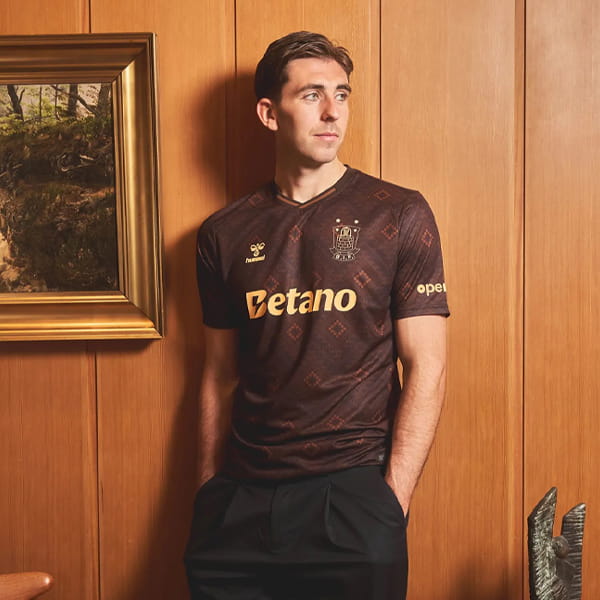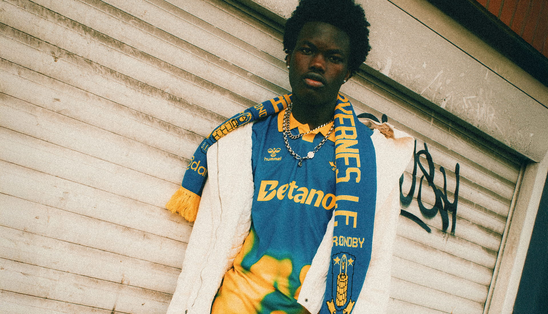
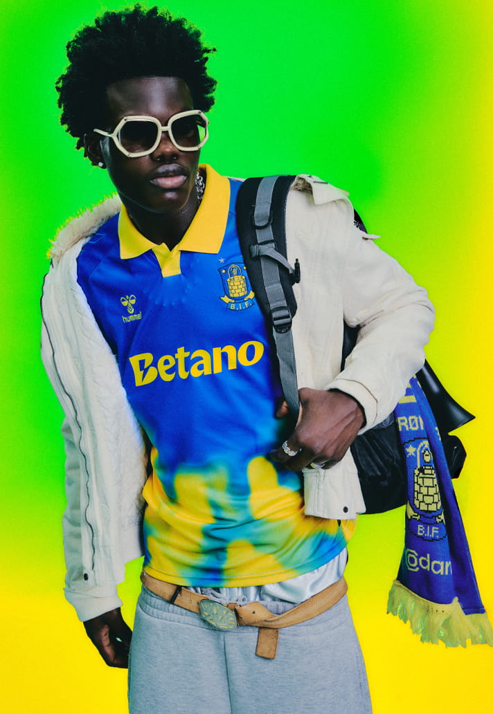
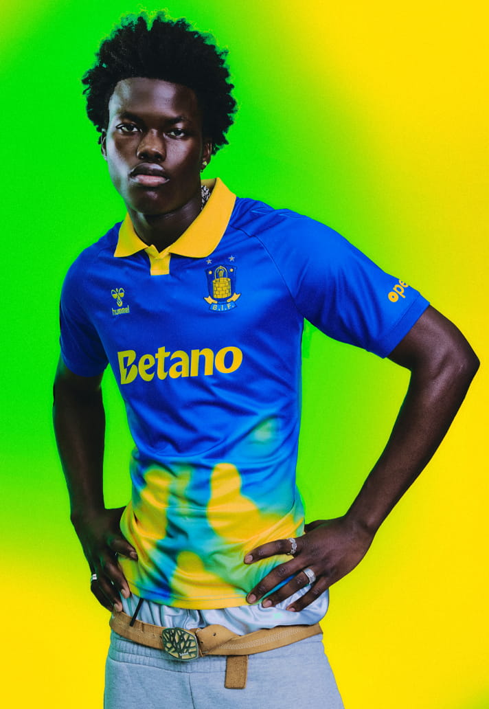
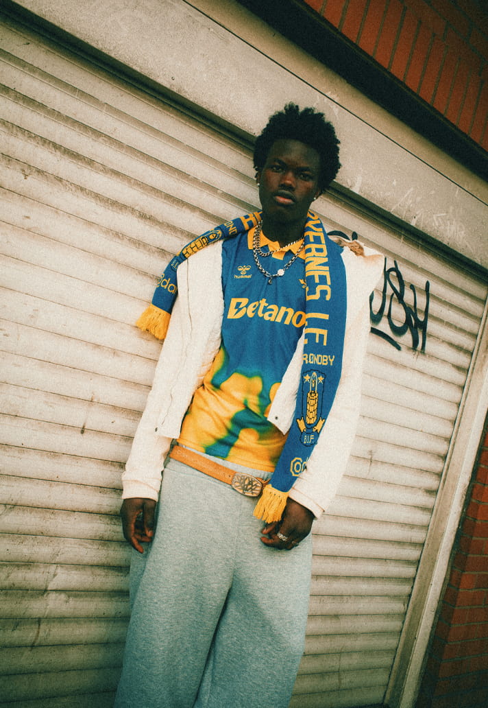
Some shirts don’t follow structure. They follow feeling. Brøndby IF’s 25/26 away kit is exactly that. A piece that leans into expression over rigidity, where colour becomes movement and identity is carried through energy rather than symmetry.
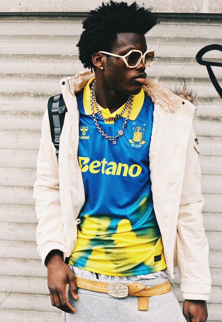
At first glance, it’s bold. But spend time with it, and you realise it’s carefully unbalanced. Because this is controlled chaos. The base lands in a rich, saturated blue and unmistakably Brøndby. But it’s the lower half of the shirt where things shift. Yellow and green tones bleed upwards in an almost airbrushed motion, like floodlights cutting through smoke, or colour caught mid-transition. It feels alive. In flux.
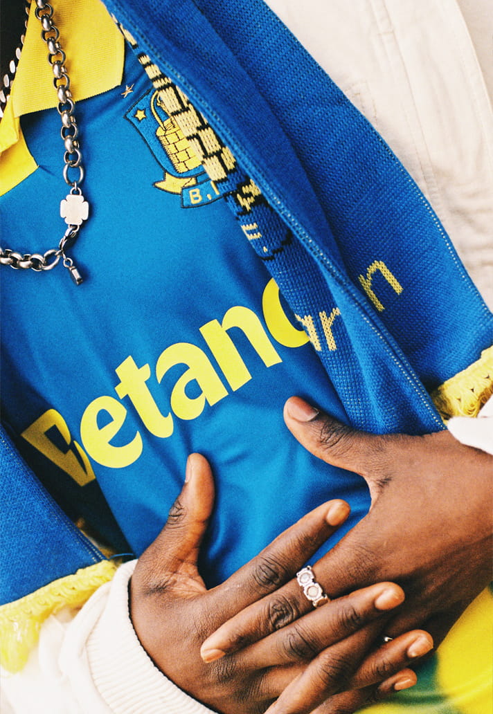
And with that level of visual movement, the sponsor has a delicate role to play. This is where Betano steps in with clarity. Rendered in a matching yellow, the wordmark doesn’t interrupt the composition, it locks into it. It mirrors the collar, the crest detailing, the Hummel chevrons. It becomes part of the palette rather than sitting outside of it. That decision is everything. Because on a shirt like this, contrast would have broken the spell.
Instead, the sponsor flows with the design. It rides the gradient. It feels embedded within the motion rather than imposed on top of it. The weight of the typography still holds presence. It cuts through the shifting tones just enough to remain legible, but never at the expense of the overall aesthetic.
That balance is what elevates it.
The crest sits proudly, detailed and traditional against a modern backdrop. The Hummel identity is subtle but unmistakable and frames the composition making the sponsor becomes the connective tissue between heritage and experimentation.
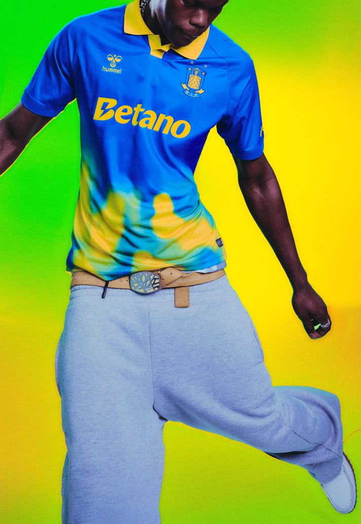
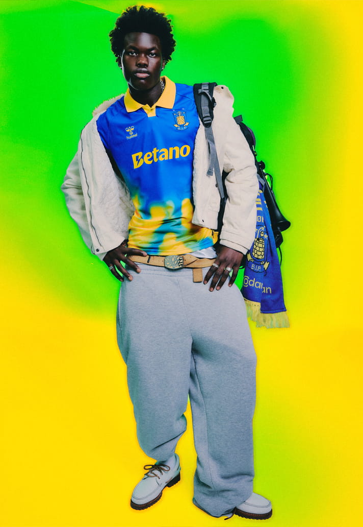
That tension comes to life through the visual language. Styled simply, worn with ease, the shirt carries its own attitude. It doesn’t need overworking. The colour does the talking. The sponsor follows its lead. And crucially, it holds.
Because when a shirt pushes into more expressive territory, every element has to move in sync. The sponsor can’t fight for attention. It has to understand the rhythm. Here, Betano adapts — not just in colour, but in presence. It knows when to speak.
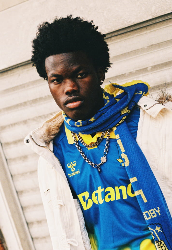
Step back and the composition reveals itself: Blue foundation. Yellow collar. Fluid colour shift. Crest. Hummel. Betano in yellow. Everything connected. Everything in motion.
Brøndby’s 25/26 away kit is a reminder that football shirts can be emotive as much as they are functional. And when a sponsor embraces that it becomes part of the expression rather than a disruption and the result feels complete. Not static but alive.
Photography by SoccerBible.