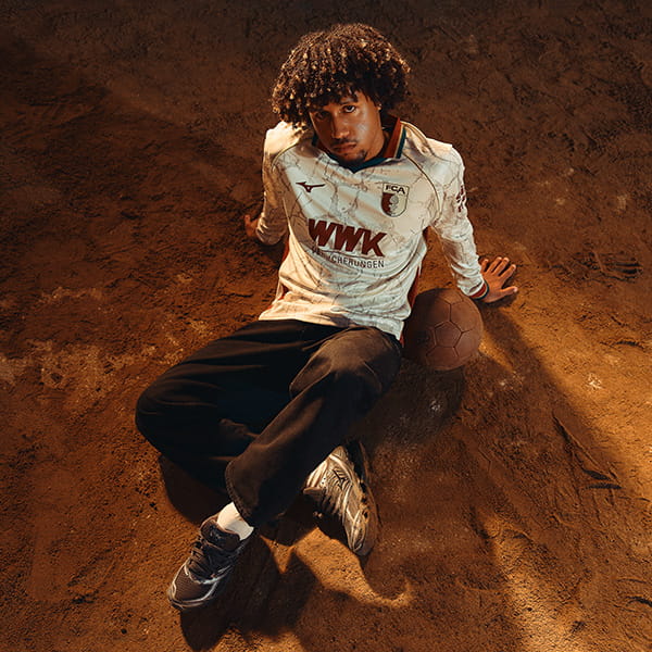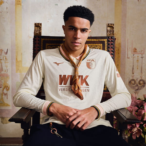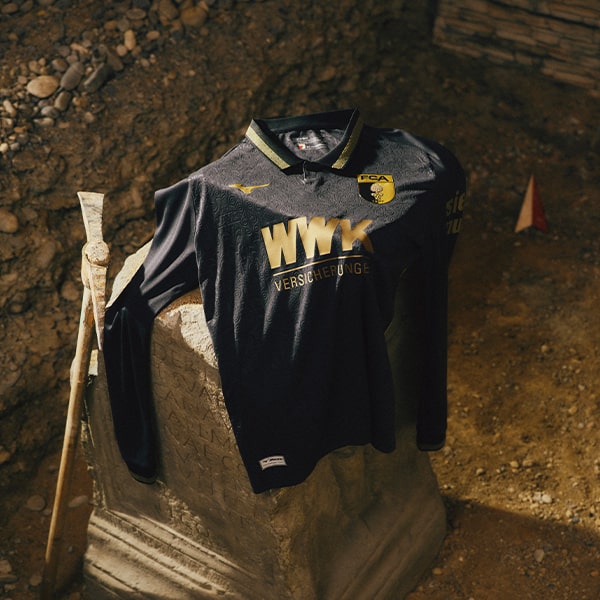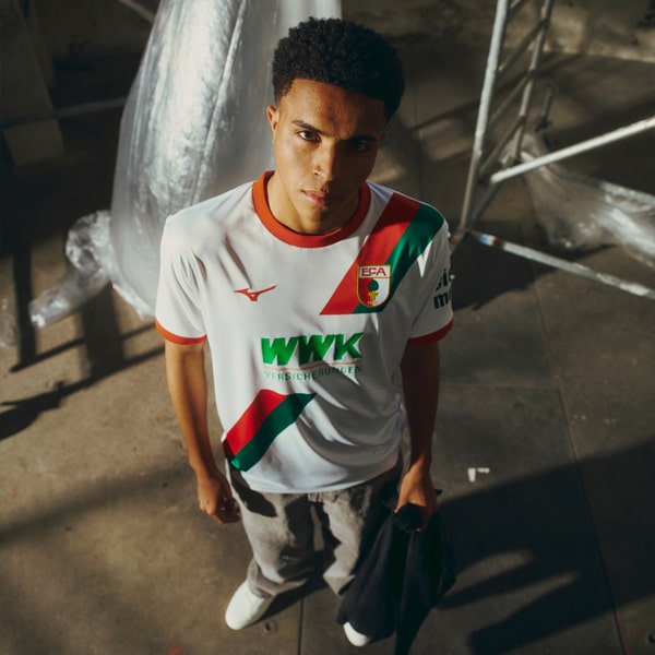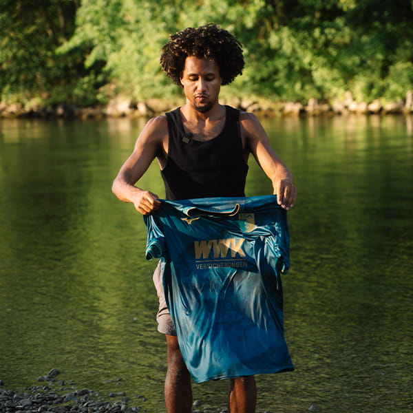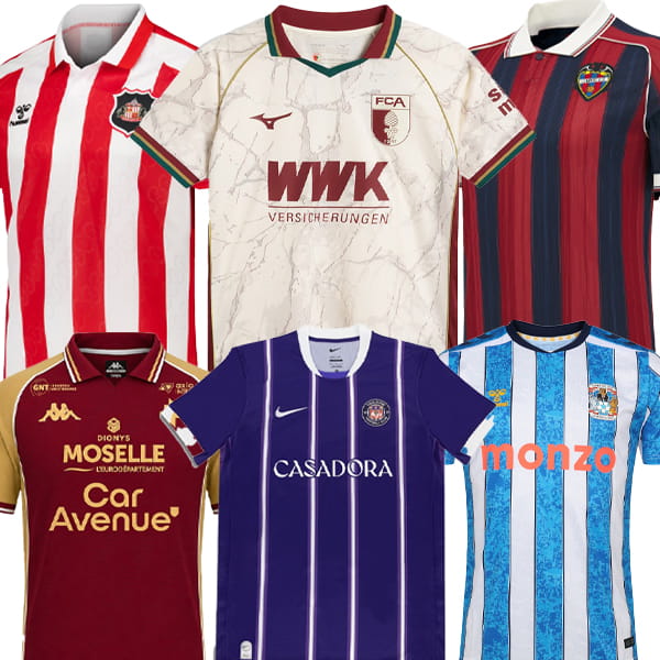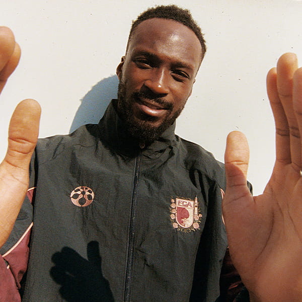
You know how sometimes you see a kit and it just instantly hits? Yeah, that’s Augsburg’s new third shirt for me. But in fairness, it’s been most of Augsburg’s shirts since they’ve been with Mizuno. Match made in heaven? Dunno about that, but the kits are bloody lovely.
Anyone who’s read my kit reviews will know that I love a beautiful design backed up by meaningful storytelling. Designing for a reason. Designing with a purpose. Sure, that purpose is at first in a performance sense, providing a kit that will distinguish a side from their opponents. But beyond that there’s a lot of room to play in. And when you get to the third kit of a season? Well, now, the fences of that playground are pretty much knocked down, and designers get to play free. That’s where some of the best stories get brought to life. And as if to prove my point, I give you Augsburg’s third shirt for the 26/27 season.
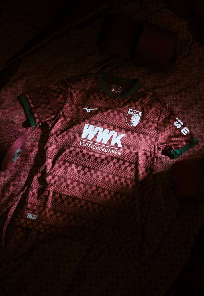
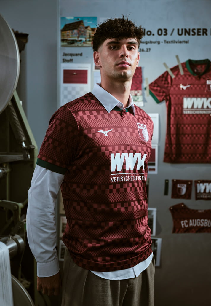
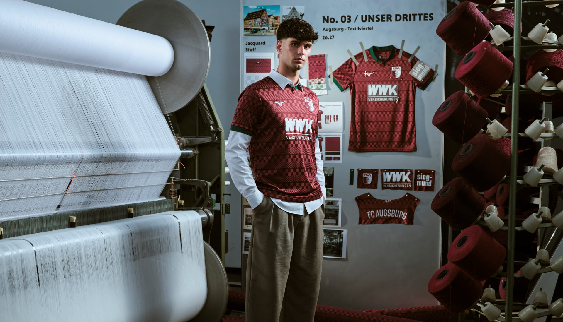
As with any good football shirt, the design starts with a story. In this case, that story is woven directly into the fabric of Augsburg itself. The club's new third shirt takes inspiration from the city's rich textile heritage, celebrating an industry that helped shape Augsburg's identity for generations. For decades, Augsburg stood as one of Germany's leading textile centres. At its peak, more than 20,000 people worked throughout roughly two dozen major factories, alongside countless smaller businesses that formed the backbone of the local economy. The industry became so significant that Augsburg was often compared to Manchester, the historic powerhouse of British textile production. Even today, the district where many of those factories once operated remains known as the Textile Quarter.
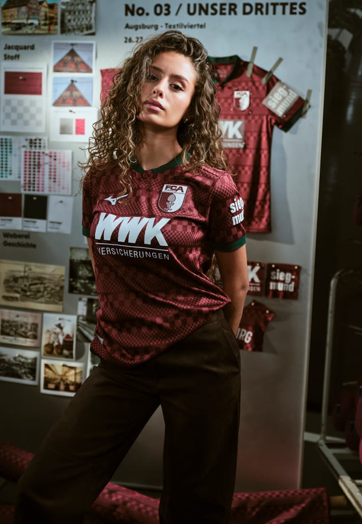
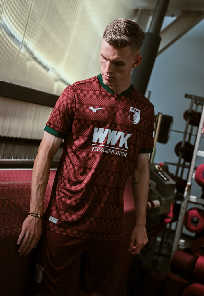
It's exactly the sort of concept that feels perfectly suited to a third shirt. Rather than simply applying another fresh colourway to an existing template, Mizuno has used the opportunity to tell a story that's deeply connected to both the city and the club.
The campaign surrounding the launch doubled down on that connection, with the shirt unveiled at the State Textile and Industry Museum Augsburg. Dedicated to textile art, design and craftsmanship, it was an entirely fitting backdrop for a kit that draws so heavily from the city’s industrial past. And thankfully, the storytelling is matched by the execution.
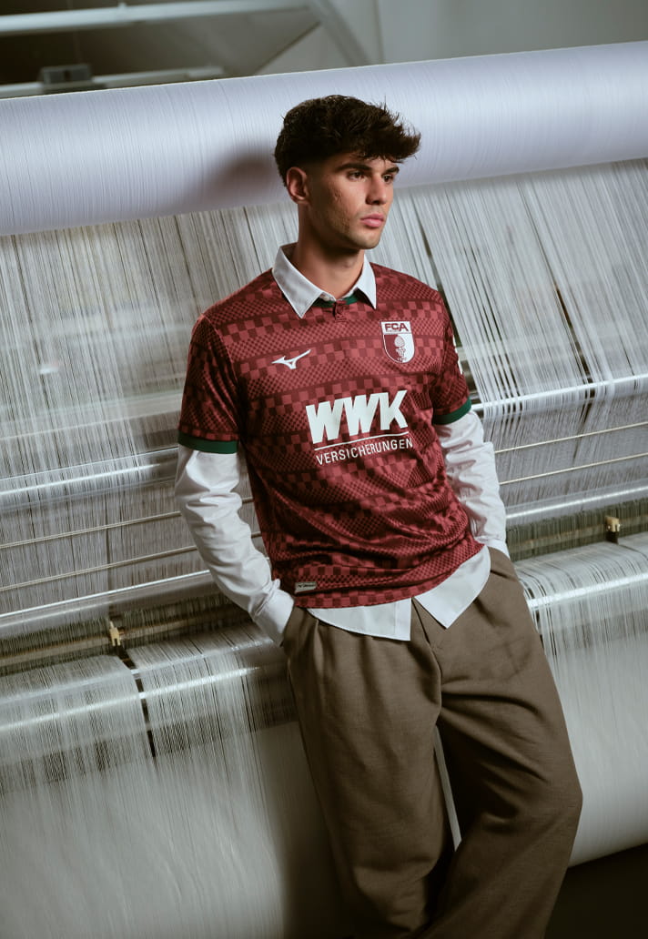
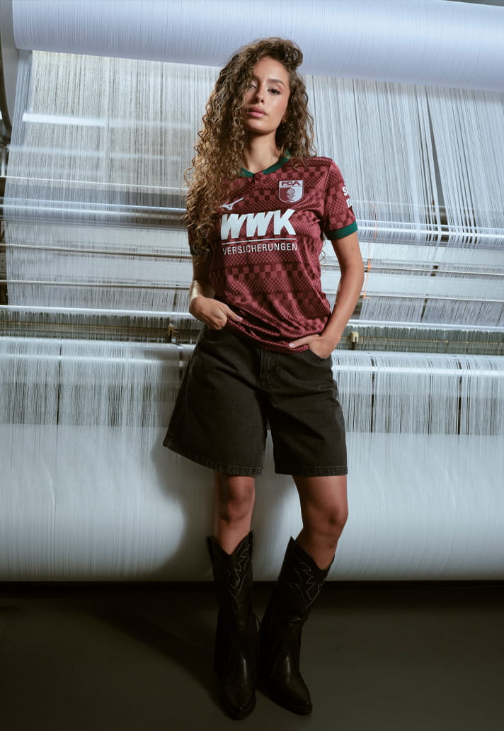
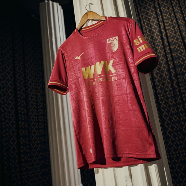
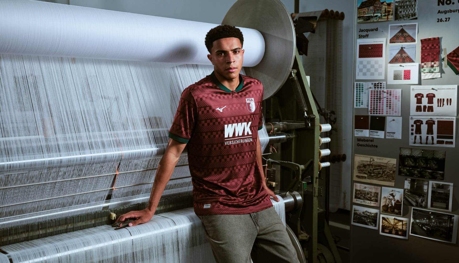
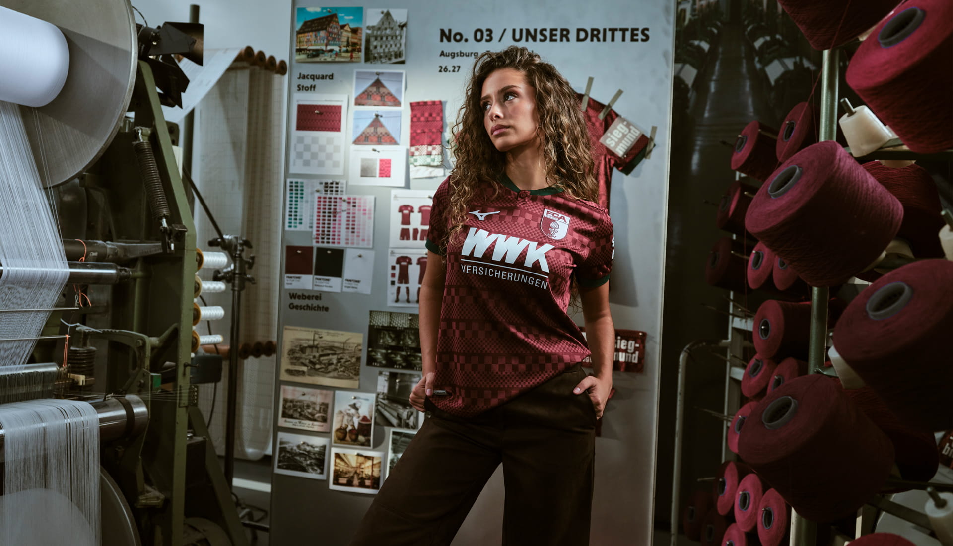
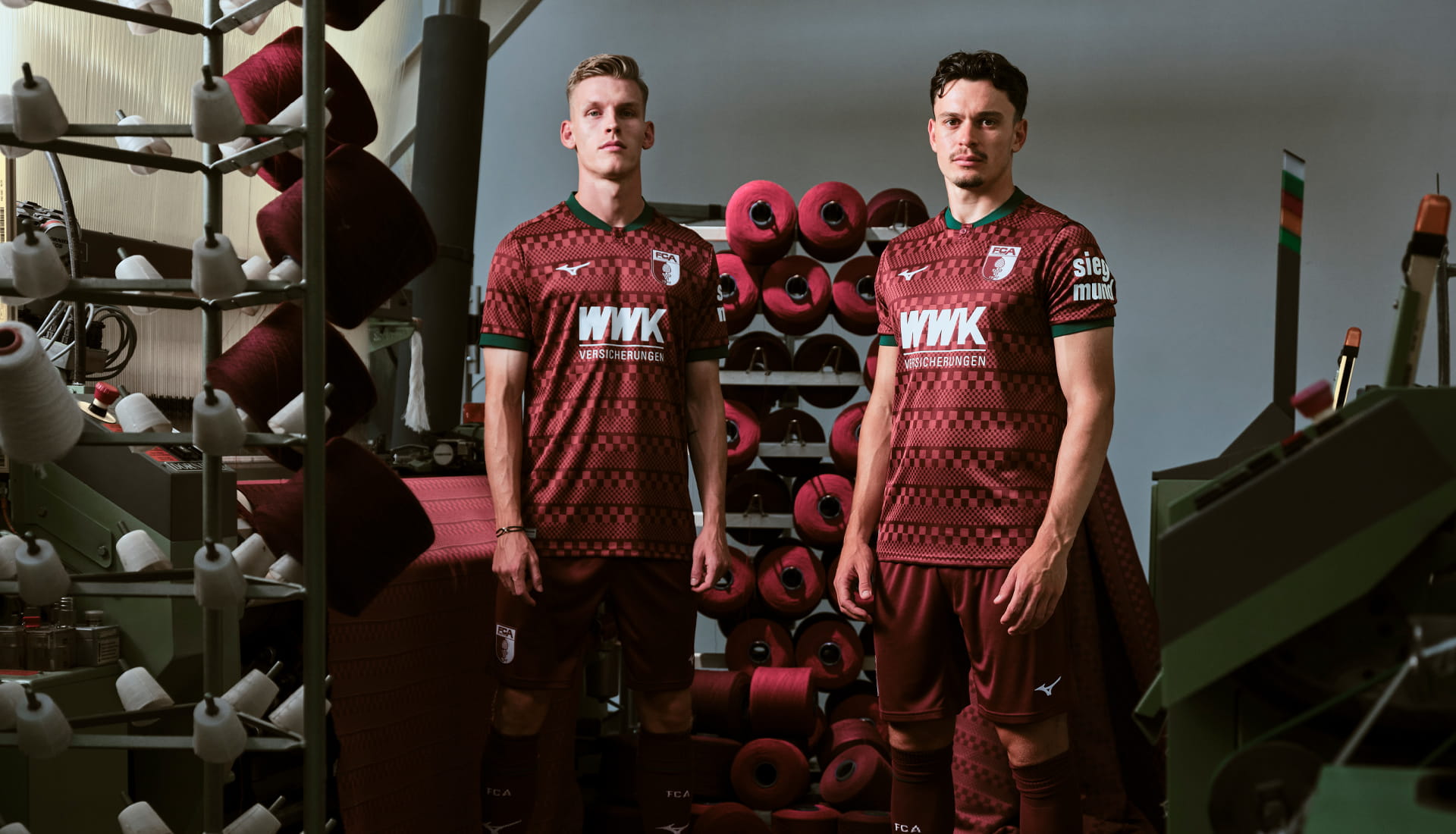
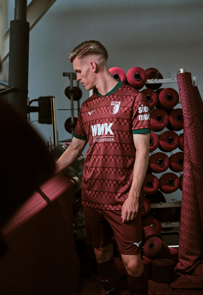
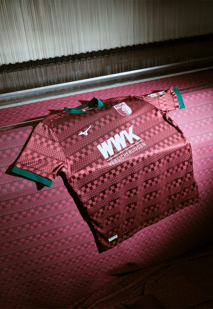
The 2026/27 third shirt features a woven check pattern that creates an eye-catching textured finish across the shirt. The pattern itself takes inspiration from Augsburg's historic Weberhaus, a building closely associated with the city's longstanding textile and craft traditions.
The colour palette is equally effective. A deep red base is brought to life through accents of white, while dark green detailing on the collar and sleeve cuffs provides a smart contrast. It’s reminiscent of the club’s outstanding third shirt from the 24/25 season, although it builds upon that design to offer something different enough to still feel fresh.
Some shirts look good. Some shirts tell a story. The very best do both. Augsburg's new third shirt firmly belongs in the latter category.