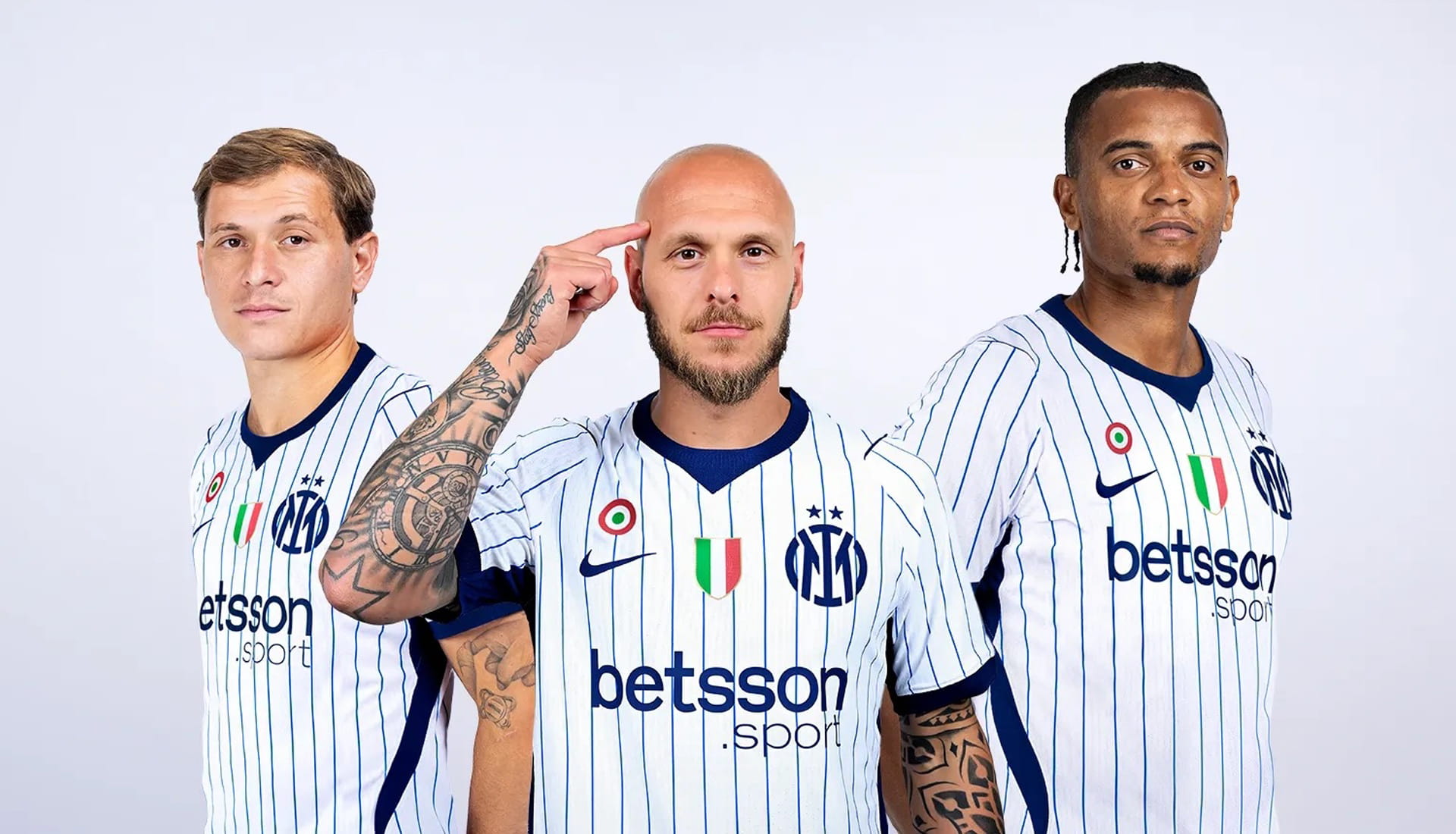
Inter Milan and Nike have unveiled the club's new 2026/27 away shirt, and it's one of those designs that immediately feels familiar while still bringing something fresh to the table. Clean, confident and packed with thoughtful details, it's a jersey that takes inspiration from baseball's visual heritage and filters it through the unmistakable identity of the Nerazzurri.
The concept is an interesting one. Baseball was one of the first sports to truly transcend the field and become a lifestyle culture, with its uniforms helping to shape fashion, design and wider popular culture for generations. Rather than simply borrowing from that world, Nike and Inter have reinterpreted some of baseball's most recognisable visual cues and made them feel completely at home within football.
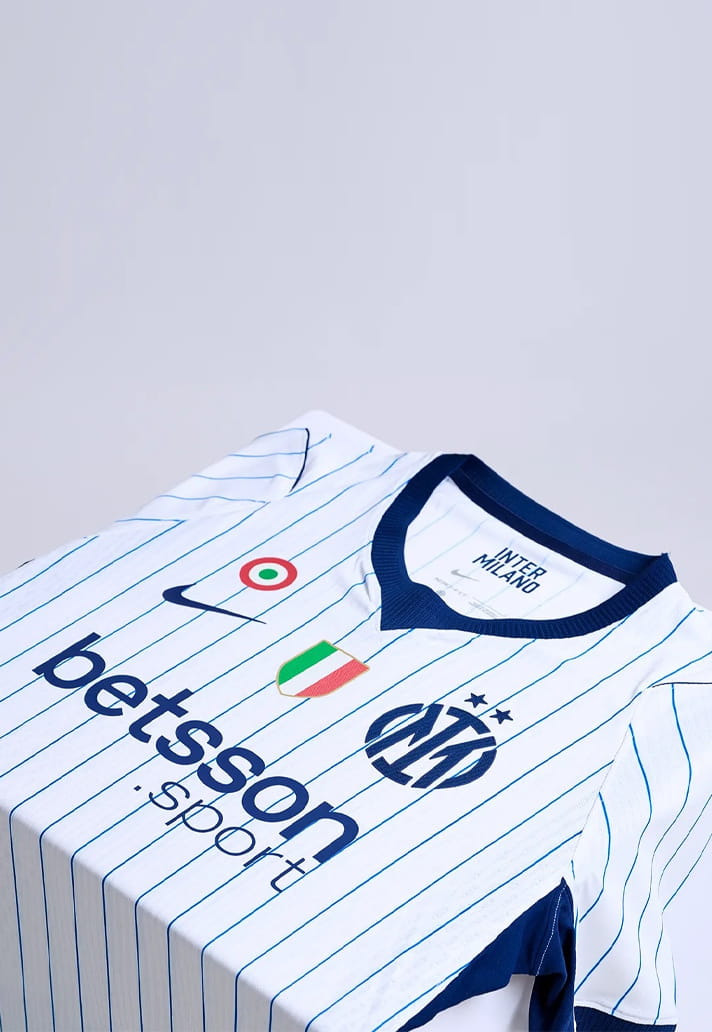
At first glance, the shirt's white base provides a crisp canvas for a series of iconic blue pinstripes that run vertically down the body. It's a nod to classic baseball jerseys, but one that feels surprisingly natural for Inter. The pinstripes add depth and character without overwhelming the design, while the contrast collar further reinforces the baseball-inspired theme. Together, they create a look that is understated yet full of personality.
What really elevates the shirt design for me, however, is the execution of the club crest.
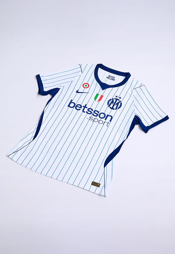
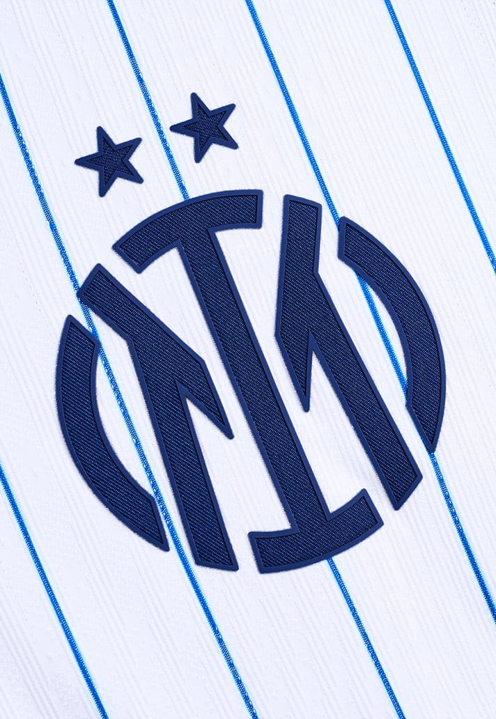
The monogram treatment feels authentic to the baseball inspiration, where oversized team marks and lettering have long served as powerful symbols of belonging and community. At the same time, it gives Inter's identity a fresh visual expression without losing any of the heritage behind it. It’s a proper example of Creative Soccer Culture in action at the highest level of the game.
It's a detail that instantly separates this shirt from countless other retro-inspired releases. The monogram isn't there simply for novelty; it becomes a central design feature that reshapes the entire aesthetic of the jersey. The result feels modern, fashion-conscious and culturally aware while still remaining unmistakably Inter.
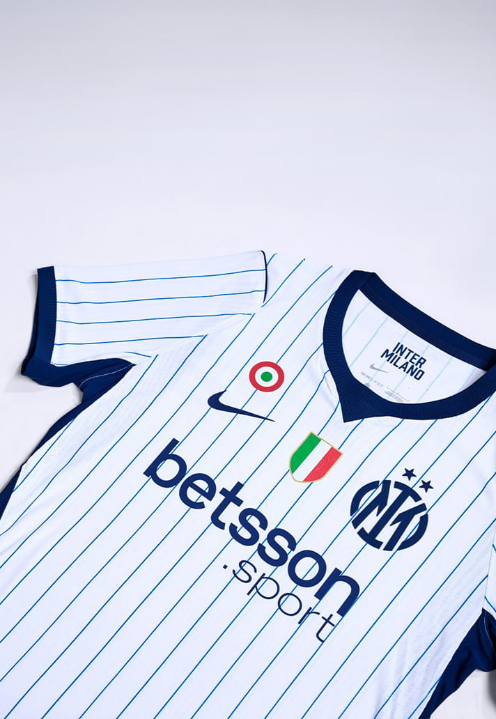
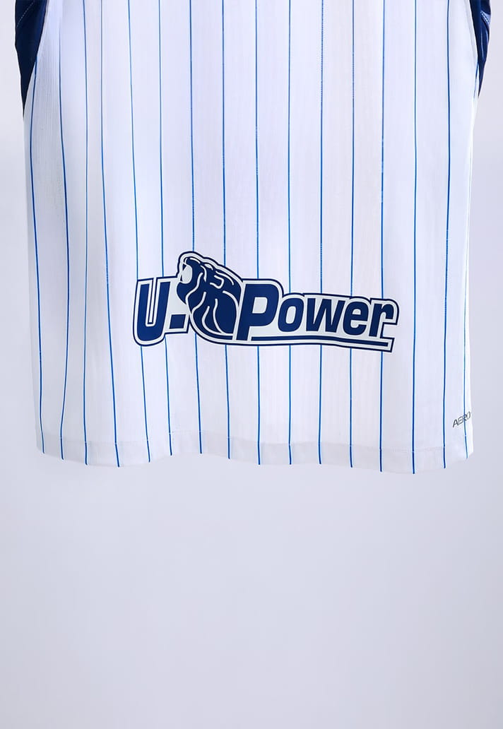
That's ultimately what makes this away shirt such a success. The baseball influences are clear, but they never overshadow the club. Instead, they provide a framework for Inter's identity to shine in a new way. From the elegant blue pinstripes and contrast collar to the standout crest execution, every detail feels considered.
In an era where some kit designs can feel overcomplicated, Inter's 2026/27 away shirt proves that simplicity, when paired with strong inspiration and thoughtful detailing, can be incredibly effective. It's a clean look, but one that carries enough unique touches to make it memorable. And the monogram crest? Well, it's just the cherry on top, isn't it?
Pick up the Inter Milan 26/27 away shirt at prodirectsport.com/soccer