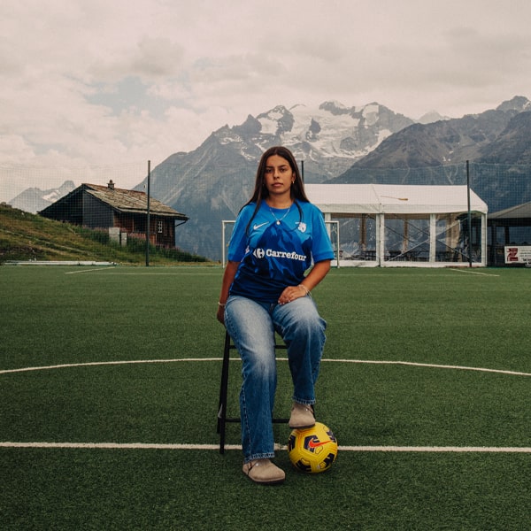
In a summer overflowing with new kit releases, cutting through the noise is no easy task. But Grenoble Foot 38 have once again shown that sometimes it's not the shirt itself that makes people stop and look, but the story told around it.
In the relentless churn of new season kit drops, standing out has never been more difficult. Every club wants a moment. Every brand wants attention. Every jersey launch is fighting for space in increasingly crowded feeds. That's why, here at SoccerBible, we're always drawn to the releases that bring something extra to the table. The ones that tap into the wider world of Creative Soccer Culture. Sometimes that's through an exceptional piece of design. Sometimes it's the narrative woven into a jersey. And sometimes it's a launch campaign that elevates a shirt beyond being just another product release. Grenoble Foot 38 have quietly become masters of the latter.
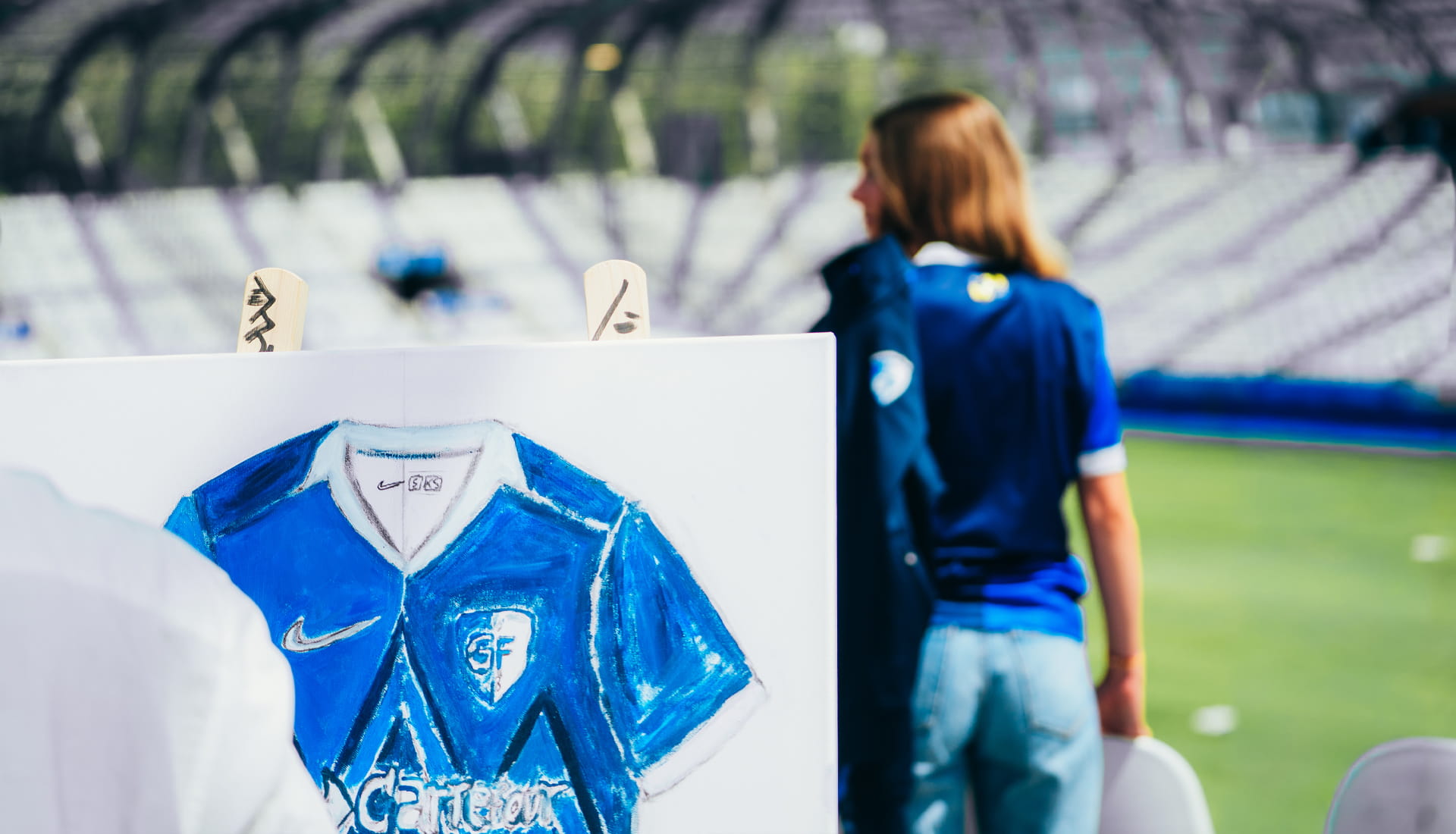
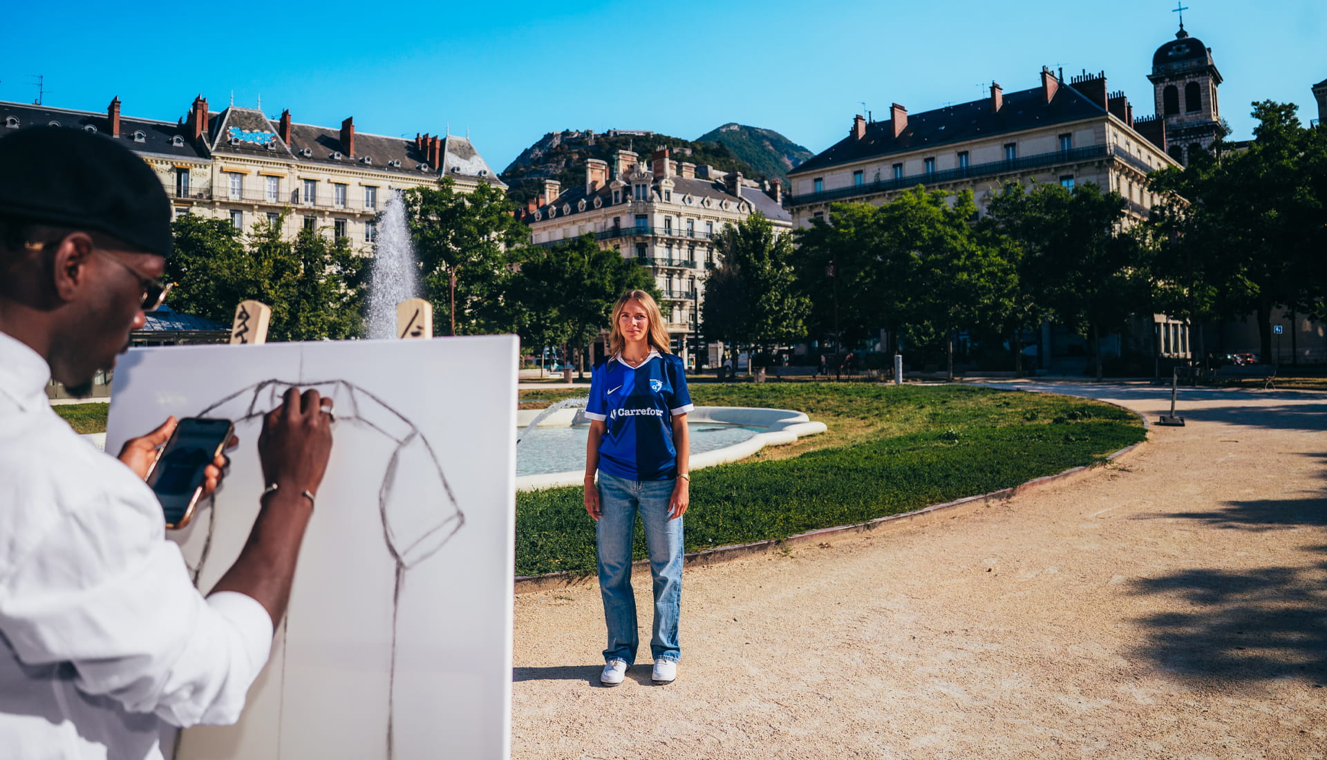
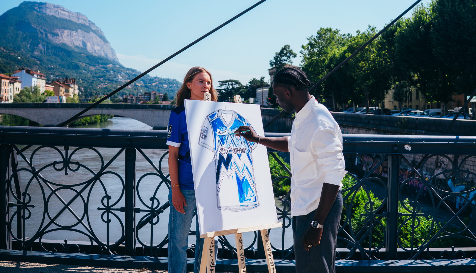
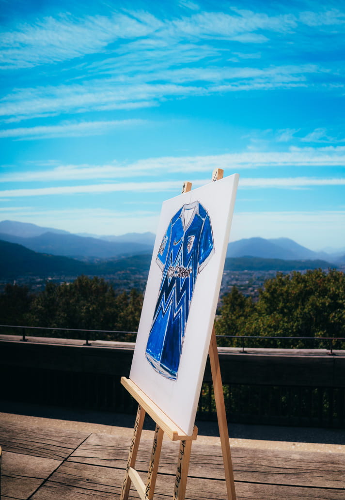
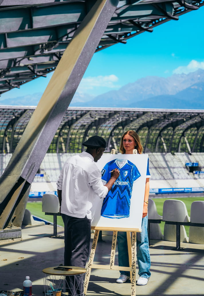
For the launch, the French Ligue 2 club handed a blank canvas to local artist Daouda Soulemane Traoré and asked him to tell the story of the new shirt in his own way. What followed was a creative journey through Grenoble itself, with the artist drawing inspiration from some of the city's most iconic locations before producing a unique artwork that now serves as the visual centrepiece of the campaign. It's a beautifully simple idea. But, as is often the case, simplicity is what makes it so effective.
While many clubs continue to rely on increasingly familiar reveal formats, Grenoble approached things differently. Instead of making the shirt the sole focus, they placed creativity, place and community at the heart of the launch.
Traoré travelled across the city, taking inspiration from landmarks that define Grenoble's identity. Victor Hugo Square, the Place du Parlement du Dauphiné, the Saint-Laurent Bridge, the Bastille Fort and the Stade des Alpes all became stops along the way. Over the course of a single day, these locations shaped the artwork stroke by stroke, with the city itself becoming part of the creative process. And when your home happens to sit at the foot of the Alps, inspiration is rarely in short supply.
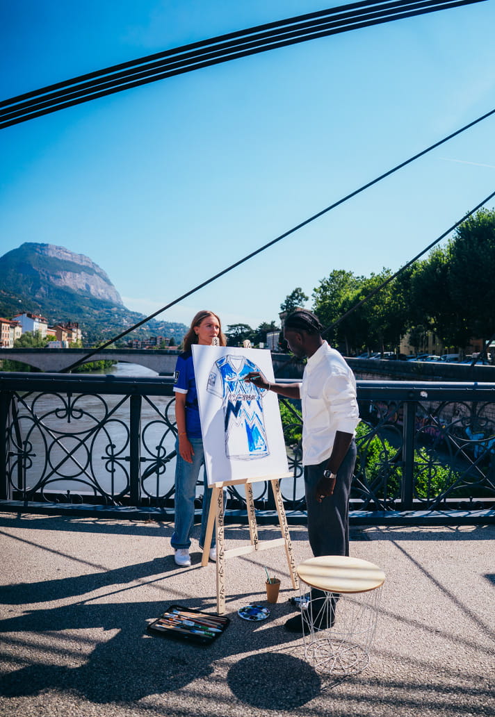
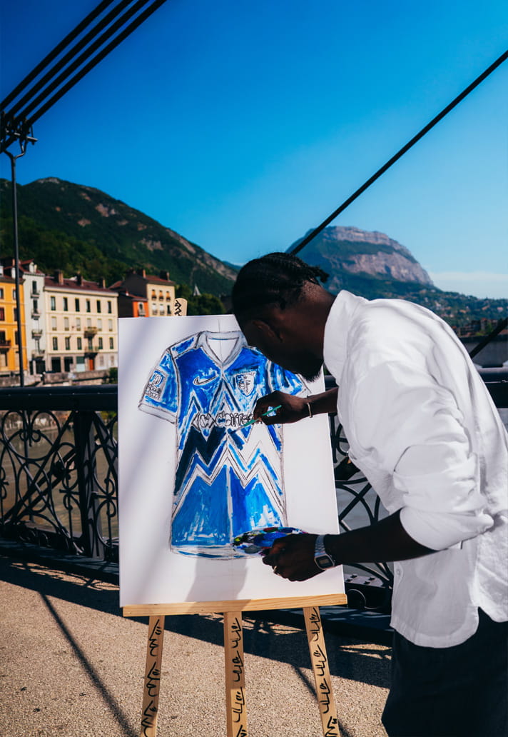
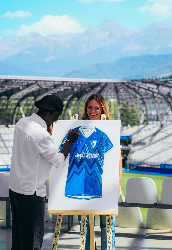
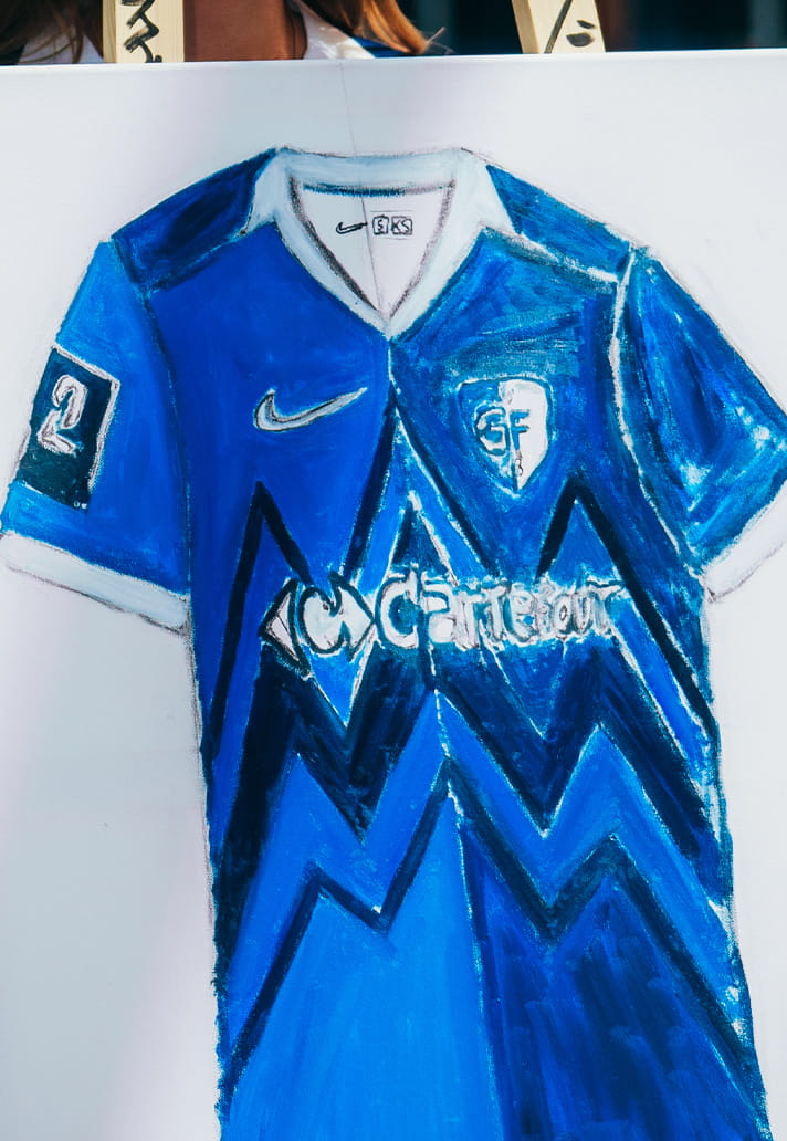
The resulting piece captures both the colours and spirit of the club's new Home Jersey, creating something that feels as much a celebration of Grenoble as it does of Grenoble Foot 38. According to Jérémie Escallier, Head of Marketing at Grenoble Foot 38, that connection between football shirt and artistic expression was at the core of the concept from the outset.
"We wanted to tell the story of a football shirt in a different way," explains Escallier. "Every kit begins as a blank canvas before becoming something filled with emotion, memories and identity. Working with an artist allowed us to make that creative journey visible. Watching the shirt literally come to life through paint felt like the perfect metaphor for what a football shirt means to a community.”
That notion of visualising a shirt's journey is an interesting one. Football kits often arrive fully formed in polished campaign images, detached from the creative process that brought them into existence. Grenoble's campaign does the opposite. It places the act of creation front and centre, making the audience part of the journey rather than simply showing them the finished result.
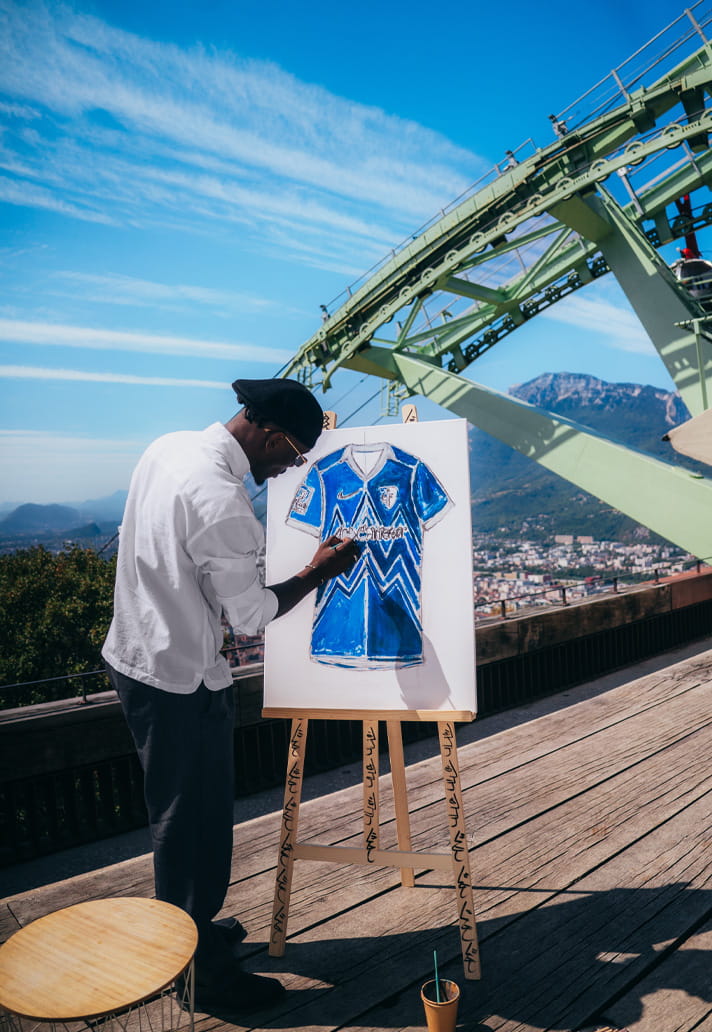
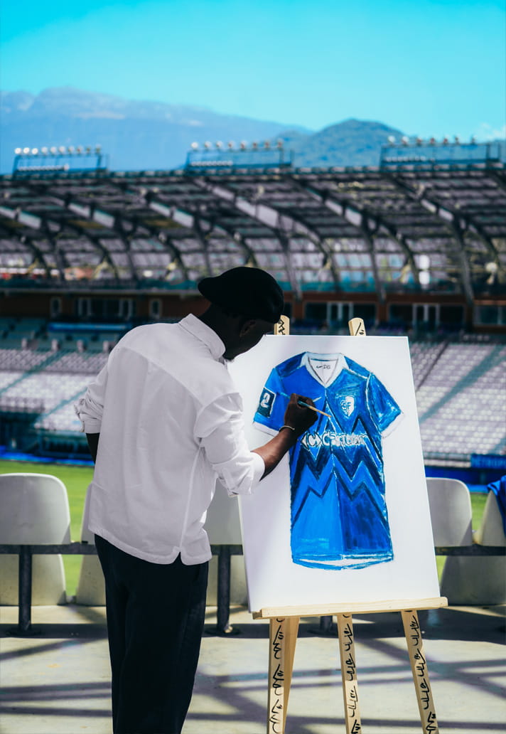
Escallier reveals that performance was another important layer of the concept. "We also wanted the reveal itself to feel like a live performance. We spent a long time discussing the vision with Daouda before the shoot. He arrived with nothing more than a blank canvas and left having transformed it into a complete artwork. That journey perfectly mirrored the story we wanted to tell about the shirt. Seeing him create the piece live over the course of the day was remarkable and brought the entire concept to life.”
It's easy to see why the project resonates. In many ways, it feels closer to an art installation than a traditional football marketing campaign.
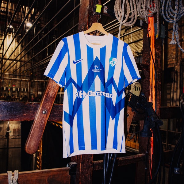
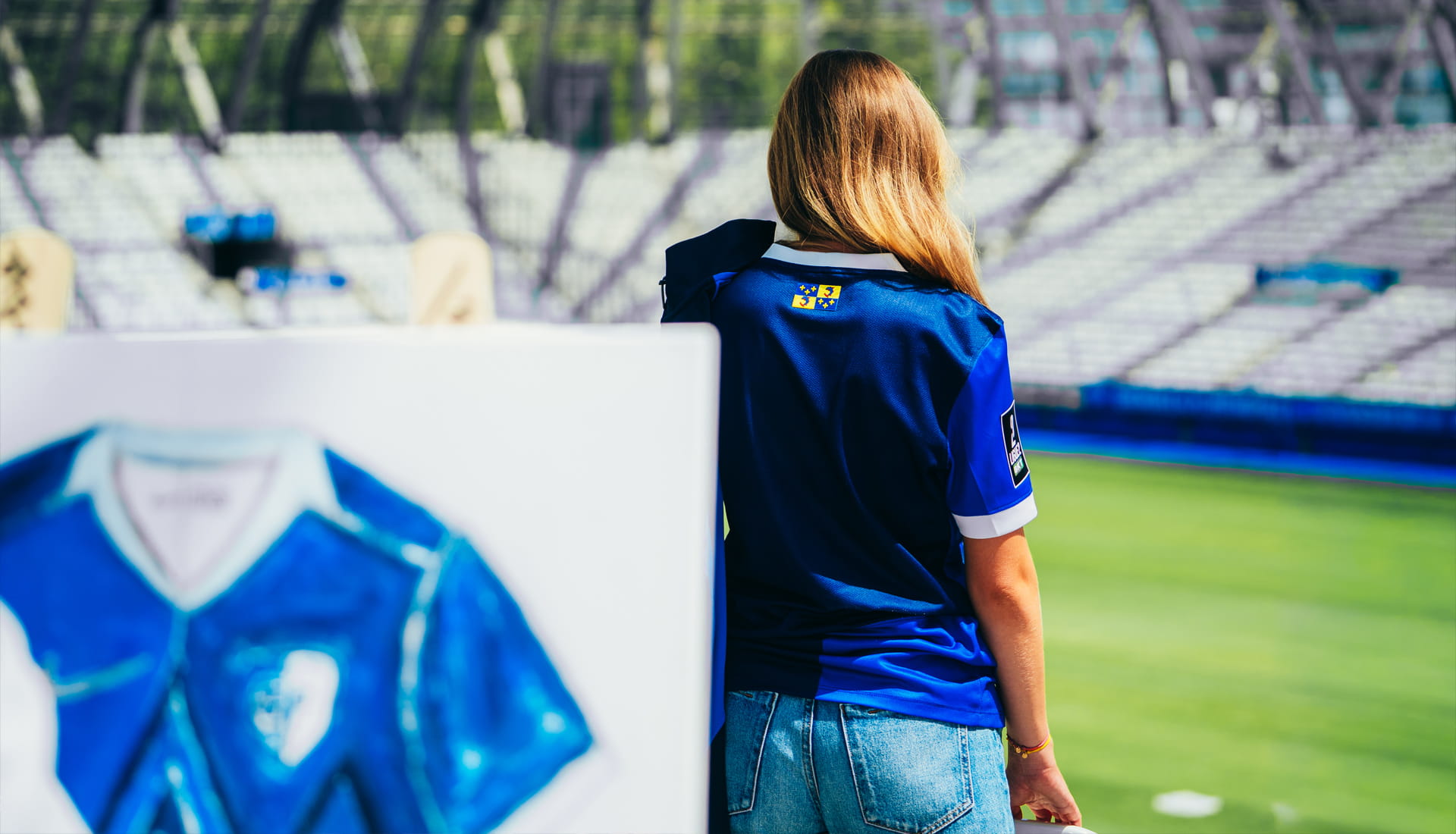
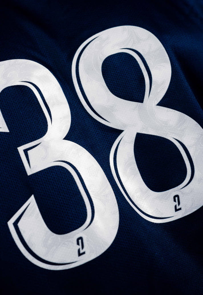
The jersey itself is certainly worthy of attention. Nike have delivered the club's traditional blue look through a split two-tone blue base, accented by clean white detailing on the collar and sleeve cuffs. The defining feature is the large mountain graphic spanning the front, rendered in tonal blues as a tribute to the Alpine landscape that surrounds Grenoble.
The design is strong. Distinctive, local and immediately recognisable. But if I’m being completely honest, it wasn't the jersey that initially grabbed my attention. It was the campaign. That perhaps speaks to a wider truth about modern football culture. Shirts have become far more than functional pieces of sportswear. They're fashion items, collectors' pieces, symbols of identity and cultural artefacts. Increasingly, they're judged as much by the stories they tell as the designs they carry. Grenoble seem to understand this better than most.
Part of that understanding stems from necessity. Unlike Europe's biggest clubs, GF38 don't have limitless resources to throw at campaigns. Instead, they've embraced creativity as a competitive advantage. "Being a smaller club forces you to think differently," says Escallier. "We don't have the biggest budgets, so creativity has become our greatest strength. Every campaign is an opportunity to tell a story that feels authentic to Grenoble rather than trying to imitate bigger clubs.”
It's a refreshing approach in an era when smaller clubs can sometimes feel pressured to replicate the aesthetics and strategies of football's elite. Instead, Grenoble have doubled down on their own identity. "We're also lucky because Grenoble has an incredible story to tell," Escallier continues. "Surrounded by the Alps, the city has a unique identity and culture, and our role is to share that through football. People remember emotions far more than traditional product launches, so every shirt is designed to tell a story that belongs to this city and nowhere else.”
That commitment to place is perhaps what makes the campaign feel so authentic. Just as importantly, the club recognised that if they wanted to tell Grenoble's story, it needed to be told by someone who genuinely understood it. Bringing in a local artist wasn't just a creative decision; it was a cultural one.
"It was essential," says Escallier. "This wasn't simply about commissioning an artist; it was about celebrating local talent. The shirt represents Grenoble, so it made perfect sense for someone from the city to help tell its story.”
The collaboration also reflects the relationship the club has built with Grenoble's wider creative community."Grenoble has a rich and diverse creative scene. We regularly collaborate with musicians, painters, photographers, filmmakers and designers because we believe a football club should be a platform for the people who shape its city. Football has the power to showcase local culture, and we're proud to embrace that. We want the club to belong to Grenoble, and for Grenoble to see itself reflected in the club.”
It's a philosophy that aligns perfectly with the notion of Creative Soccer Culture. Football clubs are increasingly becoming cultural institutions rather than simply sporting organisations, capable of connecting audiences to art, music, design and local stories in ways few other platforms can.
For Escallier, the distinction between football and creativity is becoming increasingly blurred. "Football shirts are no longer just worn for 90 minutes on a Saturday. People collect them, wear them every day and treasure them as part of their wardrobe. They've become objects of fashion, identity and culture.”
And that's why Grenoble viewed this campaign as both a kit launch and an art project simultaneously. "In many ways, creating and launching a football shirt is like producing a work of art," he explains. "The final product is the result of dozens of creative minds working together: Nike develops the technical foundation, an artist illustrates the mountain that defines our identity, designers refine every detail, and photographers, filmmakers and the wider creative team bring the story to life.
"Launching a shirt is almost like staging a theatre production, where everyone plays a role in telling the same story. We see ourselves as creatives serving football. Our job isn't just to reveal a new jersey, but to give it meaning and express what Grenoble Foot 38 stands for.”
It's difficult to argue with that perspective when looking at the finished campaign. More importantly, it highlights something many clubs still overlook: authenticity remains football's most valuable creative currency.
"The strongest campaigns are the ones that couldn't belong to any other club," says Escallier. "Every football club has something unique to say, whether that's its geography, history or people. The important thing is having the courage to tell that story authentically.”
It's a fitting conclusion to a campaign that could only have happened in Grenoble. The landscapes, the landmarks, the artist, the community and the club itself all play an equally important role. And perhaps that's why it stands out so clearly. "If a launch could only have happened in your city, with your people and your culture, then you've created something authentic. And authentic stories deserve to be heard.” Couldn’t agree more.
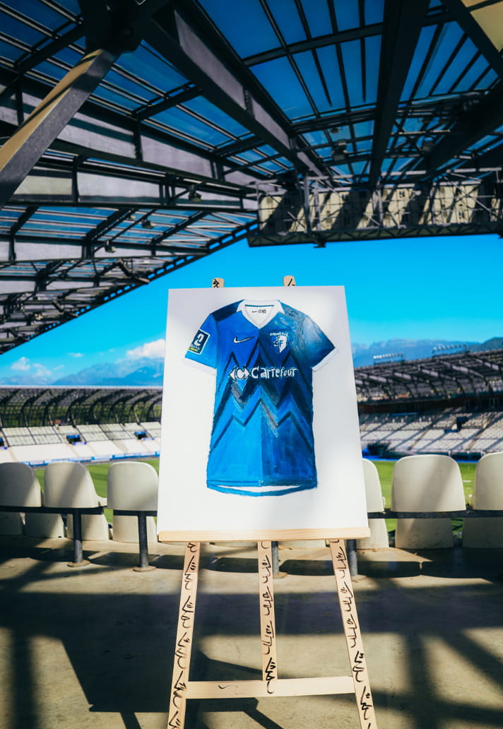
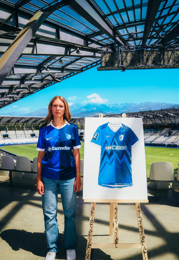
The finished artwork now sits on display at the Stade des Alpes Store. A permanent reminder that sometimes the best kit launches aren't really about the kit at all. They're about the culture, creativity and community that give it meaning.