The first Liverpool kits from Nike were always going to be a big deal, with the American brand taking on all the storied history and heritage of one of England’s biggest clubs. Our ‘Dropology’ series looks for the story behind the design of some of the biggest drops, and next up we spoke with Scott Munson, VP of Football Apparel at Nike, to get the low down on the Swoosh’s first-ever Liverpool kits.
Looking to create a collection that celebrates the rich culture of the city of Liverpool and the club itself while also staying true to tradition and being progressive at the same time? Yep, the designers at Nike had their work cut out for them ahead of their first-ever LFC kits, but that was all part of the challenge; something that they thrive on according to Munson, as he talked us through the story and process behind both the home and away shirts for the 20/21 season.
It’s a landmark moment for both Nike and Liverpool, what does this partnership mean to you and the brand?
It’s massive. There’s an unrivalled history and heritage with Liverpool and a real global following, but I think more so, they represent modern football; super-progressive in the way that they’re playing and look at the game, creative and attacking. Those have always been hallmark values of Nike Football, so it just felt like it was a really great partnership and a great club to connect with.
We’re also pretty excited about some of the things we’re seeing from the club on putting the quality in the sport first and foremost, and I also believe they’re starting to push on the women’s game, and those are the things that are important for us.
A lot has been said about wanting to really pay homage to the culture of Liverpool, how do you think Nike have done that?
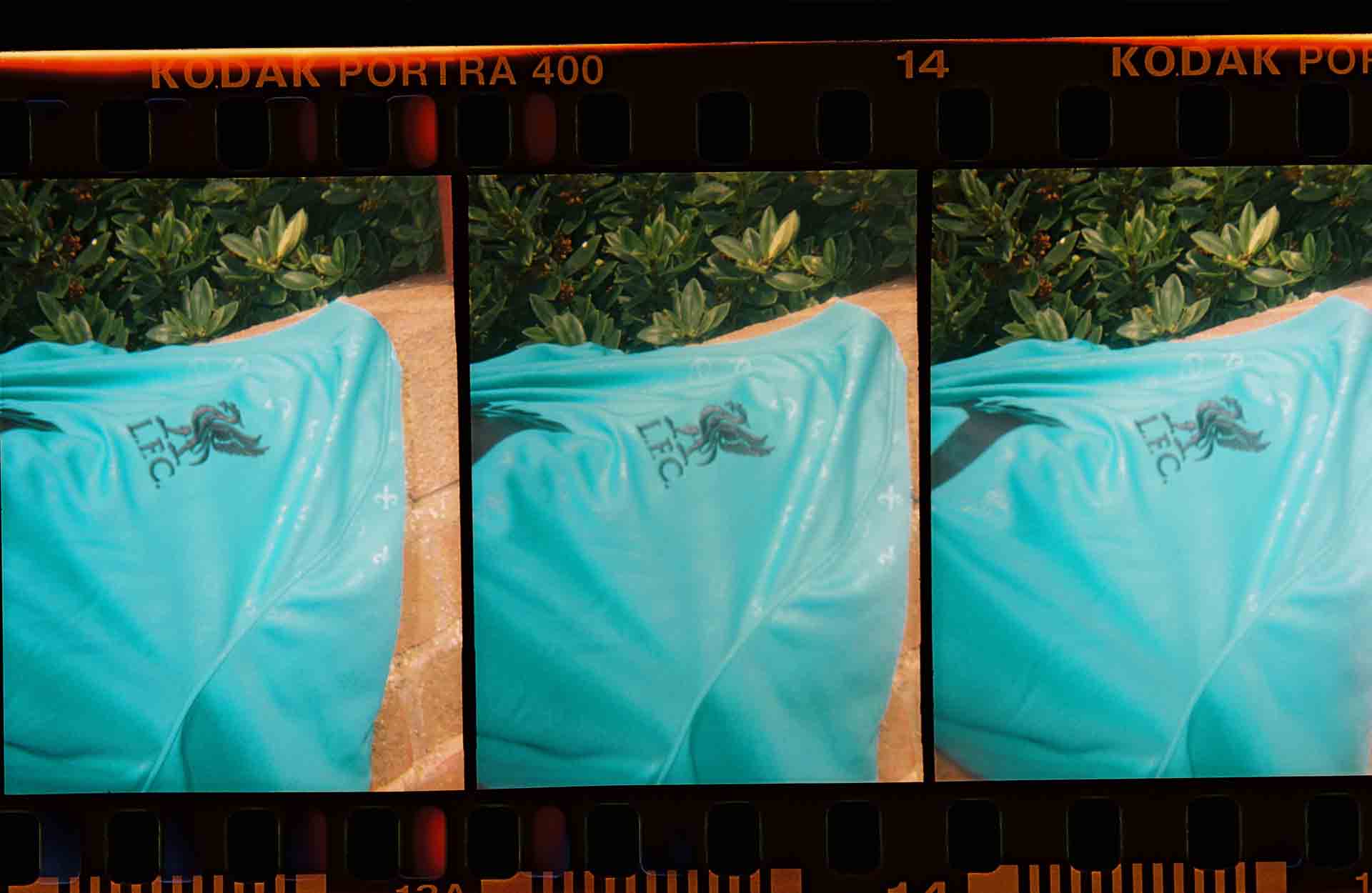
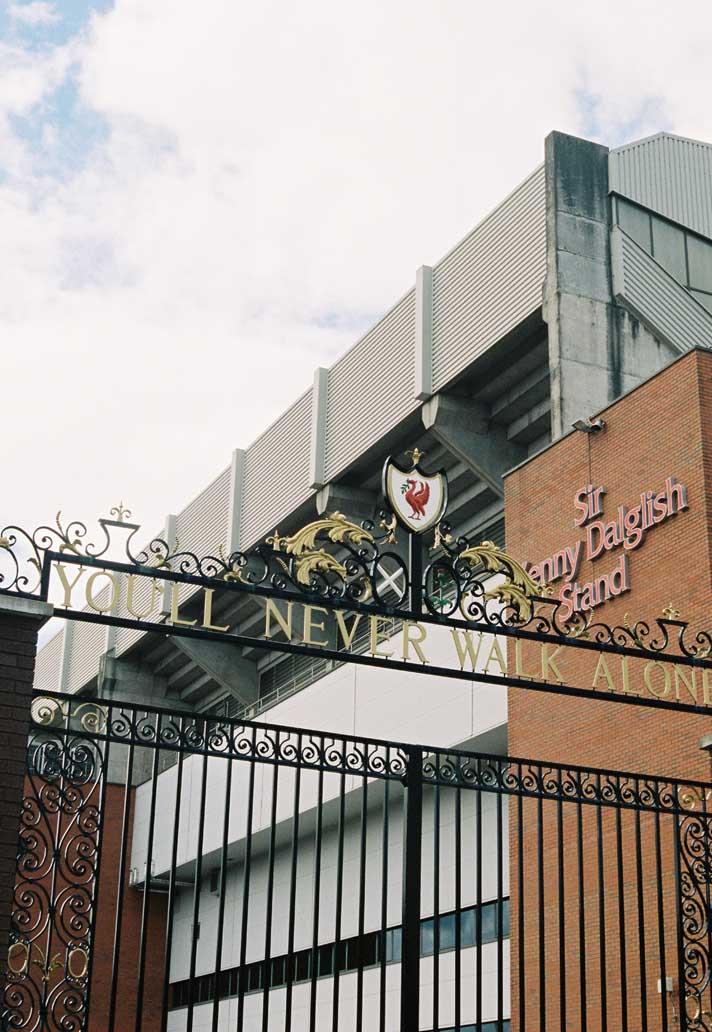
Every time that we go into some of these new partnerships we dig really deep and we talk to influencers, we talk to supporters, we talk to the club, we talk to the players. We did all that digging, and always at the outset is that we want to be respectful of the law of the club, the identity, the symbolism. So I think we had done that in this collection, when you look at the home kit, we’ve put in all three elements of the club’s identity in terms of colour and pushed that a little bit, because it’s been a long time since teal has been in the kit. But we felt like we wanted to make it traditional yet have a modern twist. Then when you look at other parts of the collection, like the pre-match jersey, we’ve gone pretty deep on the symbolism of the Shankly gates.
It’s a club that’s rich in identity and culture and we’re trying to use the key brand marks and do it in a respectful but yet modern way.
Could you let us in on the process behind the design process, given the timelines were constantly changing, what was that like for you guys at the brand?
Yeah, I mean the design process, we don’t rush it and we go as deep and as long as we need to. Where we accelerate it is on the backend of production to make sure that we can get that done and in the stores on time. Our team, we get people on the ground there and we sent people out from the office here in Portland to get on the ground and talking to the right people. We’ve got brand teams and business leaders there in the UK that also we work with to set us up with the right contacts so that we can go as deep as we can with the variety of people that have come from a different point of view.
Obviously one of the first places you go is you look at the history of kit design and see what the markers have been in the past and where some significant shifts might have been, those kind of things. You talk to the club and see where they want to go, what they’re comfortable with, and you start to iterate and the designers get inspiration from certain places. We started to hone in on the home and away direction quite quickly. We didn’t have too many iterations there. We had a lot of good debates internally, but we landed on our favourites pretty quickly and had a great partner in Liverpool who made some decisions pretty quickly.
I was super-impressed with the front office of Liverpool who really know there stuff, who come from the industry and know the consumer really well. They’ve done a ton of insight work, so that was extremely helpful.
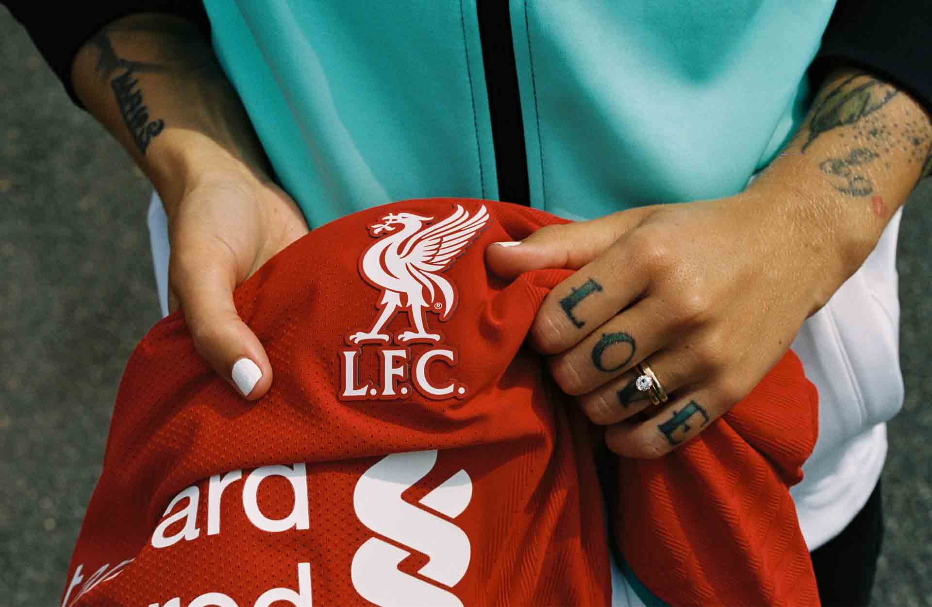
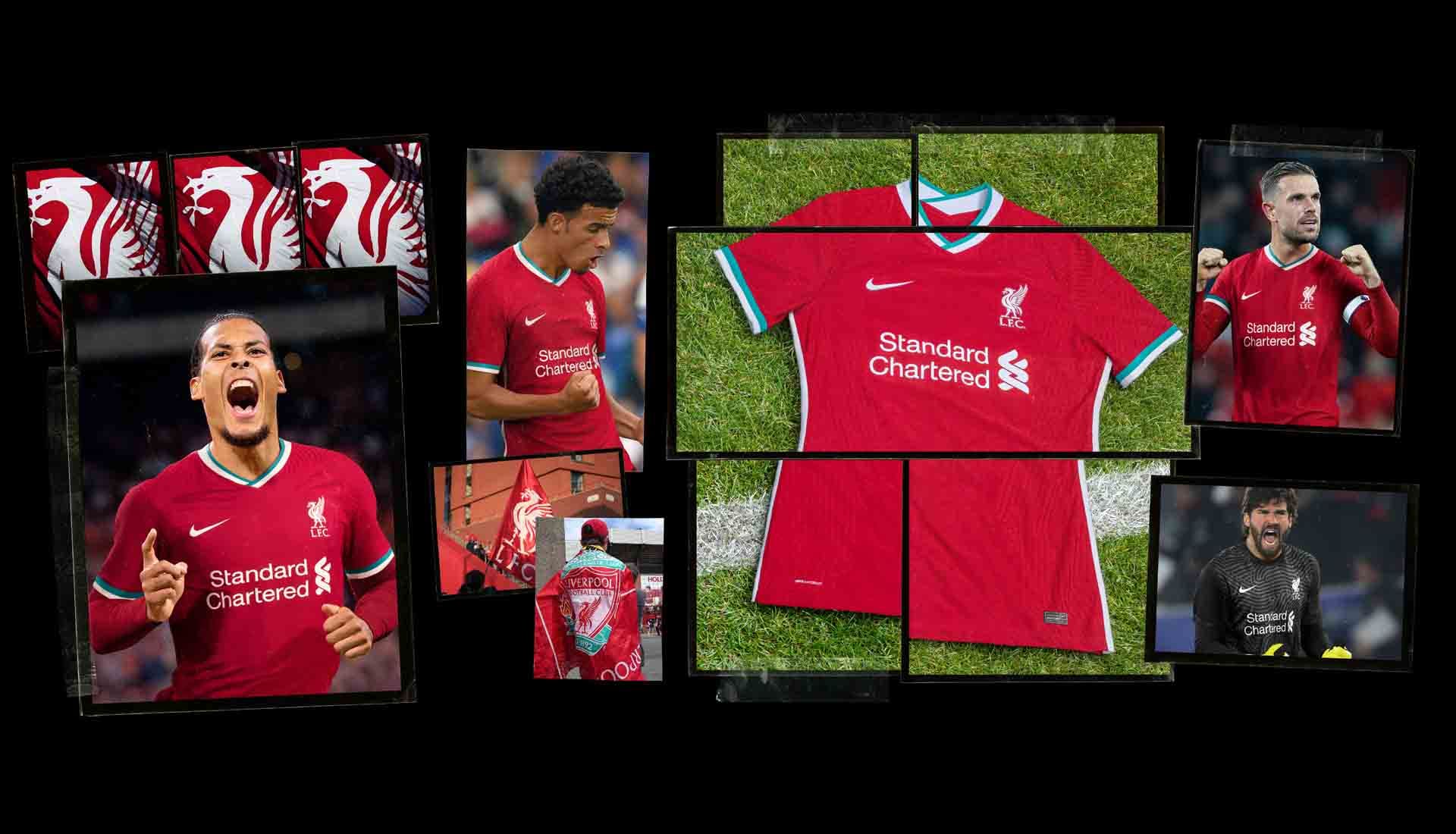
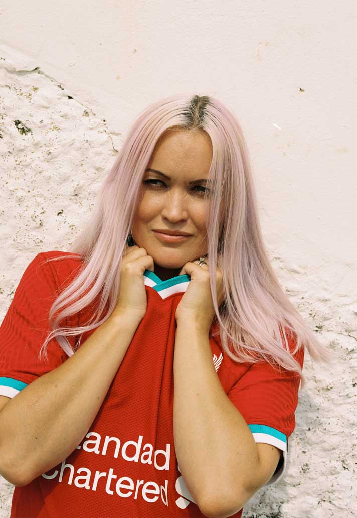
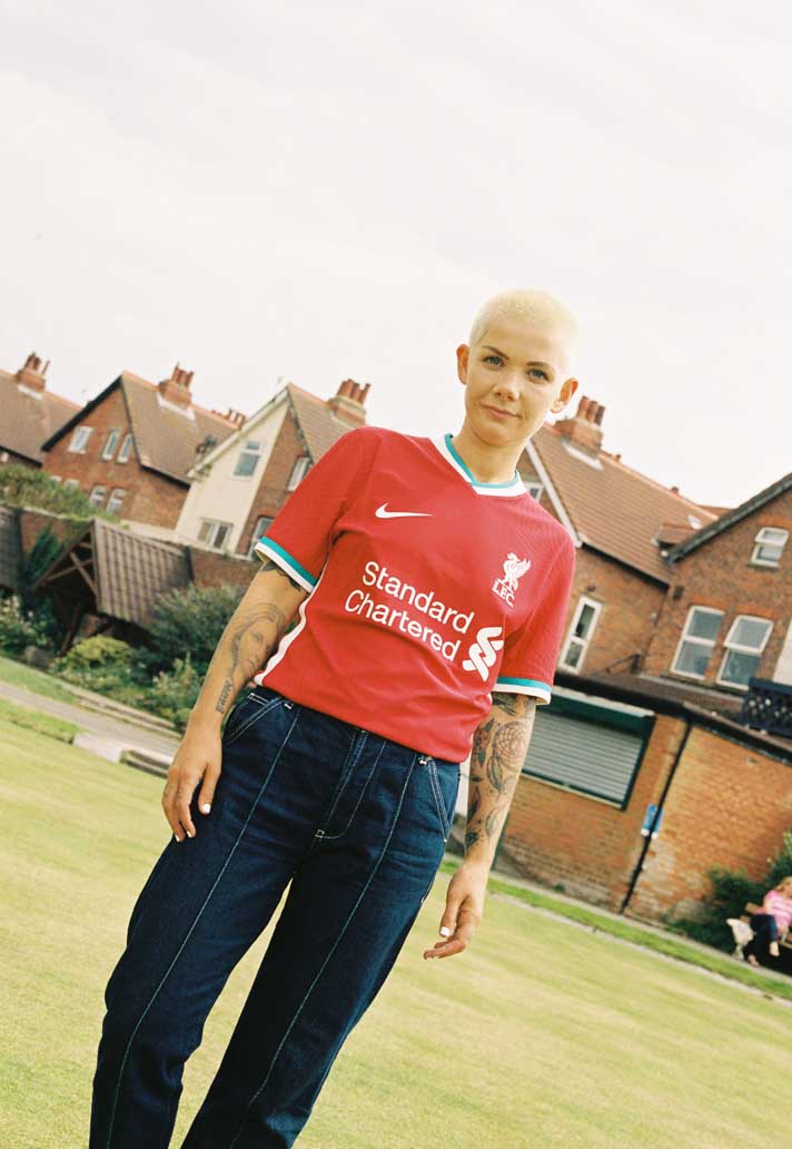
We wanted to make sure the home shirt was a traditionally dominated red kit, but we wanted a modern twist, and that’s why we brought in the teal. It’s such a powerful element in the club’s identity and crest"
So how much of an influence do the club themselves have on the shirt design?
Ultimately they have the say in whether they approve it or not, so that’s a huge part of the formula and process. But what we do is we spend a lot of time before that, before they even see anything, to make sure that we feel like we’ve done our homework, Then we bring them along and show them and get their feedback and then go back and iterate again. We definitely did that this time, and we made some tweaks here and there, but the good news is that we were in the same spot pretty quickly and that felt really good that we’d done our homework, that we felt like we were being respectful in representing the culture and that it was a nice move forward.
That’s what I think Nike brings to the table; if you’re just looking back and you’re not trying to do things slightly differently or push or progress, then you just kind of remain stagnant. We’re a modern brand trying to move things forward, but you still have to have a nod to the tradition and be respectful. It’s a fine line.
What did you learn about Liverpool along the way? Are there things that surprised you about the club that you never knew?
I think I knew the accolades and the history and accomplishments for sure. They’re more of a global club than I think we thought. Sure they’re massive in Liverpool and the UK, but they’re far reaching, especially into South East Asia. That was huge for us to understand, and ultimately their connection with a brand new fan base, I think we underestimated. You know, the Klopp era, the accomplishments they’re having now; there are a lot of fans that are new to the club in other parts of the world and we saw incredible demand and interest from all of our regions at Nike.
The other thing for me, our design team and brand team really did a great job of identifying that this is a culture that is almost unique unto itself within the UK. It’s almost like the centre of the world, and they believe it, and there’s an identity there and an attitude, and that was all fresh thinking for me. The idea of the republic of Liverpool, or just that Scouse mentality was something that surprised me. Obviously it’s super-cool, and they’re super-proud and super-passionate.
The fans speak for themselves but what’s the pressure like to work on a project that is so heavily under the microscope?
I mean, right off the bat, when you sign a club like Liverpool there’s a tremendous amount of responsibility and excitement. Our team lives for these moments. It’s not everyday that you sign this level of a club. And we knew that everyone would be looking and we pride ourselves on every kit that we put out there and we know that it’s going to be analysed and discussed and you just want to make sure that you’re serving the supporters first. And yeah, we felt the pressure, we embrace it, and there’s nothing more exciting than seeing a new team take to the field for the first time, so we can’t wait to actually see it on the players. We’ve got over 10 functions, over 100 people that probably touched the creation of this uniform; super-complex from the backend and they can’t wait to see it and be proud of it.
The home is clean and crisp to say the least - could you describe the home jersey in your words?
Anytime for a first kit with a brand new partnership we’re going to err on the side a little bit of tradition and respect, and so that’s why we wanted to make sure that we had the right red that the club wanted. It’s a little bit more vibrant than where they’ve been recently, but this is the space, these reds and deeper reds that we know the club want to be in. So we wanted to make sure it was a traditionally dominated red kit, but we wanted a modern twist, and that’s why we brought in the teal. It’s such a powerful element in the club’s identity and crest. The liver bird and how that dominates the skyline on top of buildings… the idea of bringing all of those core elements together, but in more of a subtle way through the trim… we felt like that would have that unique, modern piece to it.
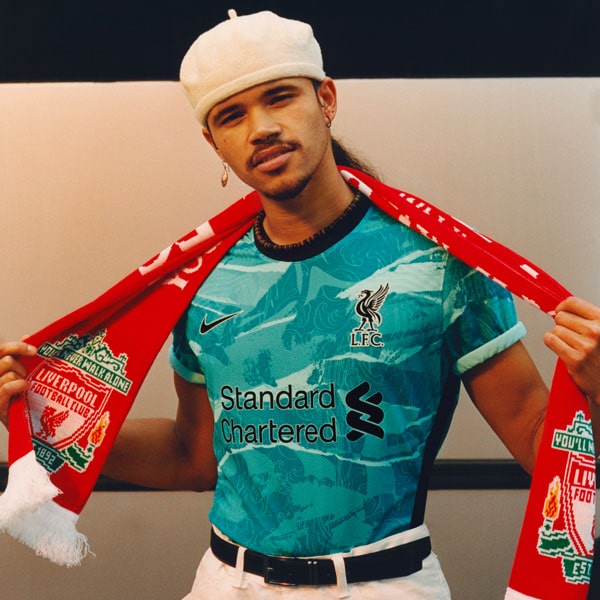
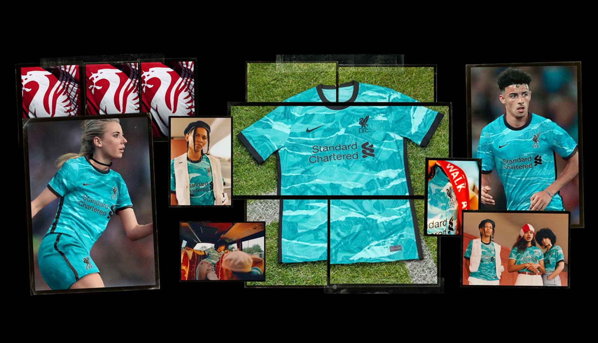
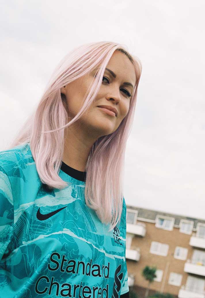
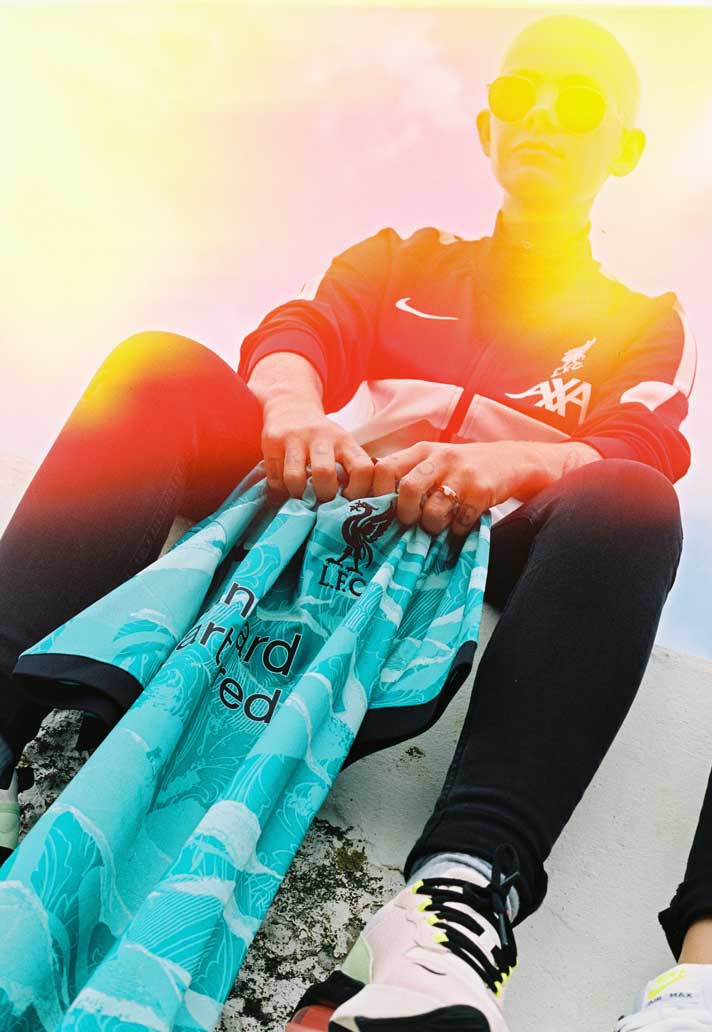
For the Away, if you’re going to be a little bit more traditional and respectful for the home, we want to push to somewhere that might not be as comfortable. For us it’s a statement kit. It’s a bold look. We talked about the Scouse mentality and the local consumer, but there’s an air of confidence, especially when you look at youth culture, but also the team on the pitch. So we just said hey, let’s be bold, let’s be unapologetic, let’s make something the young squad would feel really excited to rep out there. So that was the thinking on going with the different shades of teal on the away, making it teal with bold accents of black, and then adding in a print, which elevates it and makes it even more symbolic.
For the Away, if you’re going to be a little bit more traditional and respectful for the home, we want to push to somewhere that might not be as comfortable. For us it’s a statement kit"
The last time teal was used on the home shirt was back in the 93/95 design. Did you look at that at all, or was the inclusion of teal it purely just the influence of the crest?
We were aware that that was the last time in recent memory that teal had been used, and that was part of it, knowing that, it’s being sure that you want to understand. But it was really about bringing in all of the elements of the club’s colour identity into the home design and doing something that hadn’t been done in a long time and progressing it and pushing it a little bit further.
With a design like the away shirt, are you thinking about off pitch as well as on pitch?
Obviously we image it and we want to make sure of how it’s seen on a lead athlete first and foremost, and how it would be seen on pitch and viewed by the players themselves. But we do start to image it in a lifestyle setting, we do look at other elements of the collection, when you’re looking at other elements of the collection, like tracksuits and jackets that you’re going to put in the collection for people to represent, and you start to see how could that identity be played out. So that gives us a lot of legs.
Again, the away shirt is bold, but it’s centred on a core part of the club’s folklore, which is the Shankly gates; the floral motif, the elements in it, are pretty powerful and just an obvious place to go to. That print, with the way we treated it, gives it some texture. One of the things that the designers were inspired by was the fly posting movement used in music that used to blanket the city. You’d get music posters that would be layered on each other and torn away, and that was where we got the idea for the textures and the layers to the print – this idea that music and Liverpool Football Club are the heartbeat of the city. That was a core part of why they looked at how the print was developed.
You’ve touched on the wider collection, the shirt is the tip of the iceberg – but how creative is the opportunity to bring in nike sportswear to the wider apparel collection?
It’s huge. That’s where we go. We use some of the design pieces and elements from the football collection – there’s obviously training styles and some other styles that we look to for more of use on pitch and street. But Nike Sportswear is where we pull from, and being able to tap into the sportswear styles that are right for that part of the UK, it gives us some flexibility because there are some different pieces that we think we could use, as well as bringing in some new items that we think could work in that space, whether it’s the cut of a jacket, or a different element or a different item altogether.
When you bring in the power of Sportswear styles with the power of football and Liverpool, you start to create something that’s pretty special.
What was the ambition with season one as a whole? The creative concept around the launch is very synced but what did you want to achieve visually?
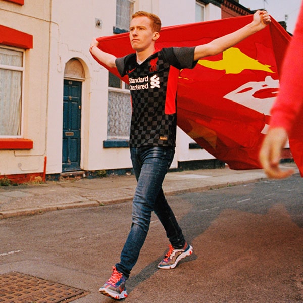
There’s obviously a signature identity to the club that you want to make sure that you’re being very strong with the colour palette. I think you want to make sure that you’ve got the balance of tradition with modern newness. We wanted to make a statement. We wanted to say hey, we’re here and are new partners with Liverpool. We’re a progressive partnership and that we are answering the youth movement that’s happening with the club and in the city. When you start to look at the home, away and the Champions League… we’ve got to look at all of that and say what do we want to accomplish with all of it. So that’s why you start to see some differences and having the right balance.
It’s such a special moment, the first year, that you want to come out of the gates with the right balance for the supporters.
Just looking at the goalkeeper shirt, that’s a great design as well. Can you tell us a little bit more about that as well?
Yeah, the goalkeepers shirt is something that we look at and we try to create a number of colour options across all of our clubs that the clubs can then choose from. That identity and pattern, or print, took inspiration from the engineered knit that’s on the kit. This year we’ve got a pretty signature engineered knit that allows us to structure – we call it precision knitting. So we can put the support or the stretch where athletes need it the most, and it’s done by using computational design, where we put in some data and it spits out a pattern of performance for the athlete, and we took that inspiration and really dialled it up and made it really visual.
We recently saw LeBron James in the Liverpool home shirt heading to a Lakers game. What does that kind of visual crossover mean for you guys?
Lebron is not only a big fan, he’s a minority owner I believe. I don’t know what percentage. So he’s a huge football fan, I’m not sure where it came from, I think it came a little bit later in life. But he reached out and wanted to be a part of Liverpool Football Club years ago, so when he heard that we’d signed them, he reached out to us immediately to say hey, I wanna be one of the first to wear that kit.
He’s worn some kits in the past from other teams, but he’s been waiting for Nike and Liverpool and he looked sharp in it. And he’s also off the rack, so we don’t have to make anything special for him, he can fit into one of the usual sizes. I thought it looked incredible, and I think when you have football and other sports combine and sort of transcend each other, that’s where there’s a lot of power and you can see the actual power of sport. In these recent times, you’re seeing the influence of football on other sports, and it’s pretty cool to see.
Shop the full Nike x Liverpool 20/21 collection at prodirectsoccer.com