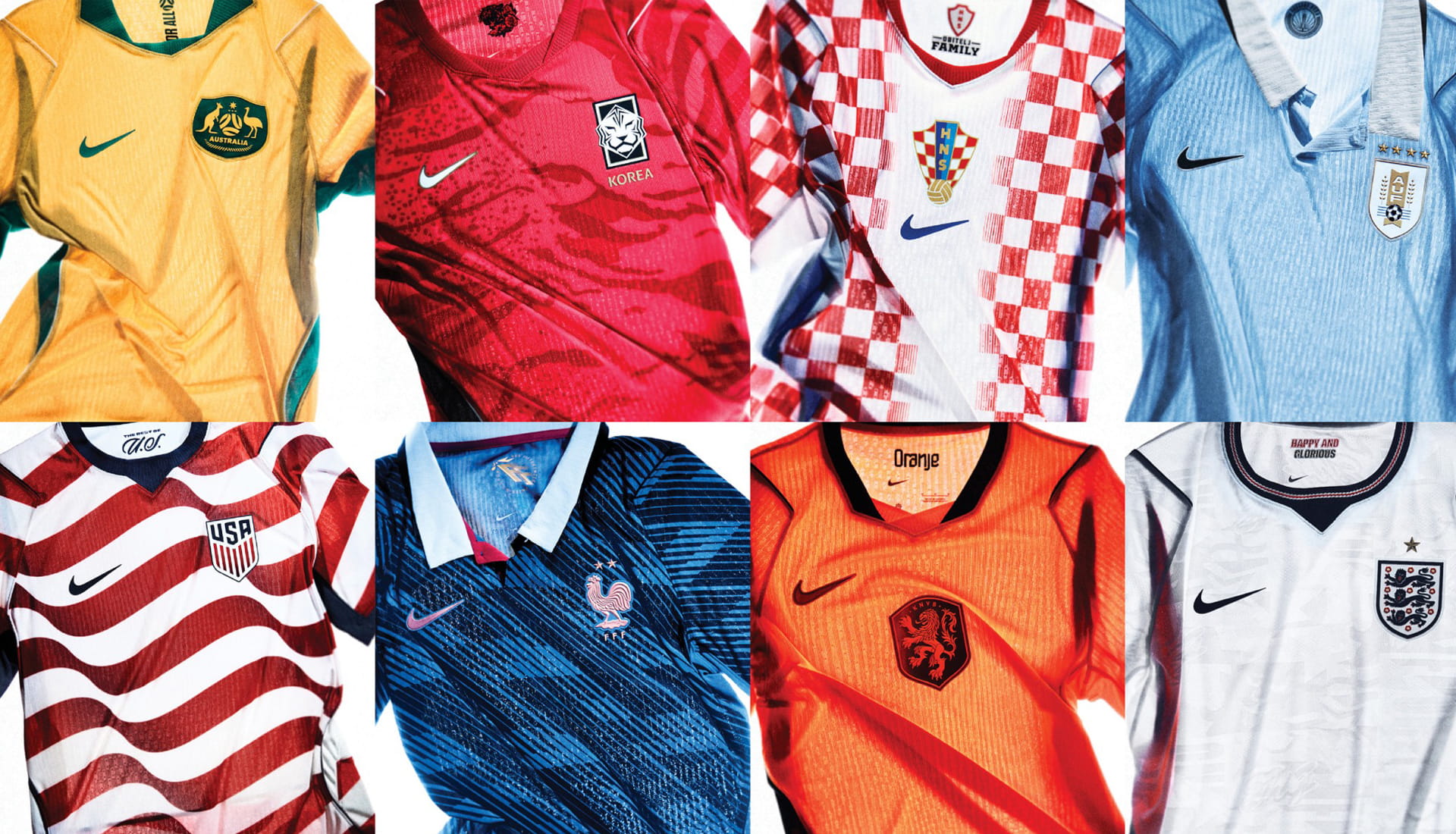
Over the last ten days or so, Nike have been drip feeding their federation kits for the 2026 World Cup, but while that approach has prolonged the news cycle, it has meant that some kits may have slipped under the radar. Here, we round them all up in one place for you to admire.
Unlike their bitter rivals at adidas, who dropped their home and away kits in two big, attention‑grabbing waves, Nike took a quieter, more deliberate path, releasing each kit individually. It’s a strategy clearly meant to keep the spotlight burning a little longer, but with some of the launch times falling at odd hours, a few kits were bound to slip past unnoticed in your feed. So we’ve pulled everything together here: a complete look at all the Nike Federation kits for the 2026 World Cup.
Nike’s approach this year is built on one big idea: unity. Each federation’s collection digs deeper into its own heritage, culture and identity, pulling out a sense of optimism that feels genuinely forward‑looking. The home kits stay rooted in each nation’s footballing DNA, while the away shirts take bolder risks, aiming to become the kind of future classics that a new generation will claim as their own.
But it’s not just about how the shirts look. At the heart of the entire lineup is Nike’s Aero‑FIT performance cooling system. It uses computational design and a highly specialised, stitch‑specific knitting process to help players stay cool in the intense conditions expected this summer.
Aero‑FIT is Nike’s most advanced cooling tech yet. By engineering the fabric right down to the yarn and stitch level, they’ve created a textured knit that blends open and closed mesh zones to move air across the body and lift the fabric away from the skin. The result? More than double the airflow of previous‑generation materials.
Even the graphic details get the high‑performance treatment. Instead of being printed or layered on top, every visual element is engineered directly into the fabric. It keeps the storytelling intact without ever compromising airflow or performance – a smart balance of style and substance that runs through the whole collection.
“Our national team kits start with the athletes who wear them and the fans who stand behind them,” says Amy Montagne, President, Nike. “These players carry a nation on their backs, and their kits travel with football culture far beyond the pitch. We take that pride seriously. These kits bring the best of Nike together with an apparel innovation designed to remove climate as a variable for athletes and design that reflects a deep connection to each federation’s DNA – creating something athletes feel proud to wear and fans feel truly connected to.”
So, let's get into the kits themselves, yeah?
AUSTRALIA
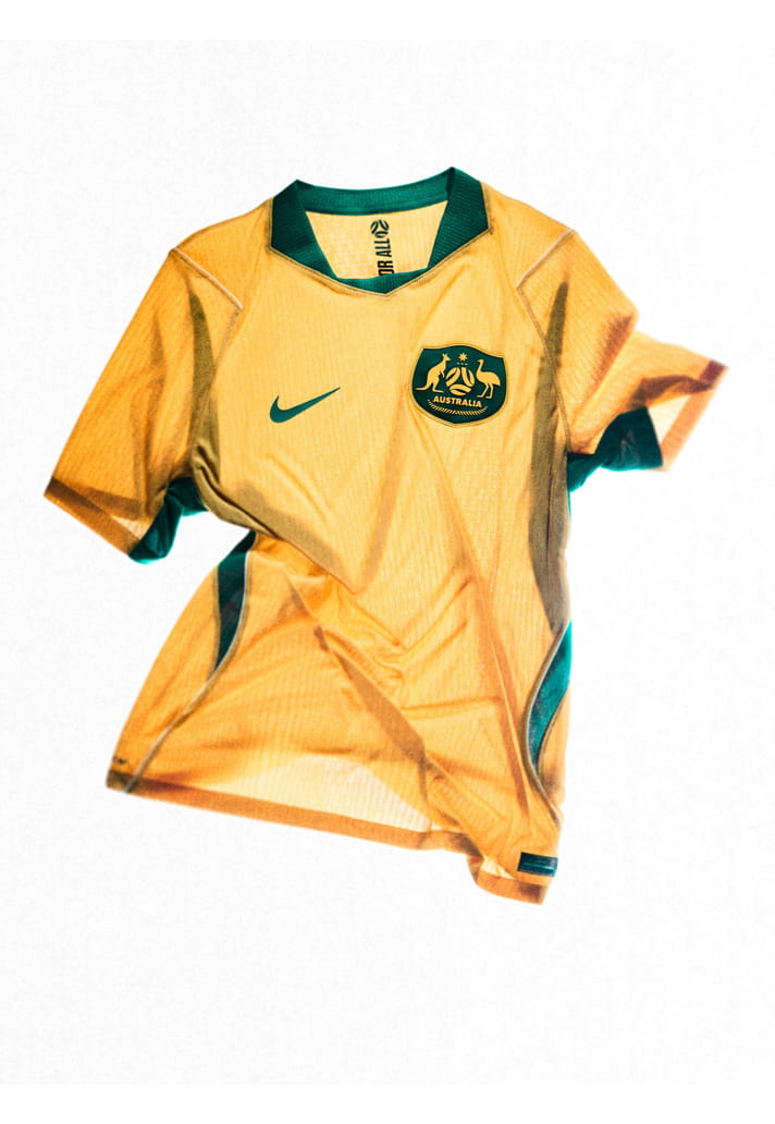
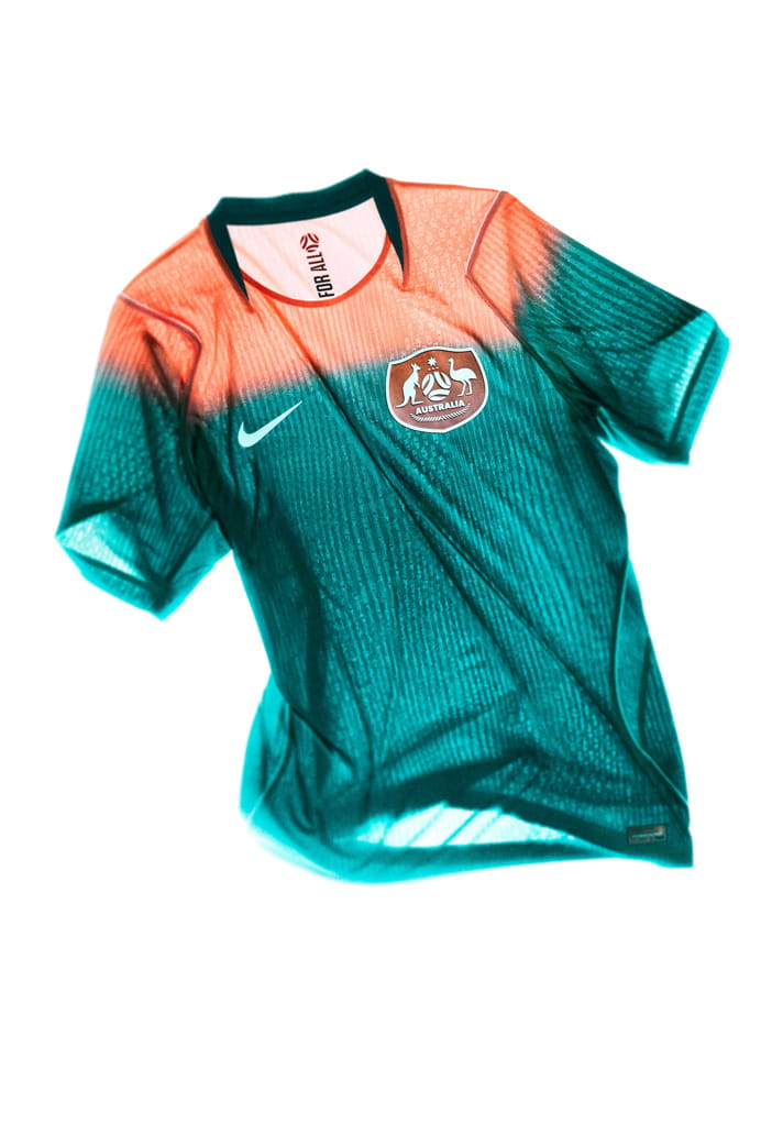
The home kit draws direct inspiration from Australia’s iconic 2006 kit and Nike’s legendary Total 90 era. Traditional yellow and green are re-energised through modern execution, including gradient green shorts that add movement and depth. This kit honours where Australian football has been while reinforcing its continued presence at the highest level.
The away kit was inspired by Australian sunrises, representing the forward momentum and possibility of taking football in Australia into the future. A coral and dark green gradient captures energy and progression, while a lenticular federation crest introduces dimensional movement.
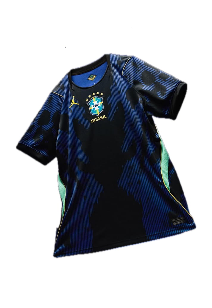
BRAZIL
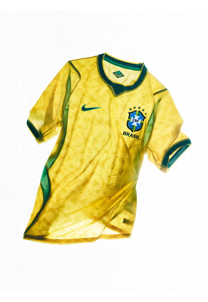
The home kit represents the roots of Brazil National Team football, reimagining national identity through motion, energy and expression. Elements inspired by Brazil’s flag are distorted and transformed into an engineered knit graphic, turning a familiar symbol into a living texture across the body of the shirt.
The Jordan Brand away kit reveals a more formidable edge of Brasil. Inspired by the animals of the Amazon – both majestic and unforgiving – the design introduces a darker, moodier palette and layered graphic language, including a disruptive “poisonous” elephant print. This kit expresses Brazil’s ability to dominate through intensity as much as flair, balancing elegance with menace.
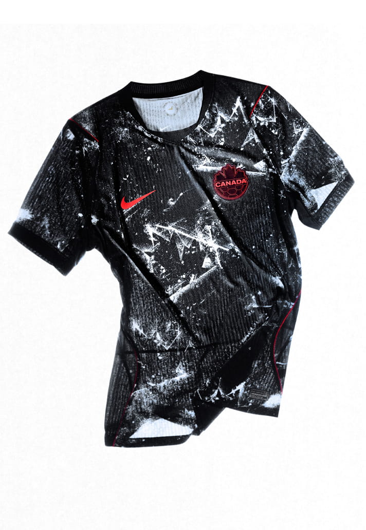
CANADA
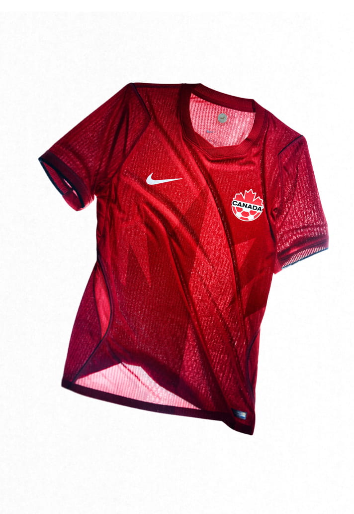
The home kit is rooted firmly in the DNA of Canadian football. The design elevates the maple leaf as the central symbol – split‑toned and centred, pointing north as a gesture of collective ambition and progress. Craft‑led details inspired by Canadian outdoor apparel reinforce durability and precision.
The away kit represents the new face of Canadian football – confident, unapologetic and shaped by recent competitive momentum. Inspired by frozen landscapes, a cracked-ice graphic captures both tension and beauty. A frozen maple leaf etched like a skate blade reinforces Canada’s winter‑sports heritage. Designed as a future classic, the away kit channels intensity and forward drive through a darker, more disruptive expression.
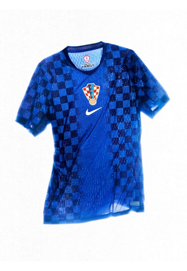
CROATIA
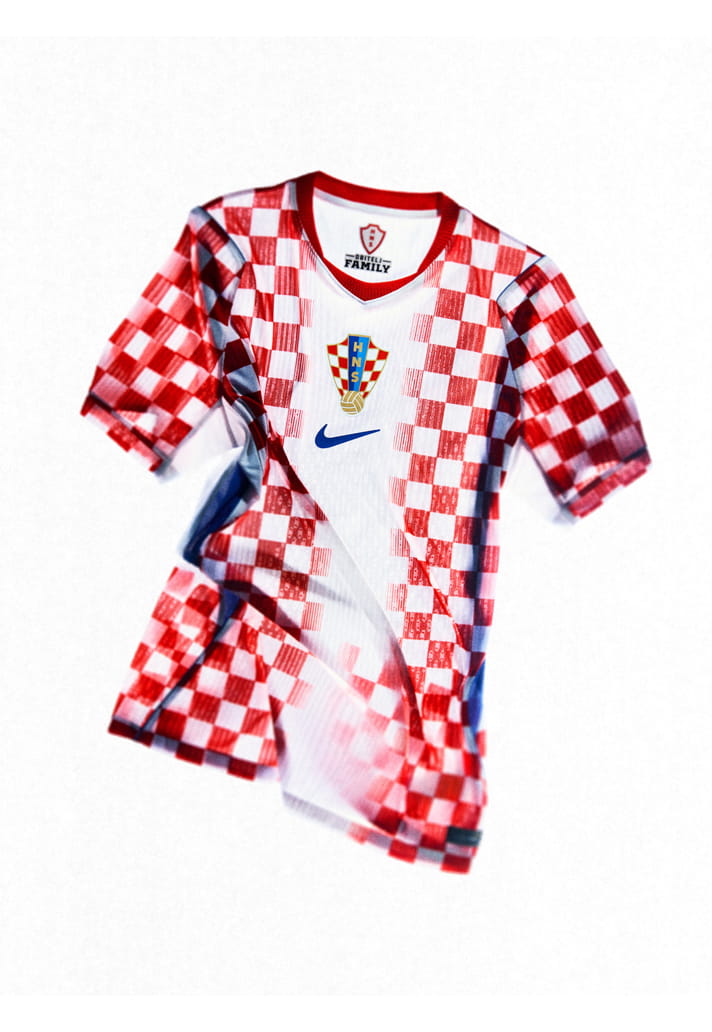
The home kit reintroduces Croatia’s classic checkered pattern in a smaller, more refined scale, closely referencing the 1990 design while updating it for the modern game. The execution is not a direct replica but rather a faithful reinterpretation that preserves the spirit and visual impact of the original. The result is a home kit that feels instantly recognisable yet contemporary, balancing heritage with performance-led precision and honouring a moment that shaped Croatia’s football story.
The away kit offers a darker, more restrained expression of the same identity. The signature checks are carried over and reimagined in a blue colourway, creating a strong visual contrast while maintaining continuity with the home kit. This darker execution delivers a more composed, authoritative presence, positioning the away kit as a modern counterpart that complements the home kit while standing confidently on its own.
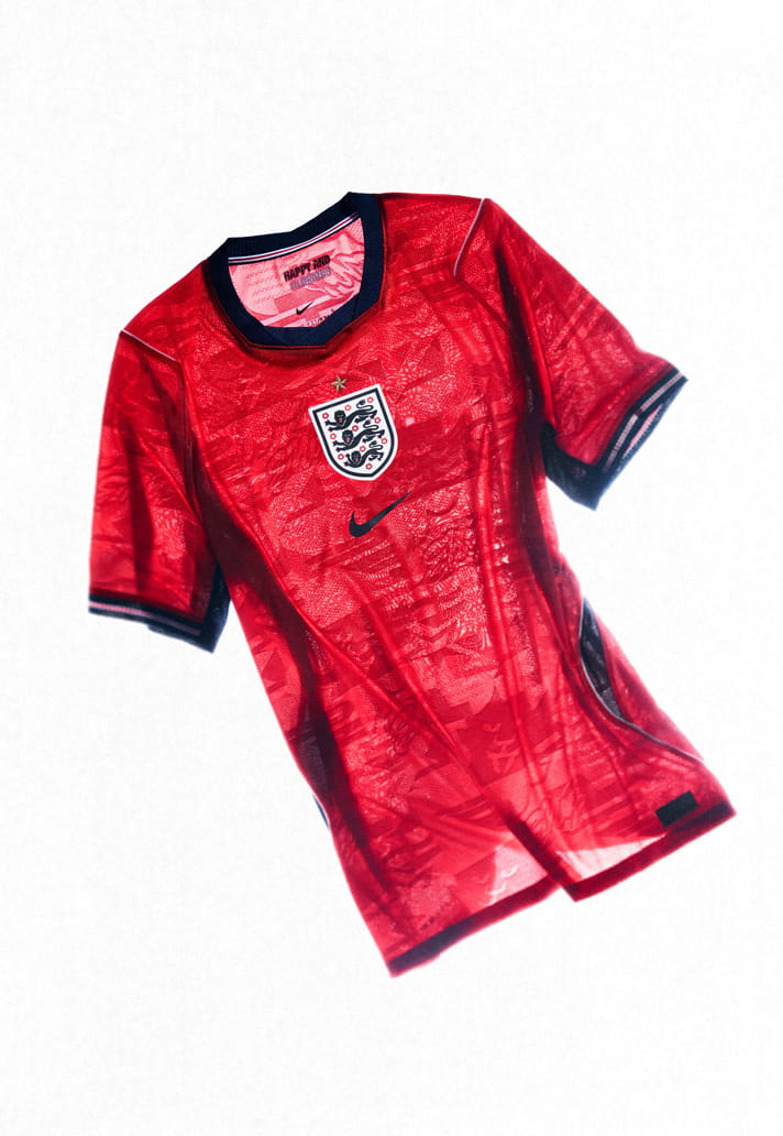
ENGLAND
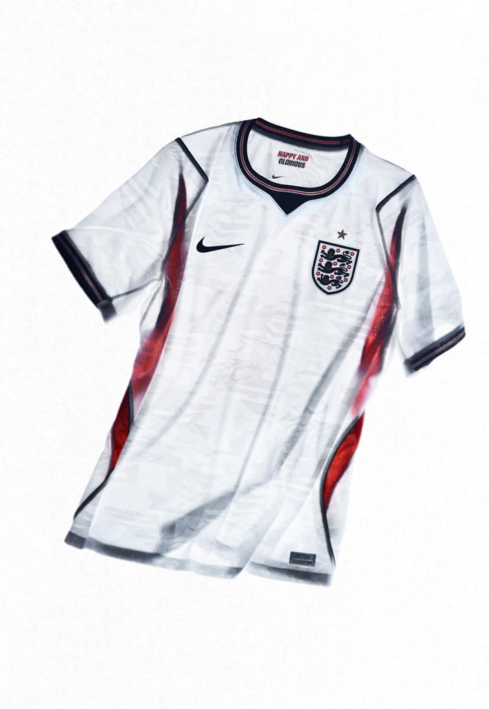
The home kit is grounded in the heritage of English football, reasserting the iconic all‑white look while elevating it with modern expression. Subtle iconography inspired by England’s football culture is engineered directly into the fabric, creating depth without overwhelming the classic silhouette. A metallic gold star above the crest replaces the traditional tonal execution. The home kit feels familiar yet newly assertive, honouring history while signalling England’s reawakening on the global stage.
The away kit marks a historic shift in England’s visual identity, pairing a red top with navy shorts. This bold combination signals a future‑facing England, willing to challenge convention while remaining rooted in tradition. A centrally placed federation crest sits beneath the metallic gold star, reinforcing presence and pride.
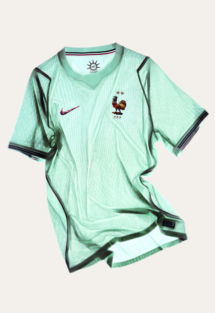
FRANCE
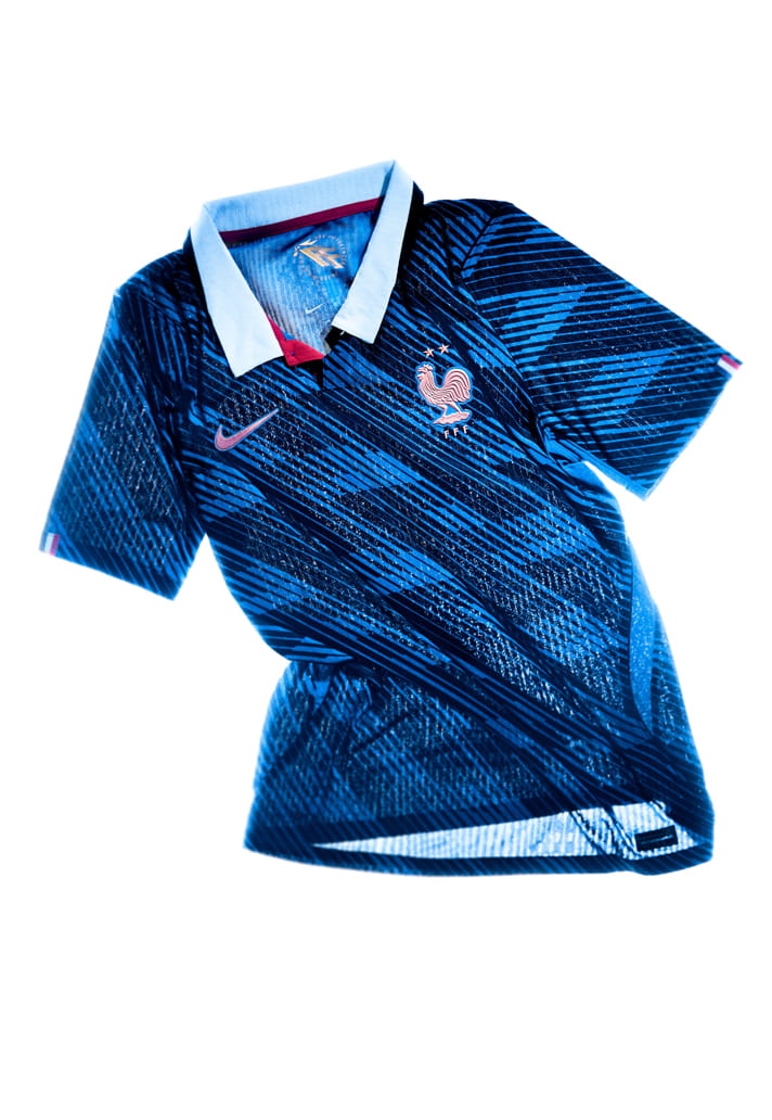
The home kit embodies the energy of a new generation and the elegance of modern French football: young, expressive and creative. Inspired by French haute couture, the kit’s white collar reinterprets the traditional blue, white and red palette. A repeated blue pattern embedded into the fabric reflects the speed of the French team. A metallic copper crest is paired with a classic white polo collar and a red button placket.
The away kit is one of the most innovative ever created for the French National Team and is deeply rooted in contemporary history. Named “Liberté,” it is inspired by the Statue of Liberty, a gift from France to the United States. Its light blue-green base reflects the statue’s current patina, contrasted with metallic copper elements recalling its original material. Tricolor sleeve trims and the kit’s typography add a cultural, luxurious and minimalist dimension.
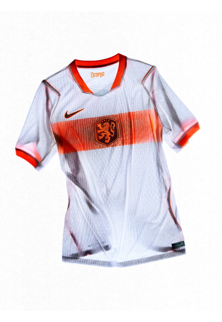
THE NETHERLANDS
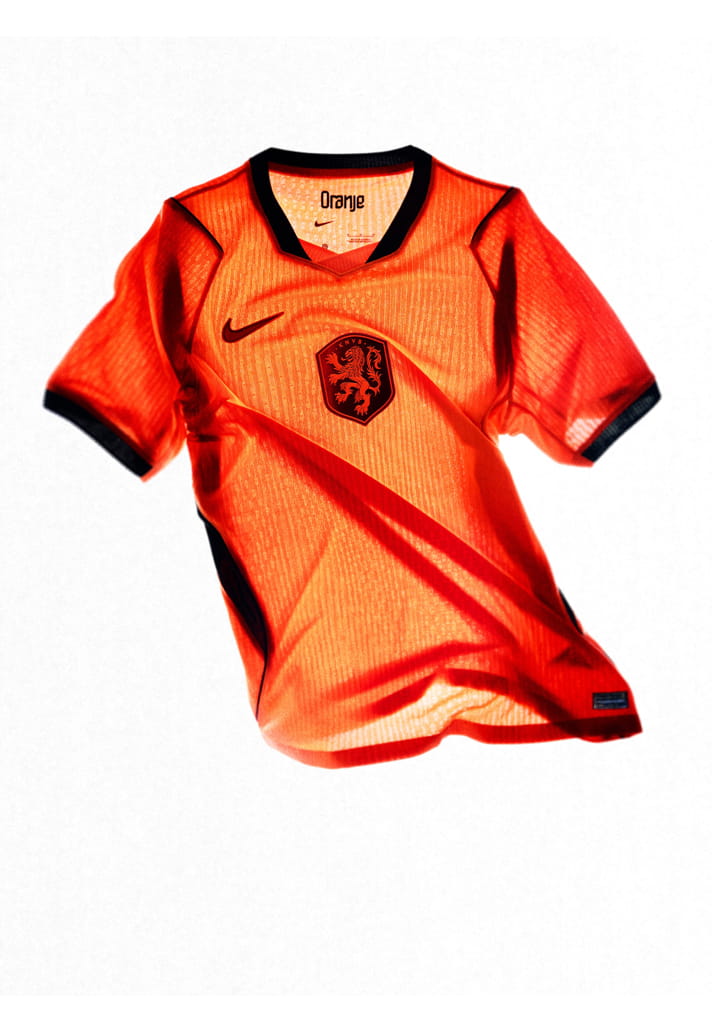
The home kit reimagines the iconic Oranje through amplification rather than reinvention. Designed to be seen from a distance, the kit delivers the most vibrant expression of Dutch orange to date. An innovative lenticular federation crest introduces movement and dimensionality, shifting appearance as players move on the pitch. The home kit is unmistakable, energetic and proudly Dutch.
The away kit revives the Netherlands’ historic all-white look. Inspired by microscopic gradients, a horizontal orange fade runs across the kit, symbolising experimentation and precision. The oversize, centred lenticular crest reinforces innovation as identity. Clean lines and geometric balance reflect Dutch design principles while signalling a progressive future.
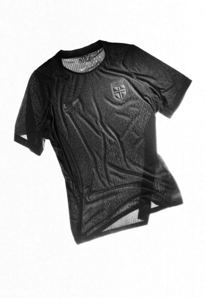
NORWAY
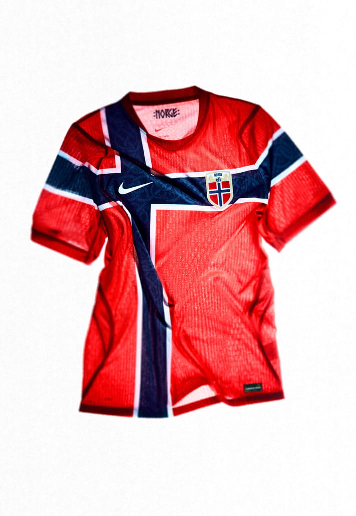
The home kit builds on Norway’s iconic all‑red identity while drawing directly from the national flag. A tonal Urnes‑style graphic inspired by Viking heritage is embedded within the blue stripes, linking ancient symbolism with modern performance. This kit reflects moments of national pride and collective belief, honouring Norway’s past while reinforcing its growing presence on the global stage.
The away kit introduces Norway’s first head‑to‑toe black national kit. Inspired by Viking Berserkers – frontline warriors known for explosive intensity – the design signals a new era of Norwegian football. Minimal and ruthless in execution, the away kit expresses confidence through restraint, using darkness and material finish to convey strength.
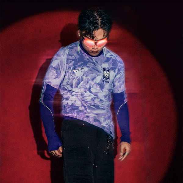
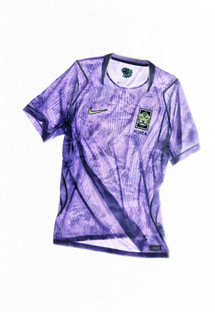
SOUTH KOREA
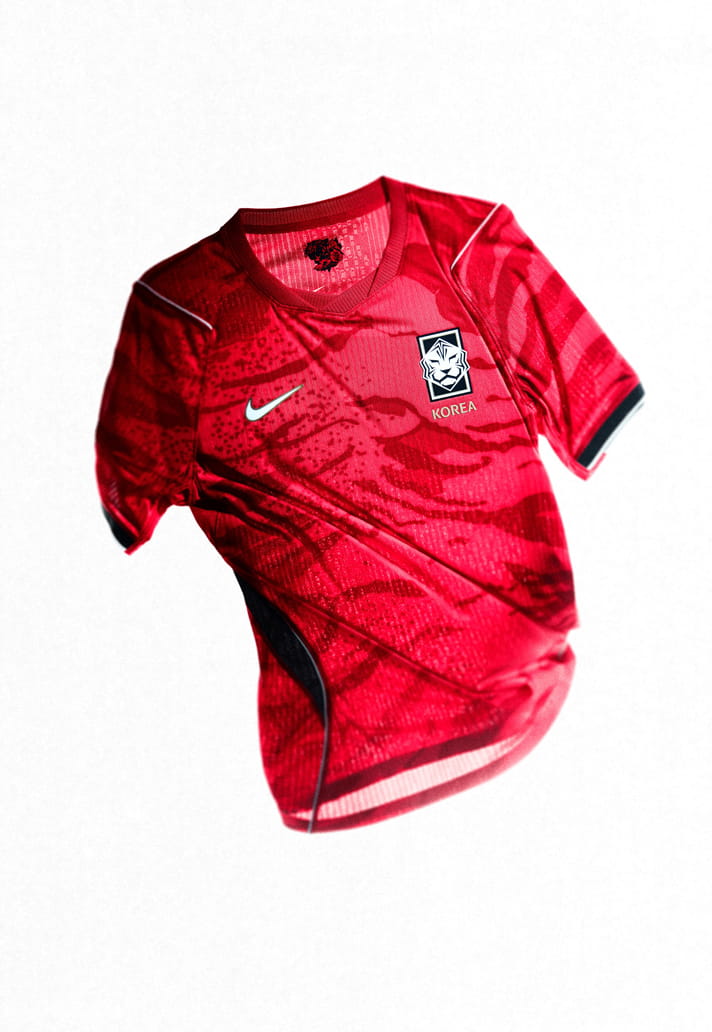
The home kit is centered on a bold reinterpretation of the white tiger, an enduring national symbol of strength and protection. A striking tiger camouflage print is engineered into the fabric, creating a dynamic visual that feels both rooted in heritage and distinctly modern. Custom typography merges traditional Korean calligraphy with Western design cues, reinforcing the fusion of past and present. The home kit expresses Korea’s identity through controlled aggression and visual confidence, capturing the spirit of a team built to surprise.
The away kit extends the ambush narrative through a floral‑inspired expression of Korea’s passion and momentum. The design blooms with intensity, capturing movement, emotion and collective energy as it builds and releases. Set against a Bold Violet colourway, the graphic execution balances elegance with power, reflecting Korea’s ability to combine beauty and aggression in competition. The away kit feels expressive and confident, an alternative identity that amplifies cultural pride while maintaining a sharp competitive edge.
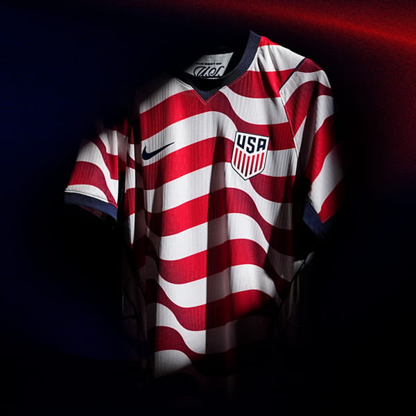
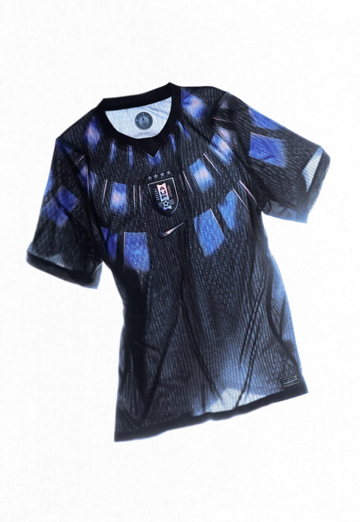
USA
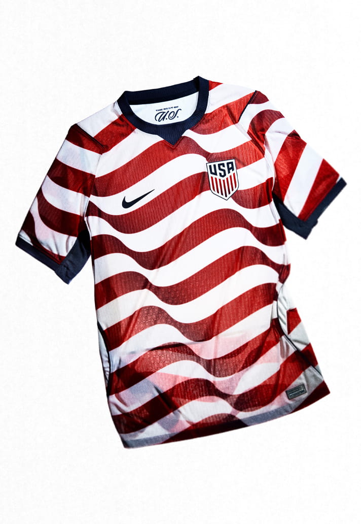
The home kit is rooted in the DNA of American soccer, reinterpreting the Stars and Stripes through a modern, movement‑driven lens. Distorted stripes and gradient effects reference the flag in motion, symbolising a nation shaped by its diverse communities, landscapes and love for the game.
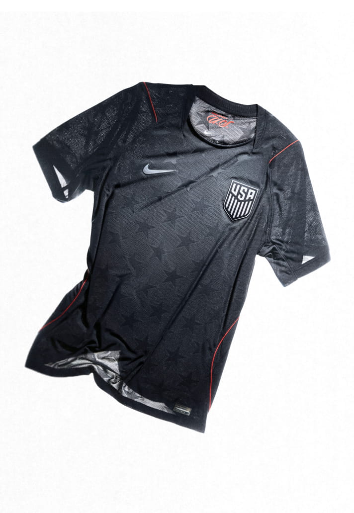
The away kit is conceived as a future classic – a clean, iconic expression designed to stand the test of time. Anchored in a flooded Dark Obsidian palette, the kit introduces a bespoke grid‑star knit pattern subtly woven into the fabric, shifting focus from stripes to stars as a defining symbol.
URUGUAY
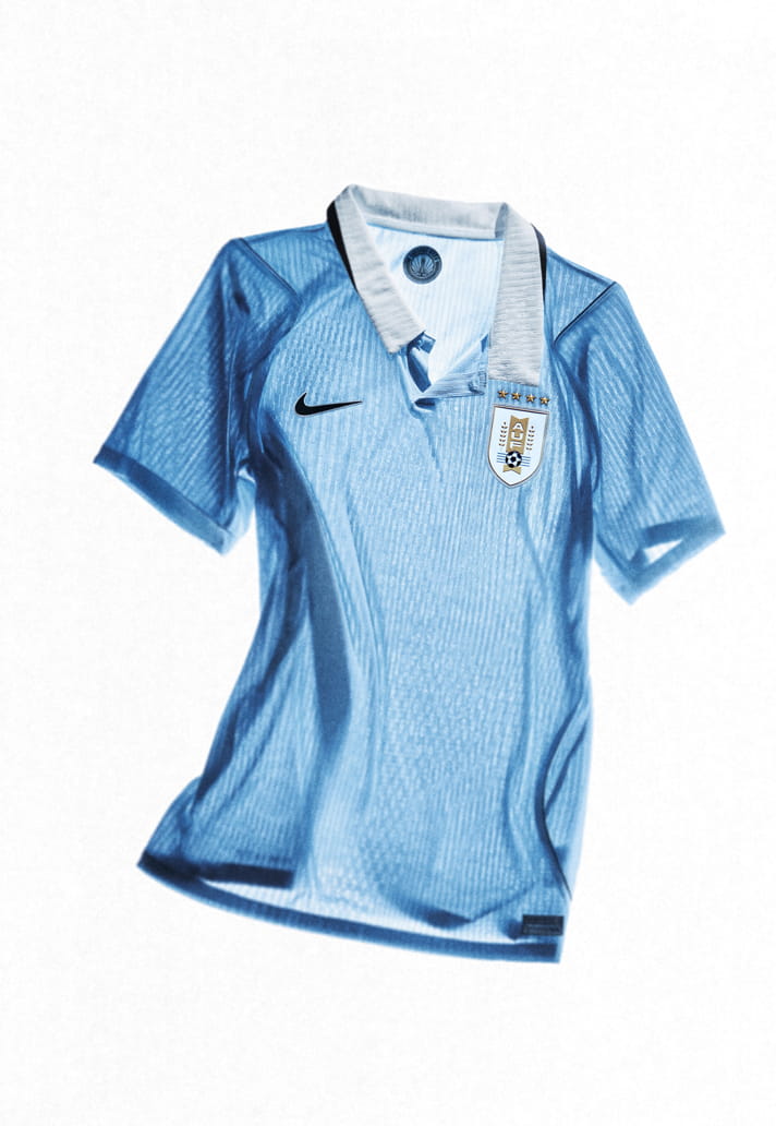
The home kit embodies the pure essence of Uruguayan football. Built on a modern‑classic foundation, the kit features a clean execution of Uruguay’s iconic sky blue, paired with navy accents that reinforce clarity and confidence. The simplicity of the design reflects the team’s identity: honest, disciplined and driven by collective effort.
The away kit introduces a more disruptive expression of Uruguay’s fighting spirit. A bold wings pattern stretches across the chest, symbolising ascent, ambition and the relentless pursuit of victory. This visual language nods to Uruguay’s historic achievements, including its role in football’s earliest global moments while reframing that legacy through a sharper, more aggressive lens. The away kit represents Uruguay at its most defiant: compact, fearless and unyielding.
Shop 2026 World Cup replica at prodirectsport.com/soccer