Another day, another excellent football jersey designed and created by the good guys at Madrid-based lifestyle brand Pompeii.
Building on their successful debut with Real Racing Club De Santander, Pompeii, which is making a habit of creating beautifully-executed football gear, has dropped two more jerseys for the Spanish second division side: the sort of shirts that really make you pause mid-scroll.
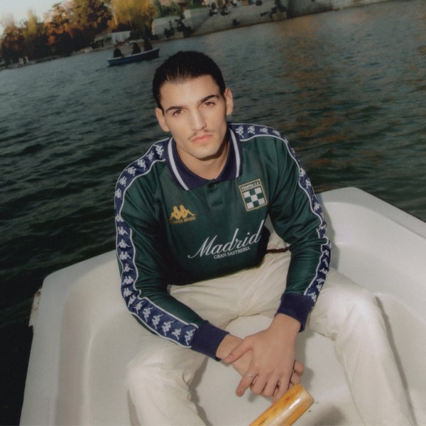
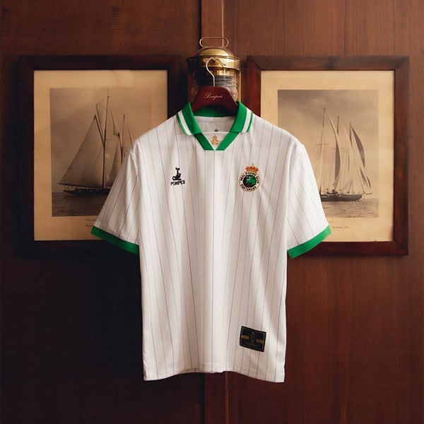
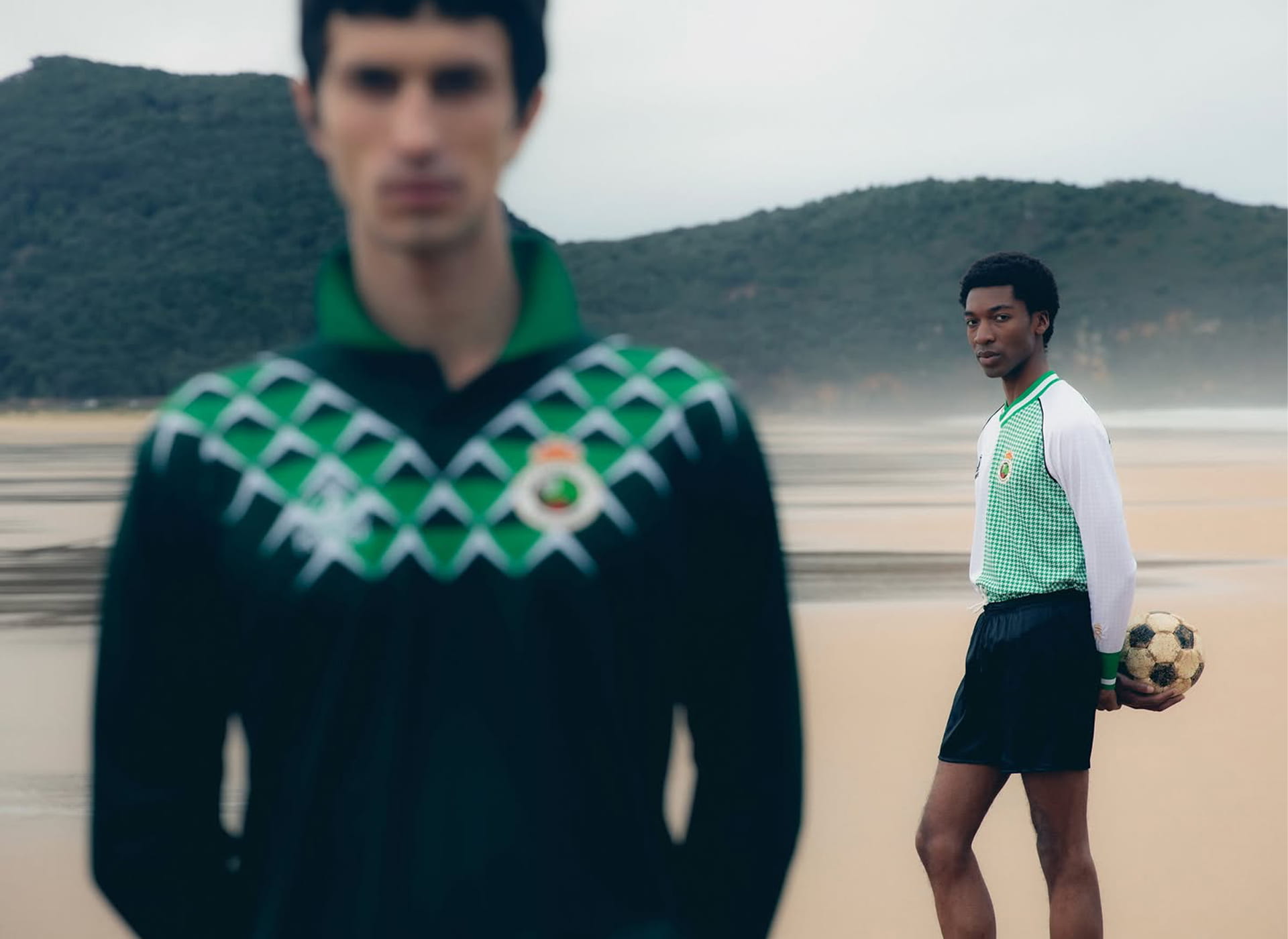
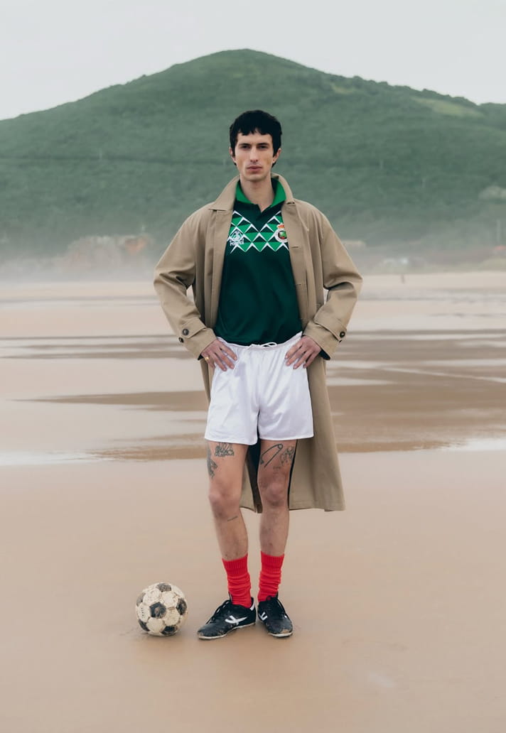
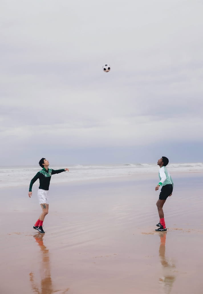
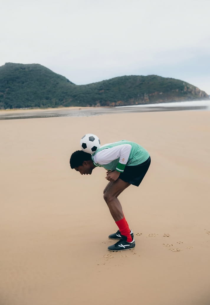
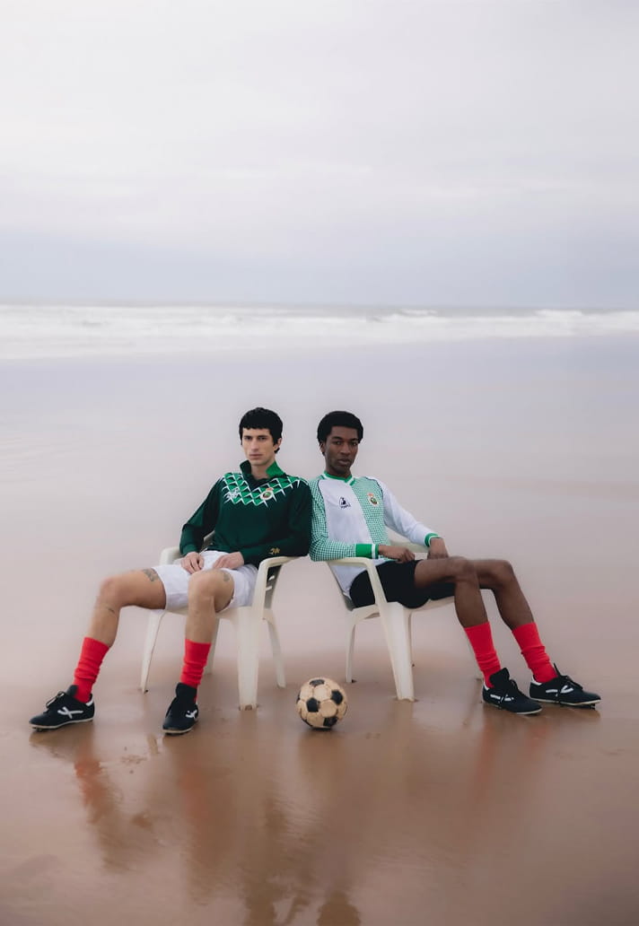
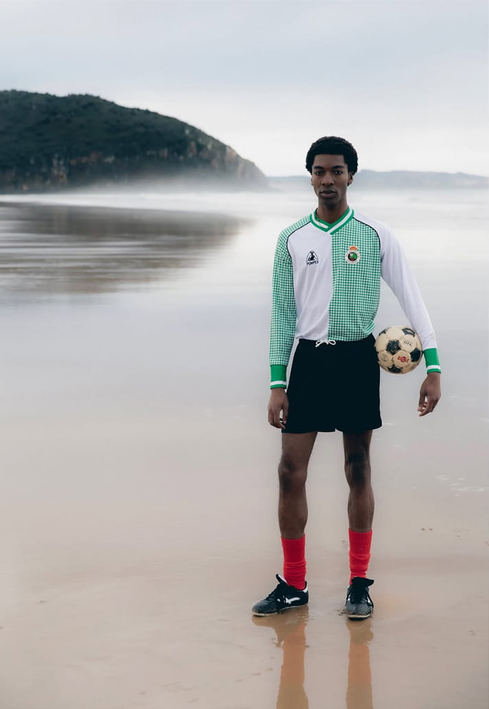
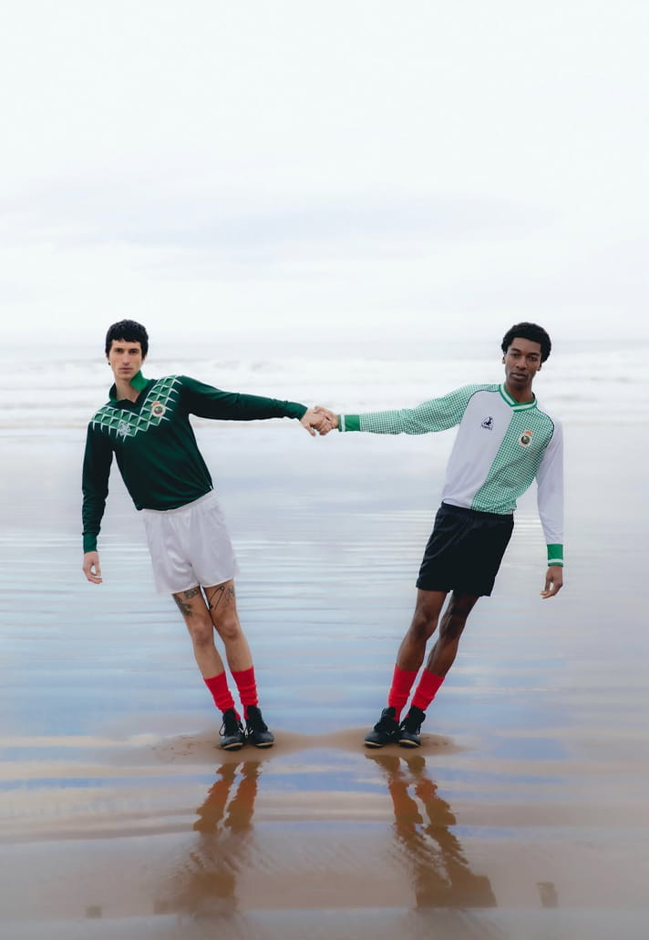
Created to celebrate the club's 113th anniversary (not a big one, in my opinion), the a polo-collared, dark green home jersey leans more Riviera than it does relegation scrap, while a half white, half green houndstooth away strip (my personal favourite) cleanly split down the middle is the cherry on top of a very good-looking, wearable cake.
The details like the embroidered crest, the like sharp cuff striping and that “RACING” across the back make it feel deliberately brash, but, like everything Pompeii touches, it works – and not just because it looks nice, but because it's been designed to be worn, and that’s the difference.

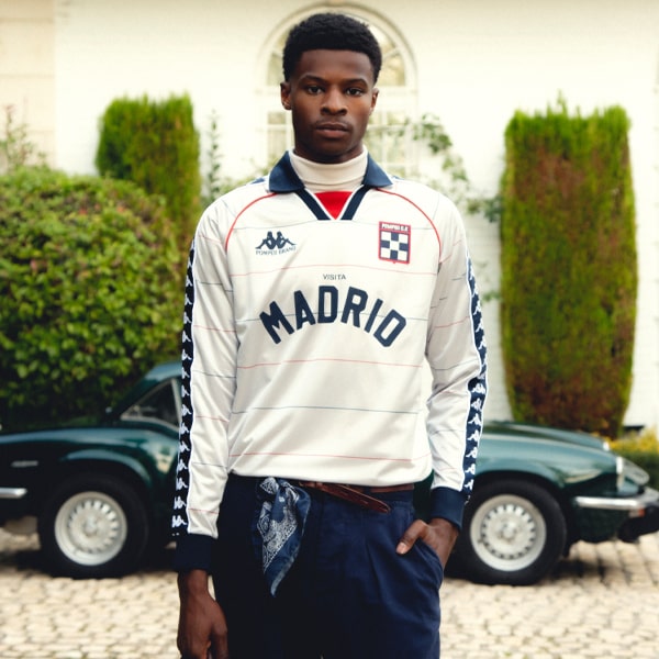
This isn’t a one-off either. Pompeii has been circling football for a few seasons now, and tightened the argument that they're leading the pack with each drop. Before this season's Racing anniversary kit (they also did one for the club's big 112), the Madrid label linked with Kappa to create Pompeii Club de Fútbol, a fictional team that somehow produced more desirable shirts than half of Europe’s top flights put together.
The first capsule in 2023 set the tone: proper striping, balanced silhouettes, crests that felt archival rather than ironic. It could have read as fashion dabbling in sport, yet it felt assured and left us wanting more. Season two doubled down. A silver away shirt with long sleeves came with pinstriped warm-up get-ups that looked good enough to wear to a wedding, or at least a mildly formal occasion.
What I'm saying is, these were pieces you could legitimately throw on with denim or tailored trousers and not feel like you’d just left five-a-side, and that consistency matters. A lot of brands can land one good shirt, sure, but very few can build a body of work like Pompeii is doing.
With Racing, Pompeii has applied the same discipline to a real club with real history. This anniversary collection doesn’t drown itself in references, instead it compliments, which isn’t easy to do. The half-and-half execution feels graphic but unquestionably grown-up, while the home shirt’s tonal triangular pattern is subtle-yet-striking enough to reward at least a second glance.
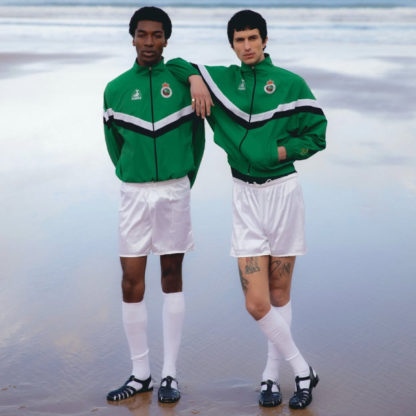
Even the track top, the kind of piece most suppliers treat as an afterthought, carries the same design language. It’s cohesive.
What Pompeii seems to understand is that football shirts have escaped the stadium. They exist in cafés, galleries, on city bikes, and they’re judged by people who care about cut and fabrication as much as league tables.
Designing for that audience requires restraint and the knowing when to stop. There’s no template fatigue here and (luckily) no last-minute sponsor chaos. It’s just clear, well-executed ideas, delivered cleanly, and yet another entry in a growing run of Pompeii-designed kits that feel like clothes first and sportswear second.
Pompeii x Racing Club's 2026/27 collection is available to buy online now