Venezia. A club in the vanguard of the football x fashion movement, boasting some of the best kits of the last five years. Gaining insight into the process behind making thee club what it is today, including the switch up from Kappa to Nocta, we spoke with designer Diego Moscosoni.
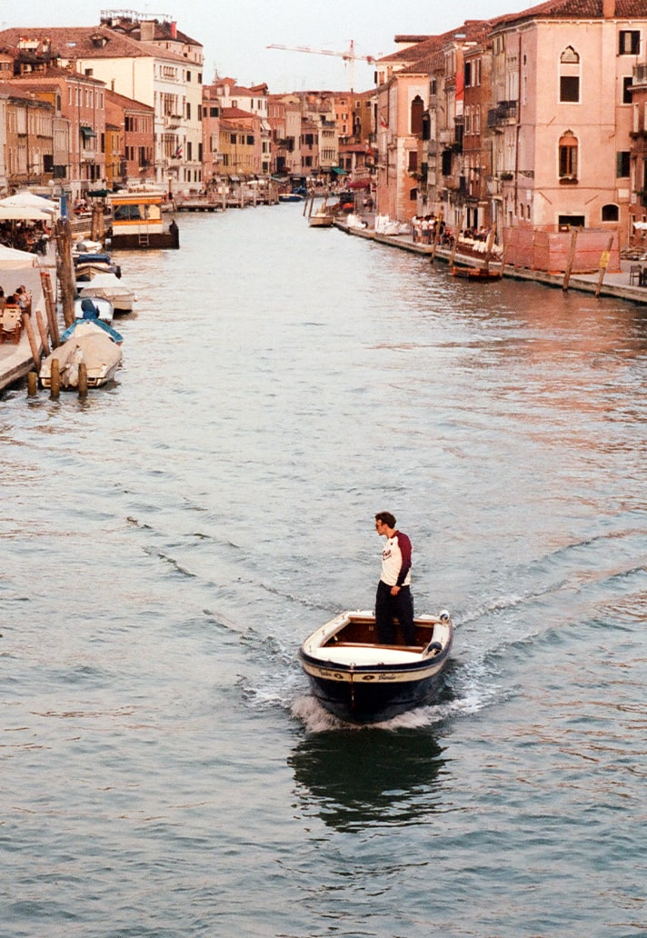
There are football clubs, and then there is Venezia FC — a club that has quietly but definitively redrawn the blueprint for how football can look, feel, and resonate far beyond the pitch. From viral kit drops to fashion-week-worthy campaigns, Venezia’s ascent as the game’s most visually arresting team is no accident. It’s the product of deep-rooted creativity, cultural fluency, and an unshakable respect for the city it represents. And at the centre of that transformation stands Diego Moscosoni — a designer, artist, and storyteller whose work has helped shape the club’s aesthetic renaissance.
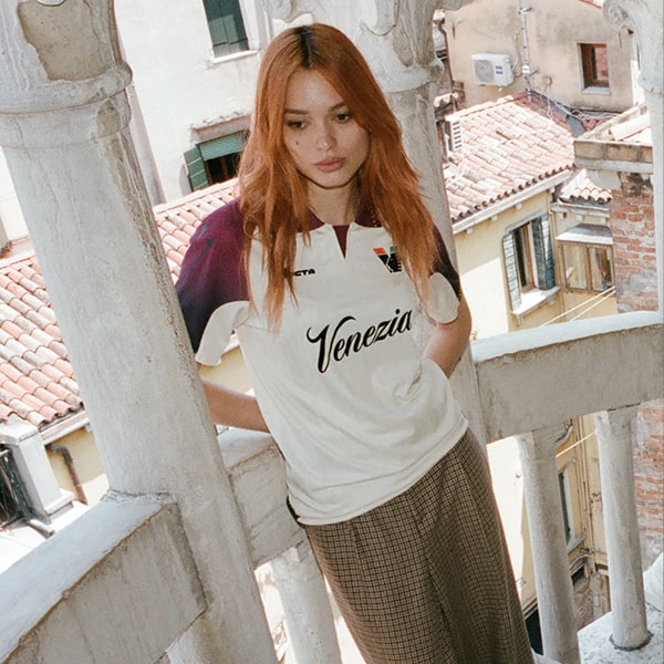
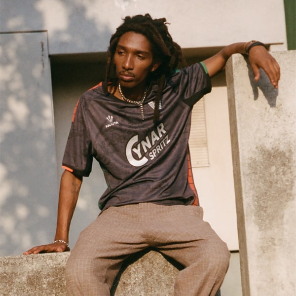
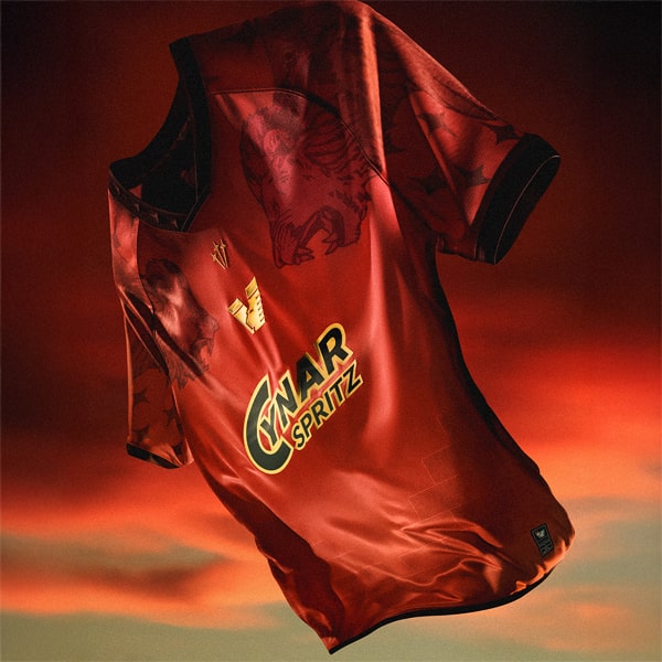
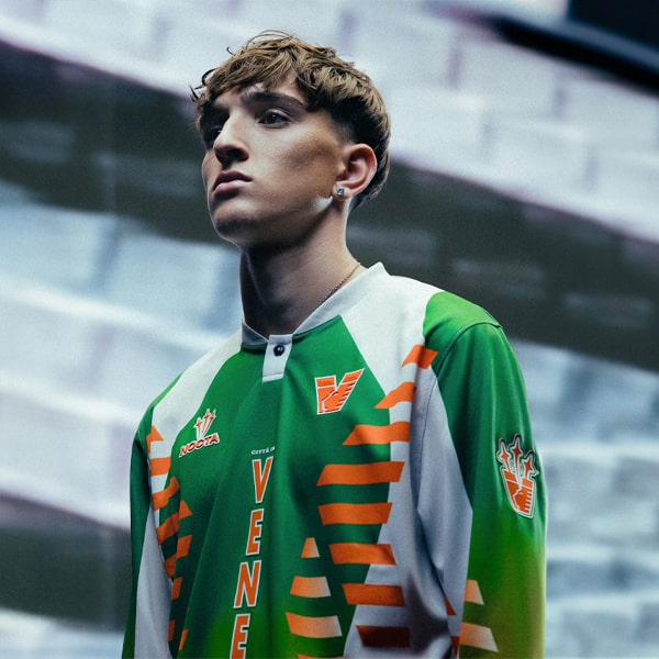
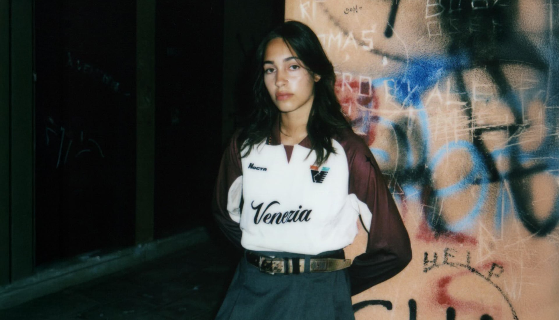
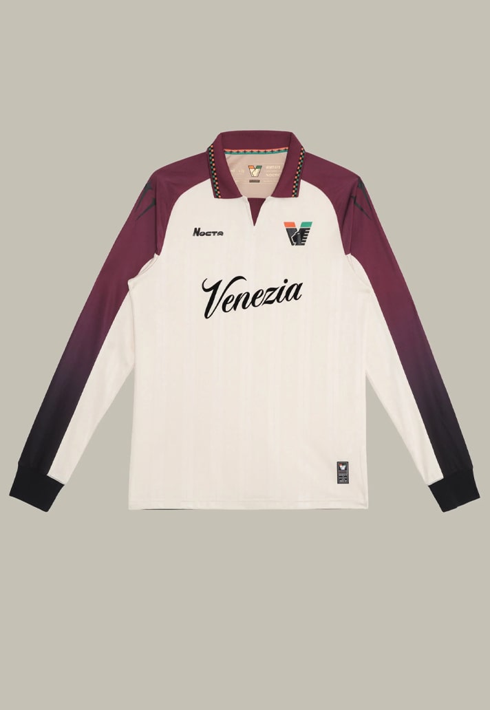
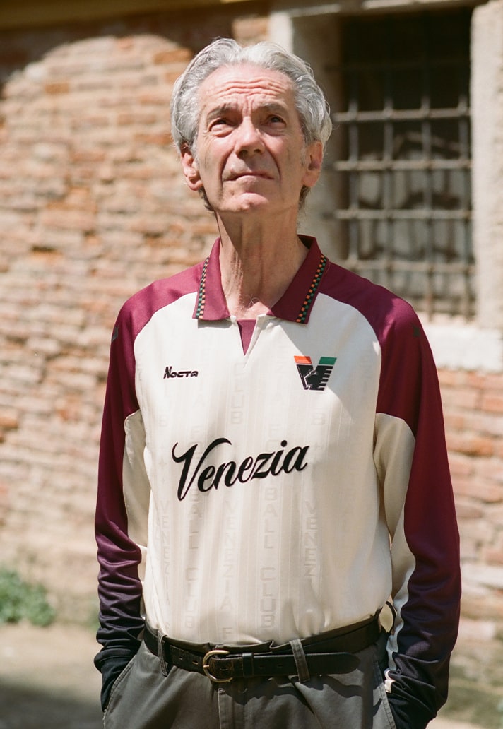
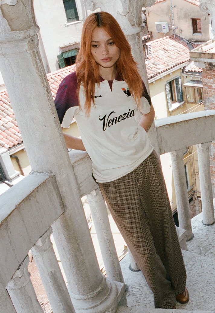
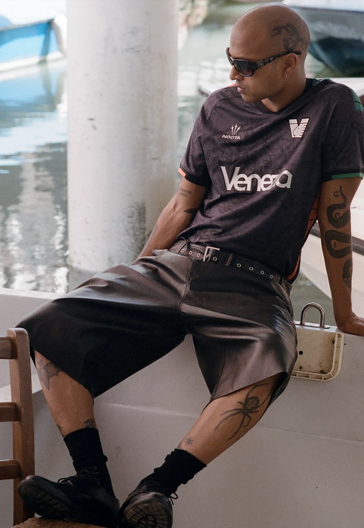
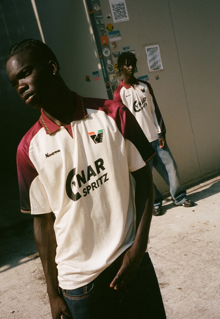
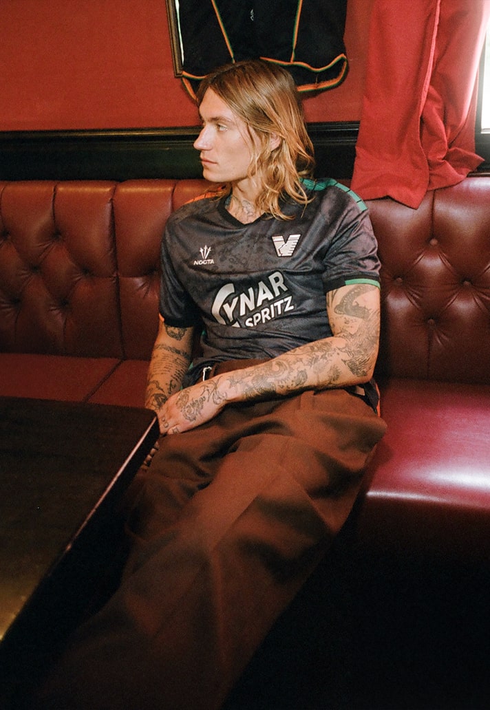
A New Yorker by way of Peru and Italy, Moscosoni first encountered Venice as a fine art student, long before football entered the picture. But it was that collision — of art and sport, tradition and innovation — that ultimately defined his role at the club. After contributing to the kits that put Venezia on the global stage in 2020, Moscosoni returned alongside collaborator Ariel Mojetta to design the 25/26 Home and Away kits — bold statements in fabric that straddle football function and fashion form.
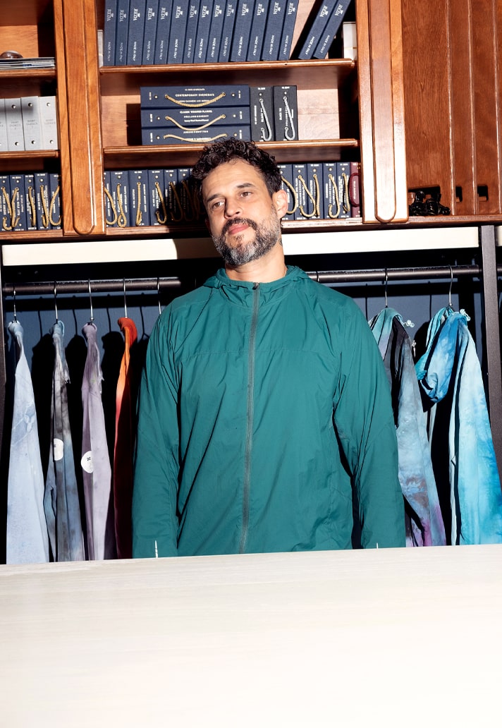
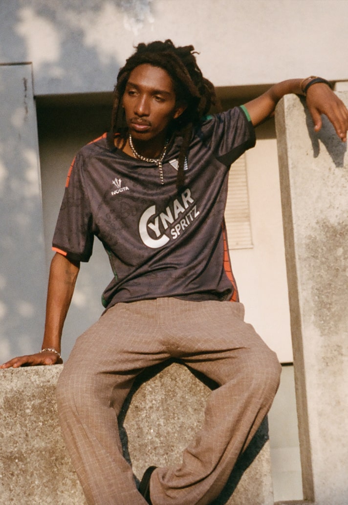
Here, Moscosoni opens up about the pressures of designing for a club with an aesthetic cult following, the challenge of balancing heritage and performance, and how working with NOCTA has changed the game. With the third kit still under wraps, and a city as layered as Venice as their canvas, this is more than just a kit design story — it’s a blueprint for football’s new cultural frontier.
Let’s start at the beginning — how did you come into the Venezia fold, and what drew you to the club creatively?
I first came to Venice as a teenage art student from Brooklyn, through the Pratt Institute exchange program. My mother made sacrifices so I could see the old world — and it was my first time outside the US. Venice left a deep impression on me, especially through the Biennale. I had no idea back then that the city also had a rich football culture. Ironically, I’d been playing since I was four thanks to my father’s South American and Roman roots — football was always in my blood, even before I connected it to Venice.
Was there pressure designing for a club with such a reputation for beautiful kits?
Definitely — but I’ve been part of the Venezia journey since the 2016/17 season. The club has always been ambitious and open to new ideas. I was running a creative football space in NYC called Football Café when they found me. I returned during the pandemic and helped design the four kits that went viral. That time — in a silent, tourist-free Venice — was surreal. I pulled from what I knew: fine art, local culture, and my background working at places like Supreme and LVMH. It was about blending football and art — something few clubs were willing to explore back then.
What was the creative brief for this season’s kits? How much freedom did you have?
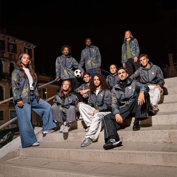
The starting point was function — these are performance garments first. NOCTA had a bold vision to break into football properly, and that meant understanding all the technical demands of the game. Building that capability inside the club was a real challenge, but also a rare opportunity. Most clubs aren’t this involved in their design process. With NOCTA and Venezia, we had the freedom to innovate, which is in the city’s DNA. Risk is part of the art.
The Away shirt feels like a fashion piece — how do you balance that with football’s demands?
Venice is our greatest asset — a city with endless layers and history in every detail. The challenge is respecting that legacy while delivering for the modern game. We don’t get to indulge in pure aesthetics — football is fast, unforgiving. But Venezia is a tight-knit club, with everyone from fans to staff pulling in the same direction. That gives us a real sense of unity between heritage and ambition.
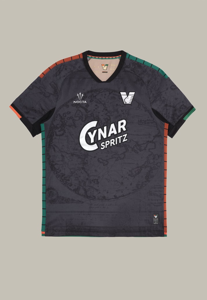
How did Venice itself influence your approach to colour, texture, and silhouette?
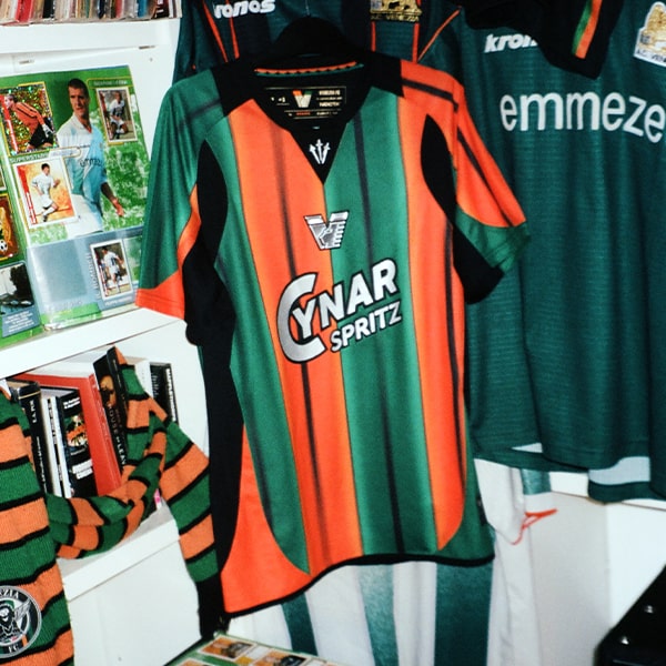
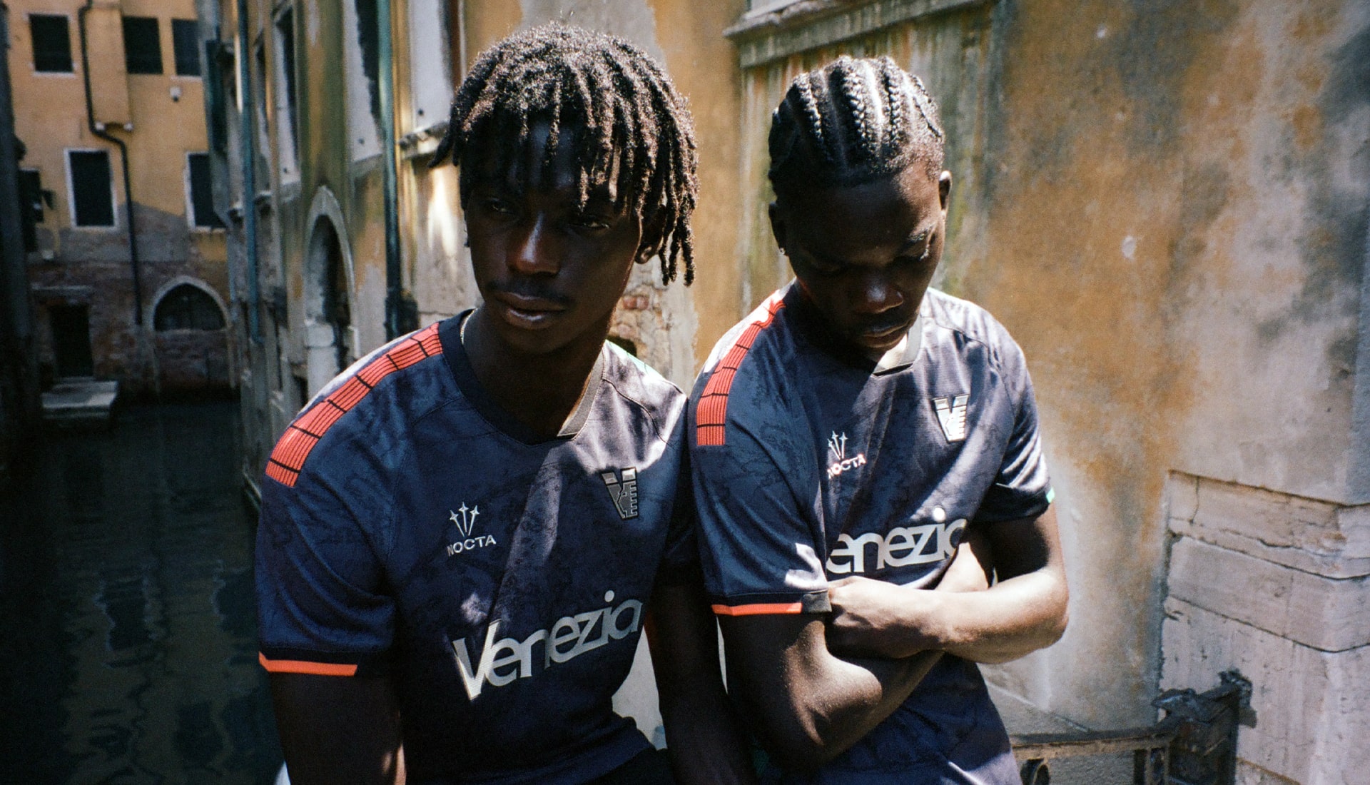
Everything starts with the locals. The colours are sacred — they represent the 1987 unification of two regional clubs, which is a powerful symbol. We approach each design decision with the fans in mind, because they don’t hold back if something feels off. I respect that. It keeps us honest. And it means we’re always listening, always refining. There’s a deep sophistication in how Venetians understand identity and style.
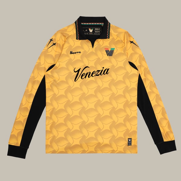
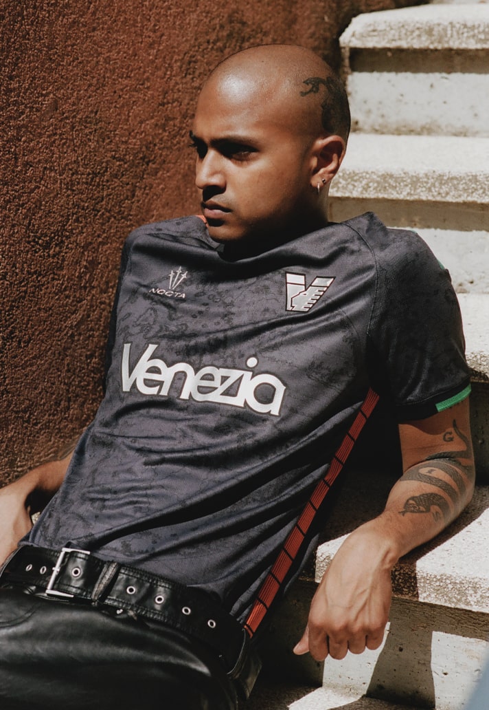
The jacquard weave on the Away kit is a bold choice — how did it come about?
We wanted something timeless — and for me, the ‘90s were a turning point, the moment before the digital age changed everything. That era had a great balance between tradition and modernity. The jacquard is a nod to that — and a way to embed the club’s name into the very fabric. It's a technique rooted in classic football, but also in couture. We're not chasing nostalgia — just drawing on good ideas and elevating them.
What was it like collaborating with NOCTA day-to-day?
NOCTA brought a clear vision and a deep respect for authenticity. They took football seriously — did the research, brought in experts, and trusted the process. My role was to bridge football and fashion, local and global. I’ve worked on big collaborations before, and often there’s culture clash. Here, the focus was on harmony — blending different creative voices into one narrative. From Ariel Mojetta to the VFC team, to the local bars and fans — it’s a true hybrid effort.
What do you want people to feel when they wear this shirt?
Soul, quality, and purpose. The shirt is like a movie poster — the club is the film, and the city is the world it lives in. Hopefully it sparks curiosity, draws people deeper into the culture of Venezia. But this isn’t a TikTok fantasy — it’s about being present and connecting with something real.
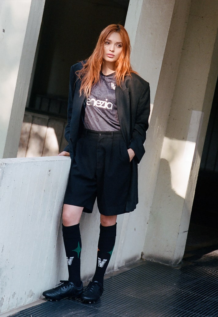
Was the Away kit designed as a counterpoint to the Home kit — a broader story?
Yes, we treat each piece as unique, but part of a larger identity. We wanted contrast and variety — a wardrobe of voices that still feels cohesive. Each design stands on its own, but together they reflect the full spectrum of the club.
Can you tease anything about the third kit? Are we in for another twist?
It’s for the purists — the fans who were there before the spotlight. It’s bold, direct, and exactly what they asked for. NOCTA listened.
What does designing for a football club allow you to do that traditional fashion doesn’t?
Football shirts have meaning. They’re worn with pride, emotion, and memory. It’s closer to DIY streetwear — a language that comes from the bottom up. Fashion often chases that. In football, it’s already there. That connection is powerful — and it’s fun. It brings you back to when you first fell in love with the game.
What’s been the most rewarding part of this journey — and what’s still unfinished?
Spending time in Venice over the past decade, meeting people, listening to their stories — that’s the reward. It’s not always easy, but it’s always meaningful. Venice has reinvented itself over and over. There’s so much more to explore, and I hope we can keep uncovering those stories and translating them into something people can wear, feel, and be inspired by. And of course, have fun with it — we’re not saving lives, but we can make people feel something real.
Shop Venezia 25/26 kits at shop.veneziafc.it/