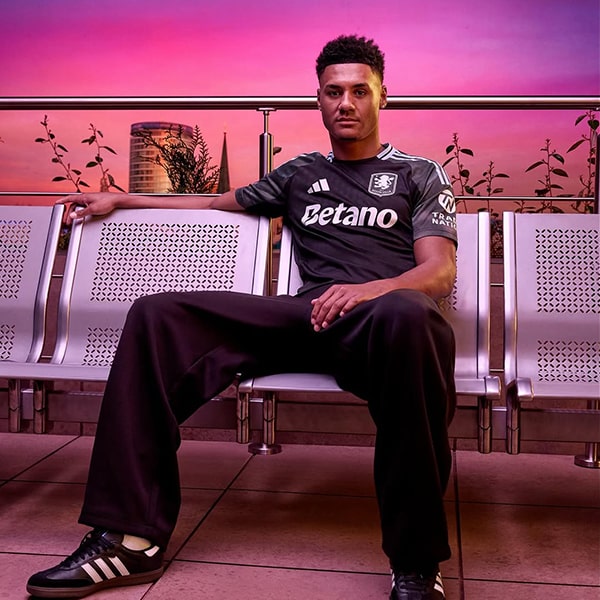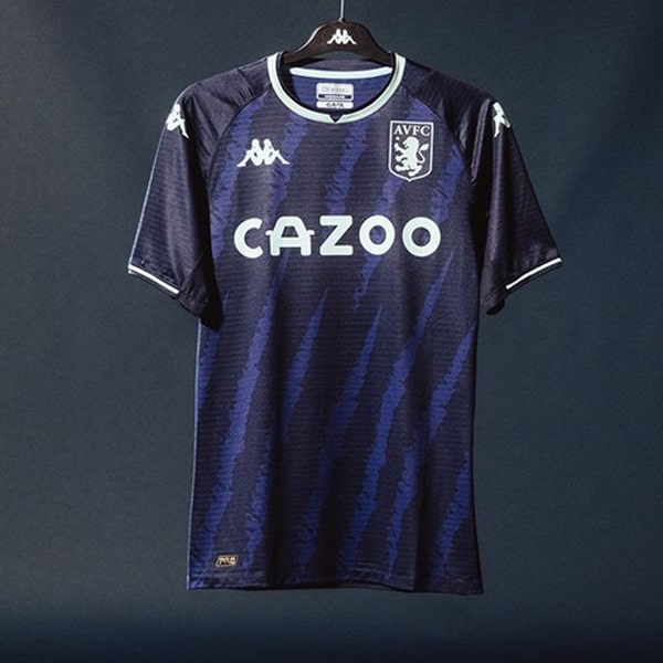
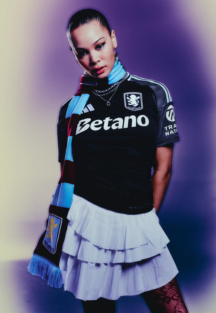
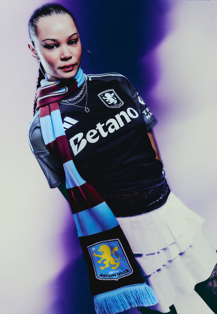
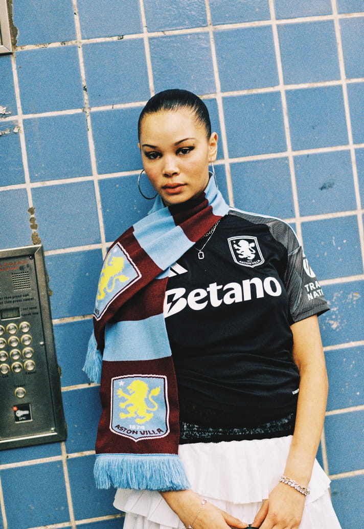
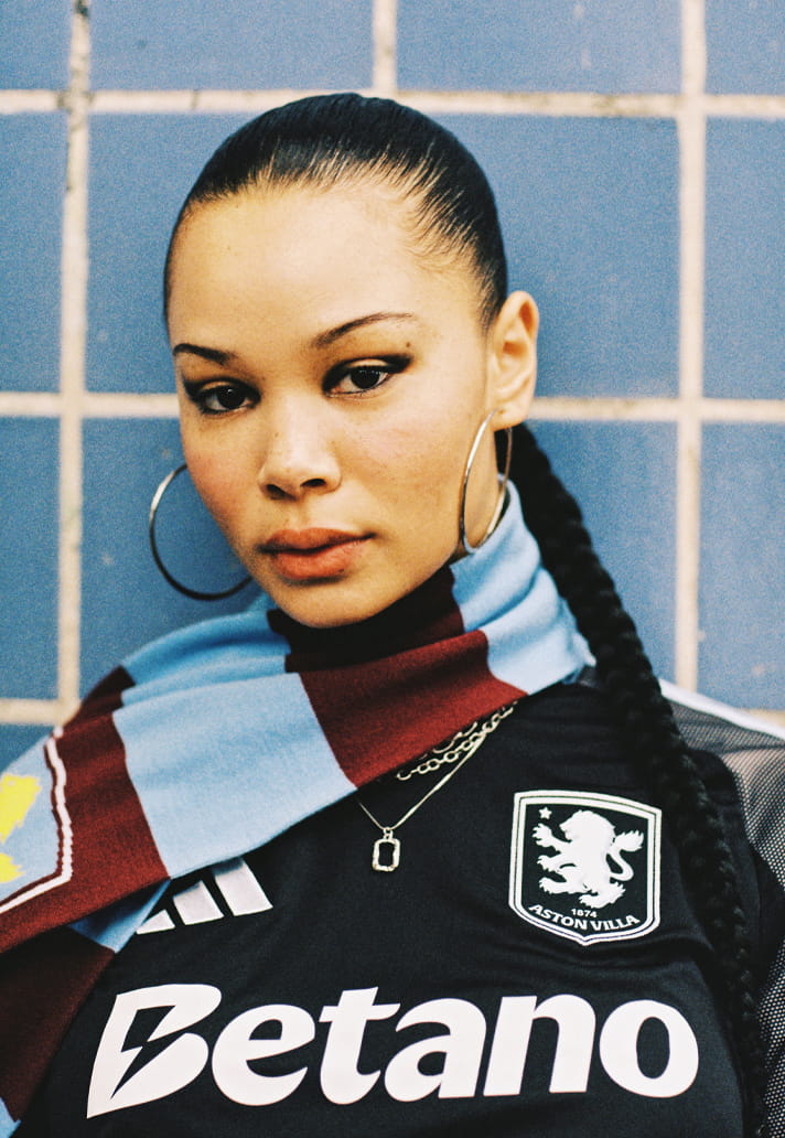
Some shirts speak in colour. Others speak in control. Aston Villa’s 25/26 away kit belongs firmly to the latter. Stripped of claret and blue, this is a study in restraint. A near-monochrome composition that leans into shadow, texture and sharp contrast. It’s understated, but it carries weight. Because when you remove colour, everything else has to be right.
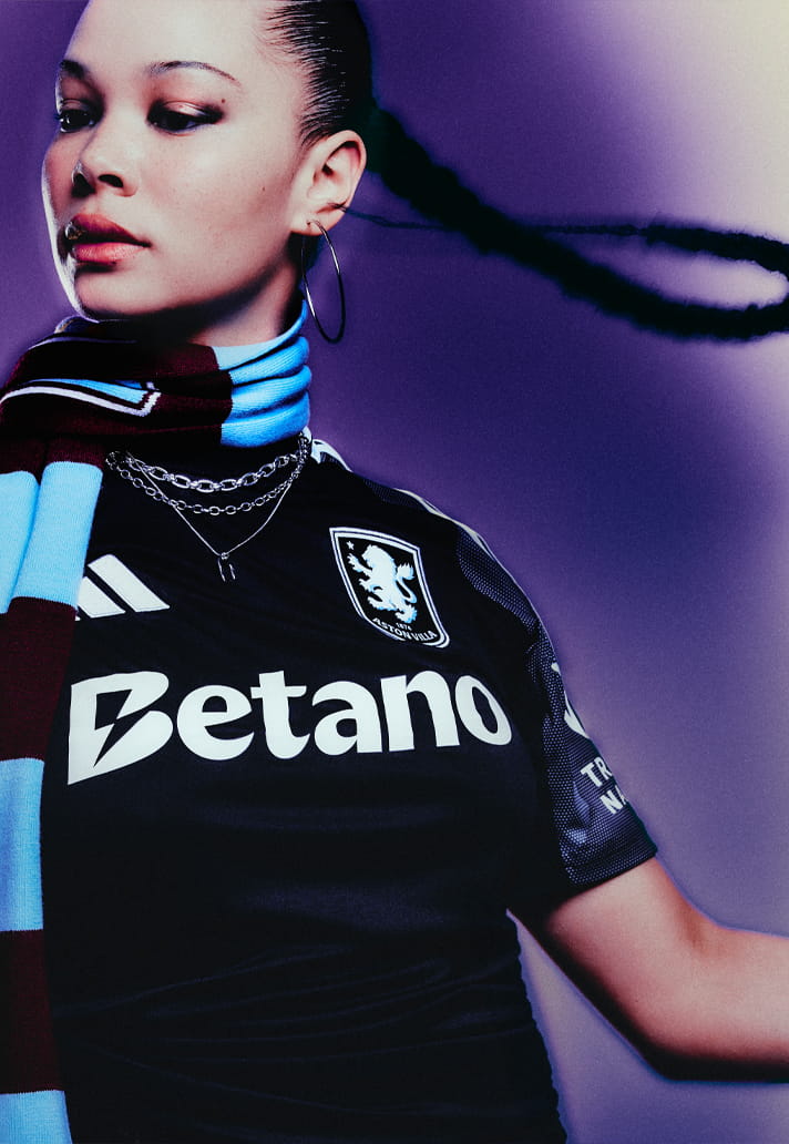
The base lands in deep black, but it’s not flat. There’s movement in the fabrication, subtle shifts in tone across the shoulders, a technical texture that gives the shirt depth without noise. The detailing… cool-toned blues across the upper panels: nods to club identity without overpowering the palette. It’s Villa, distilled.
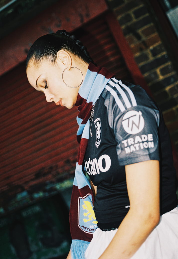
And within that minimal framework, the sponsor becomes critical. This is where Betano’s execution hits with clarity. Rendered in clean white, the wordmark cuts through the darkness with precision. No gradients, no embellishment, just confident typography placed exactly where it needs to be. The weight of the logo balances the adidas mark and the club crest, forming a composition that feels engineered rather than assembled.
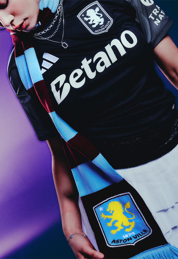
On a shirt like this, there’s nowhere to hide. Every element is exposed. Every decision is visible. And that’s what makes the integration work. The sponsor doesn’t disrupt the shirt, it defines its focal point. It becomes the brightest note in a deliberately muted arrangement. It’s contrast used intelligently.
Black kits often lean into aggression. This one leans into control. The silhouette is clean. The detailing is disciplined. Even the crest feels sharpened in this context, a modernised stamp rather than a decorative badge. The sponsor follows that same philosophy. Functional. Direct. Precise.
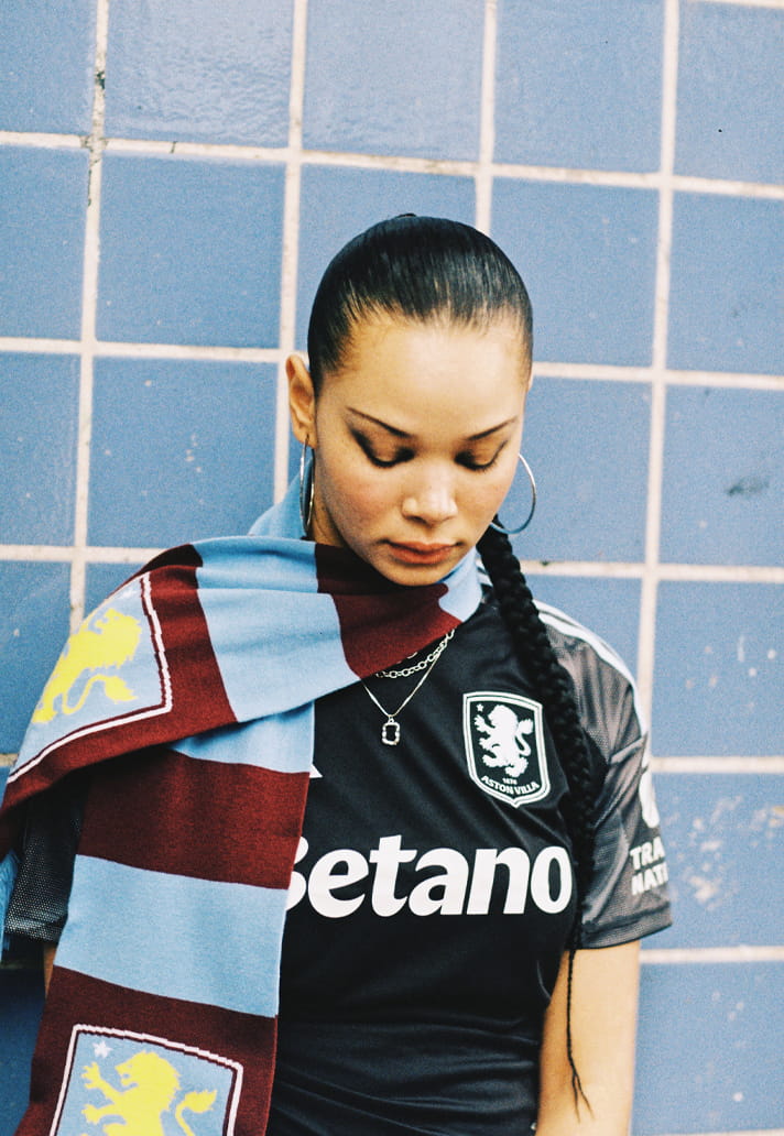
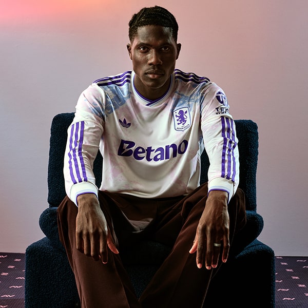
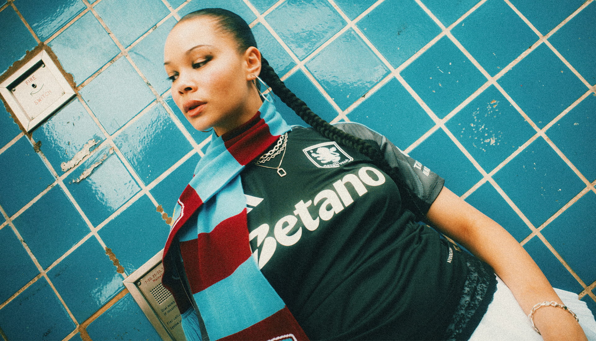
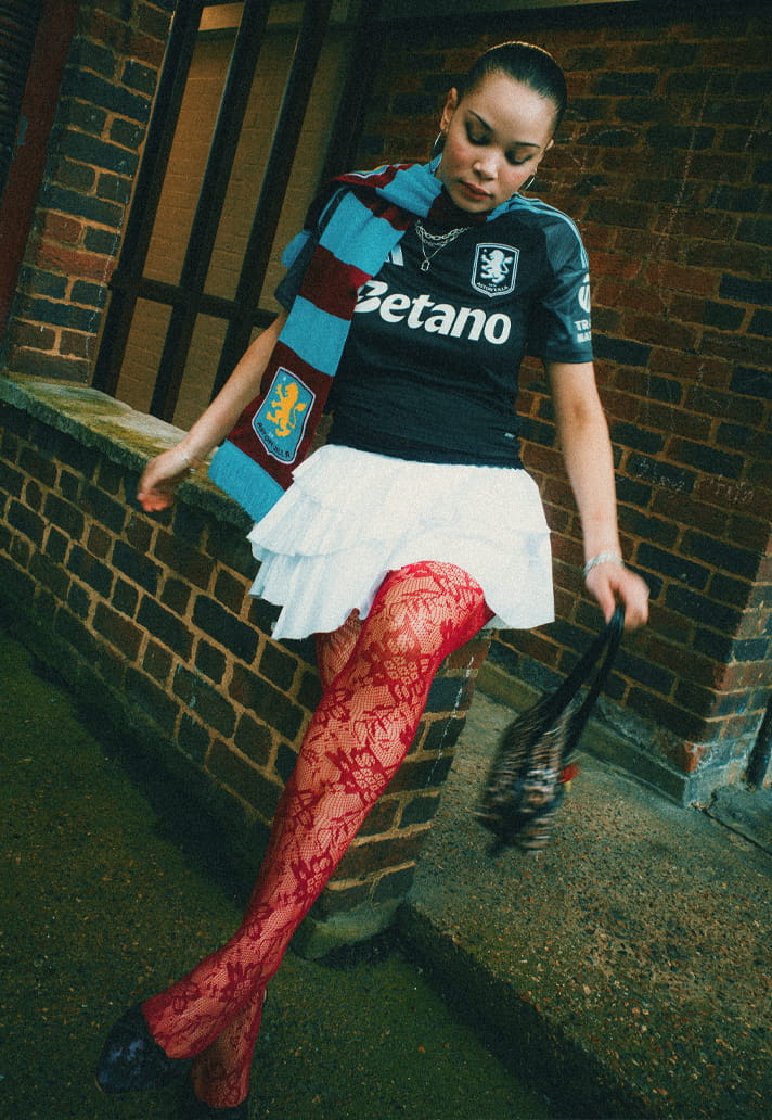
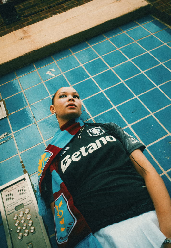
In our editorial framing, the simplicity becomes the strength. Styling that oozes control, owning a moment, owning the power. A confident visual language in looks however the shirt holds on its own, moving easily between performance and lifestyle. And crucially, the sponsor moves with it. That’s the benchmark.
Because in a cultural context, off pitch, under different light, styled with intent, a sponsor has to feel as deliberate as the garment itself. Here, it reads almost like a piece of graphic design. A typographic anchor sitting at the centre of a controlled composition.
Step back and it resolves into something clear. Everything placed with purpose. Nothing competing for attention. Black base. Textured shoulders. Crest. Adidas. Betano.
Aston Villa’s 25/26 away kit is proof that minimalism in football isn’t about doing less, it’s about doing only what matters. And when a sponsor understands that, it doesn’t just fit the shirt. It sharpens it.
Photography by SoccerBible.