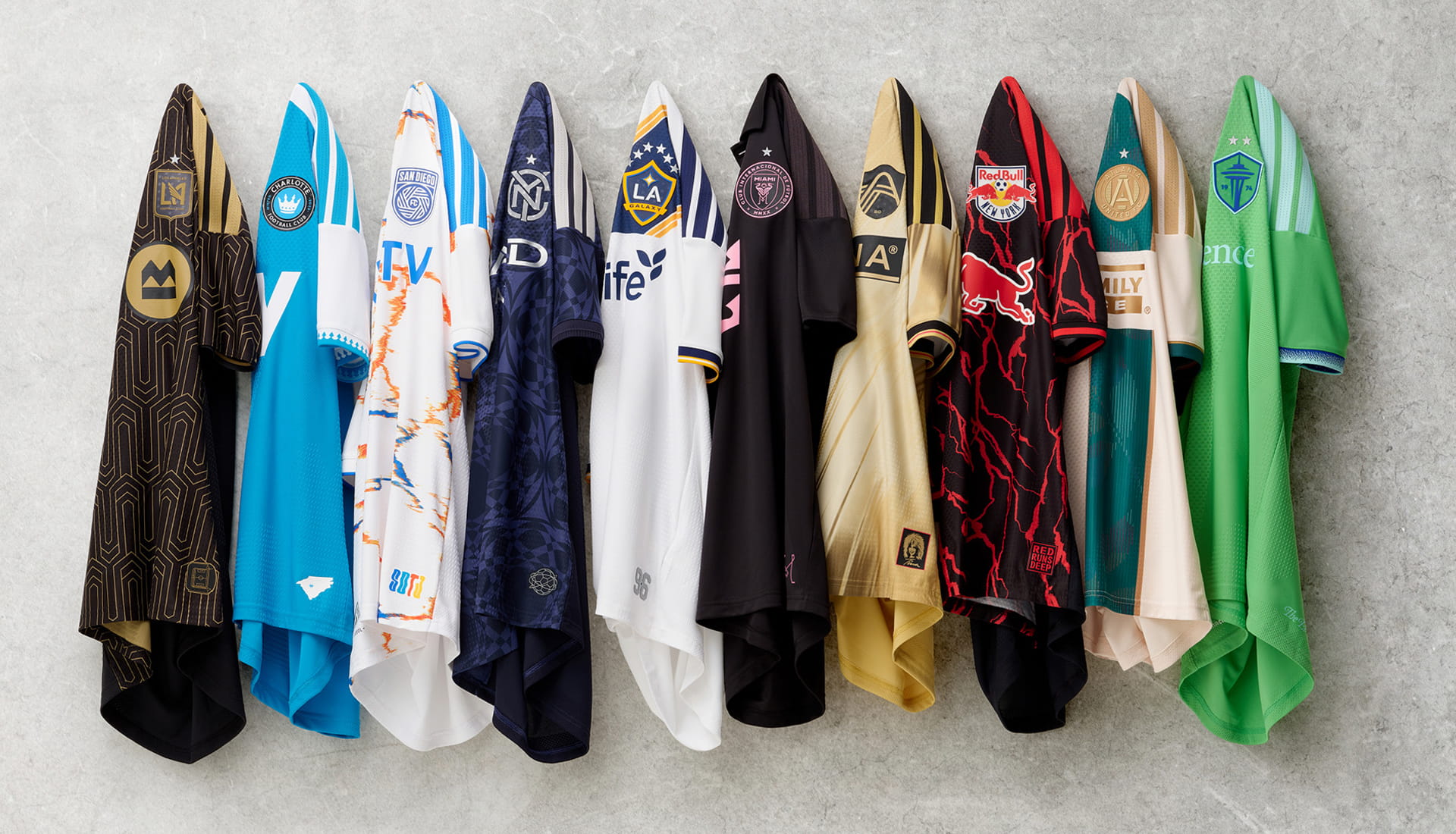
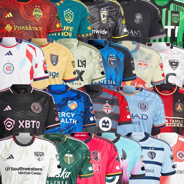
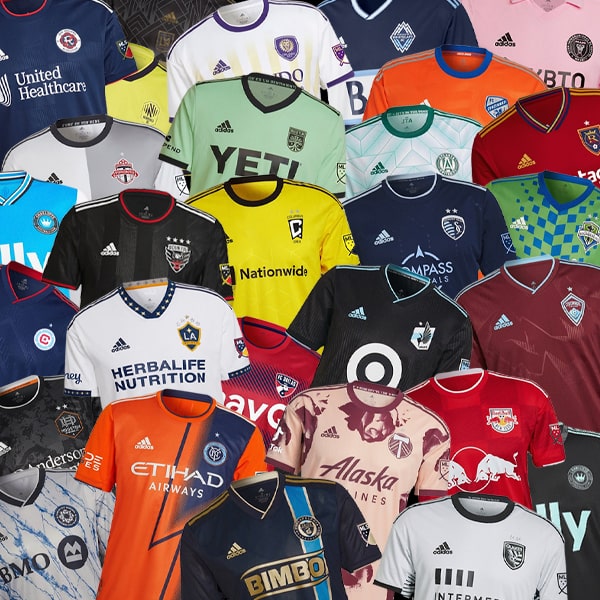
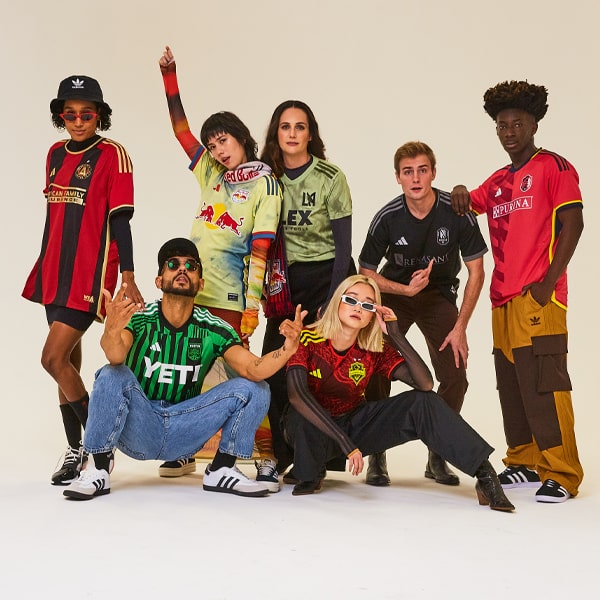
Ready for the 2026 Major League Soccer season, adidas has revealed new kits for all 30 teams. But which ones hold up off pitch? This is not your usual ranking game. Prepare to style it out.
In case you didn’t know already, Major League Soccer doesn’t do subtle. Every season arrives with a flood of new shirts all fighting for your wallet and your wardrobe. But beyond the launch videos and choreographed unveilings, the real question is simpler: would you actually wear it?
So instead of simply ranking this season’s MLS jerseys, we’ve gone through and judged each one on something far more important than points on a table: wearability. How it sits with denim. Whether it works under a jacket. If it feels like a garment rather than just merchandise. From the hardest-to-style to the genuinely excellent, this is MLS, re-ordered for real life, in reverse.
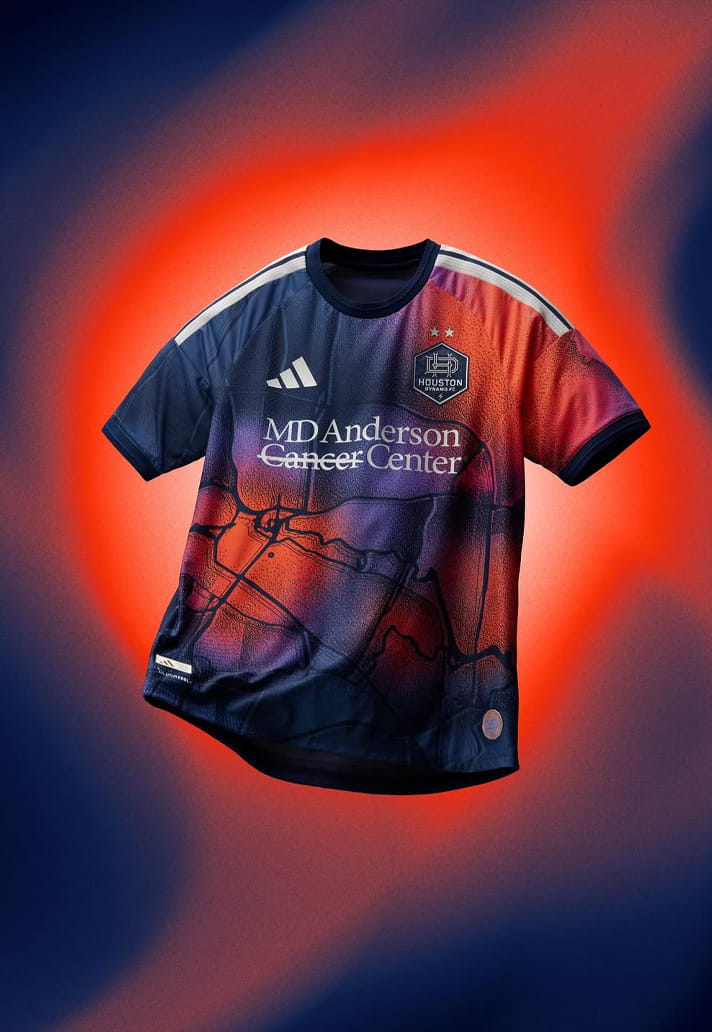
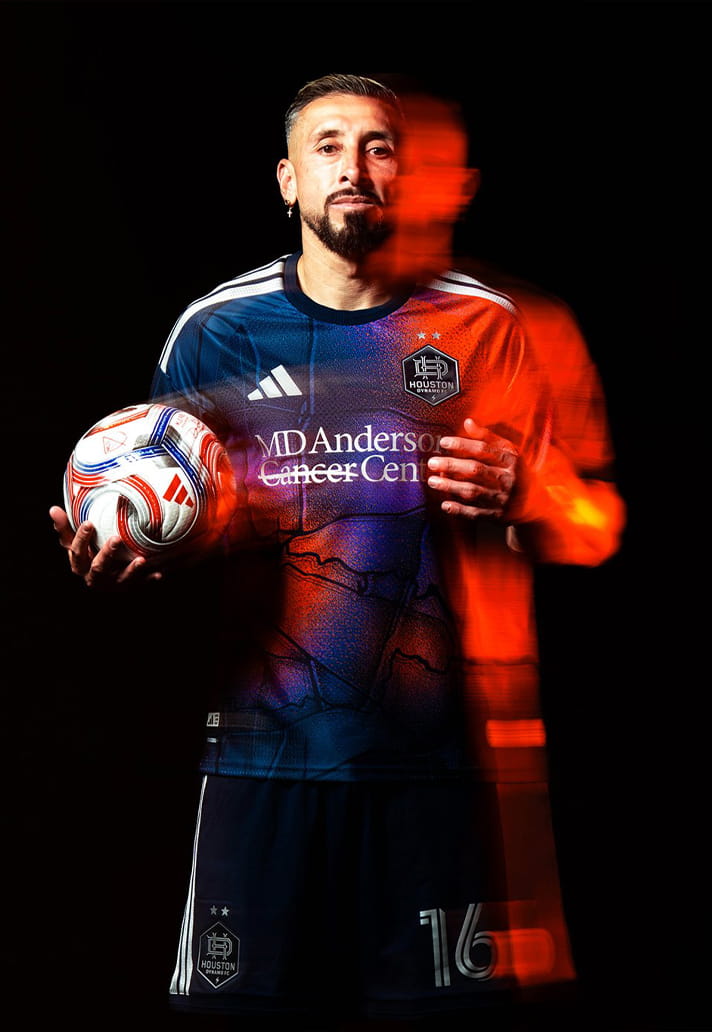
Houston Dynamo
There’s ambition in the concept. Orange can be brilliant when it’s handled properly. This one never quite settles. It feels slightly disconnected, like a prototype that made it to retail a week too early.
Style Notes: Probably stronger in motion than on a hanger.
Wearability Grade: D
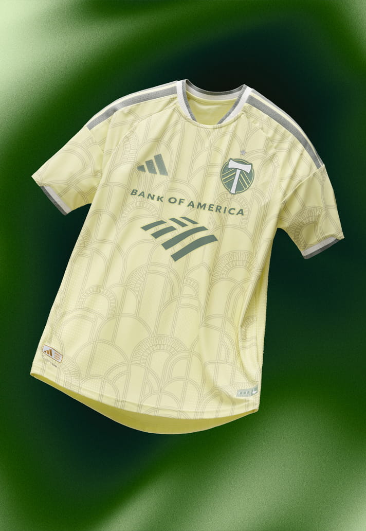
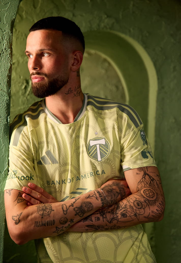
Portland Timbers
Good idea, slightly flat execution. You want more texture, more risk, more sense of occasion. It ends up feeling safe when it should feel special.
Style Notes: Concept over cut.
Wearability Grade: D+
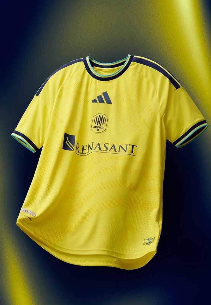
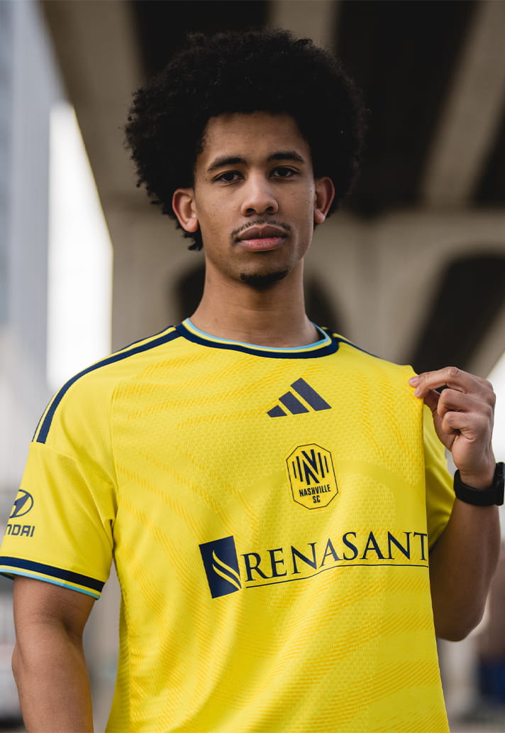
Nashville SC
Yellow is brave. The layout here feels clunky – sponsor and crest competing for space rather than working together.
Style Notes: Not the easiest pub shirt.
Wearability Grade: D+
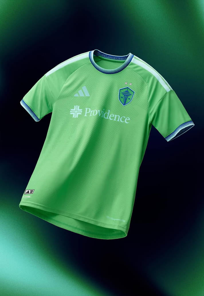
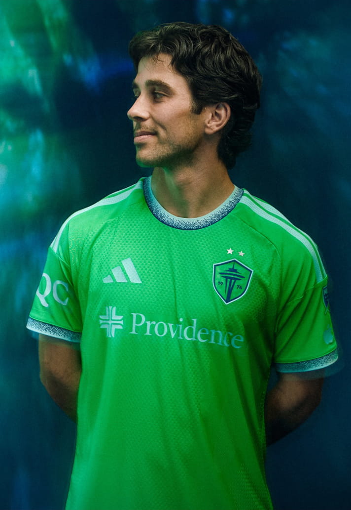
Seattle Sounders FC
Rave green is a gift. This version plays it strangely safe. It feels like a training top when it could’ve been something cult.
Style Notes: Better under floodlights than under a blazer.
Wearability Grade: D+
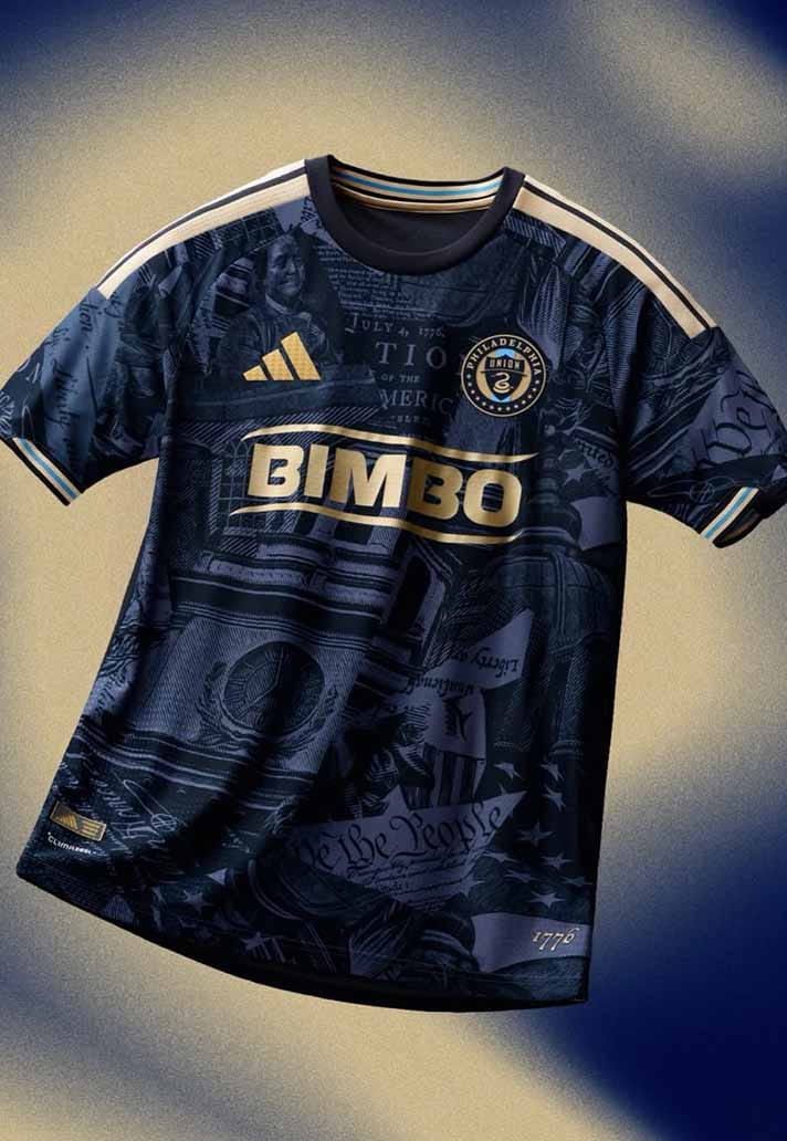
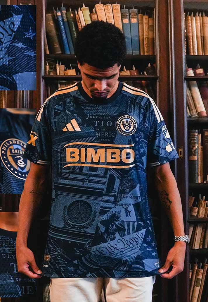
Philadelphia Union
The colour palette has promise. The execution feels unfinished. There’s no defining detail that makes it memorable, which is a shame.
Style Notes: Difficult to justify over stronger navy shirts.
Wearability Grade: C-
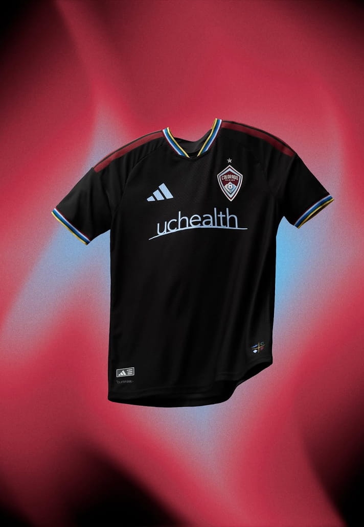
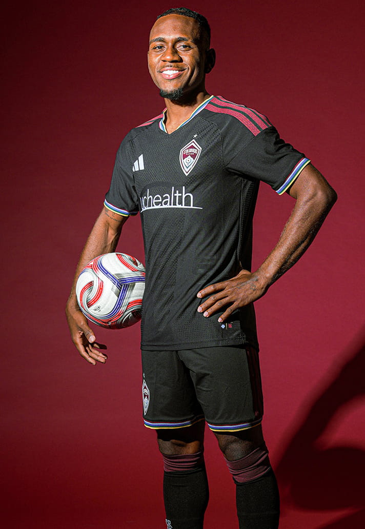
Colorado Rapids
Black kit, limited narrative. It feels generic, like it could belong to anyone.
Style Notes: Slight gym-top energy unless styled carefully.
Wearability Grade: C-
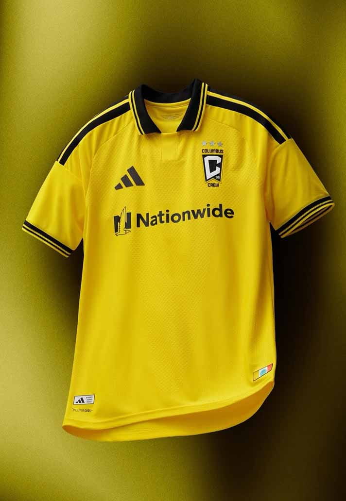
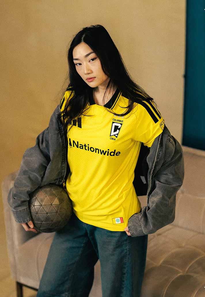
Colombus Crew
Bright yellow makes a statement whether you want it to or not. It’s bold, but not particularly nuanced.
Style Notes: Needs darker layers to balance the brightness.
Wearability Grade: C-
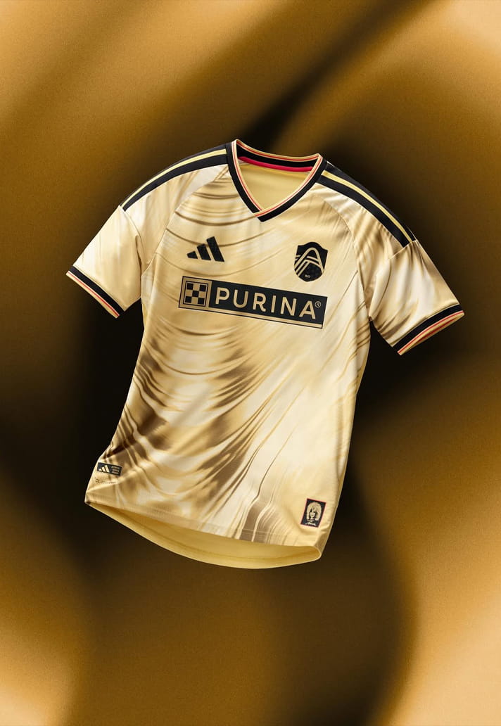
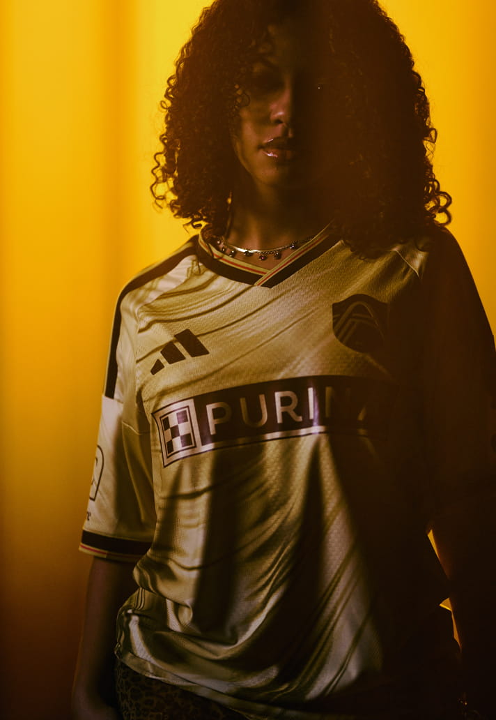
St. Louis City SC
Plenty of energy (I mean, it’s a tribute to Tina Turner ffs), but maybe too much. The composition feels busy rather than bold, and that makes it difficult to live with day-to-day. That said, it's pretty enough.
Style Notes: Applaud the intention, but hard to rotate casually. Demands commitment.
Wearability Grade: C
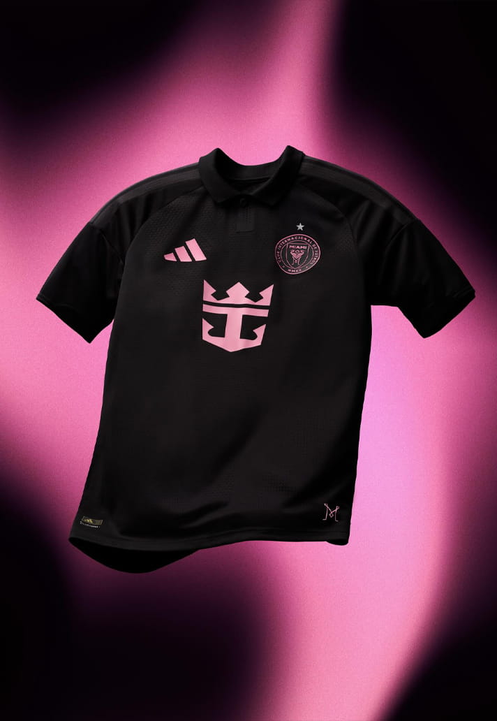
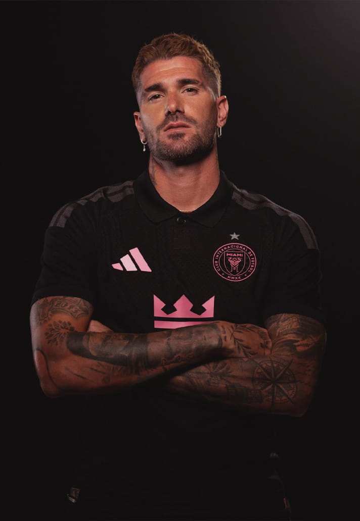
Inter Miami CF
Pink and black should be an automatic win. This one leans more merch-table than runway. Go oversized and it improves, in our opinion.
Style Notes: Size up. Let it drape, baby!
Wearability Grade: C
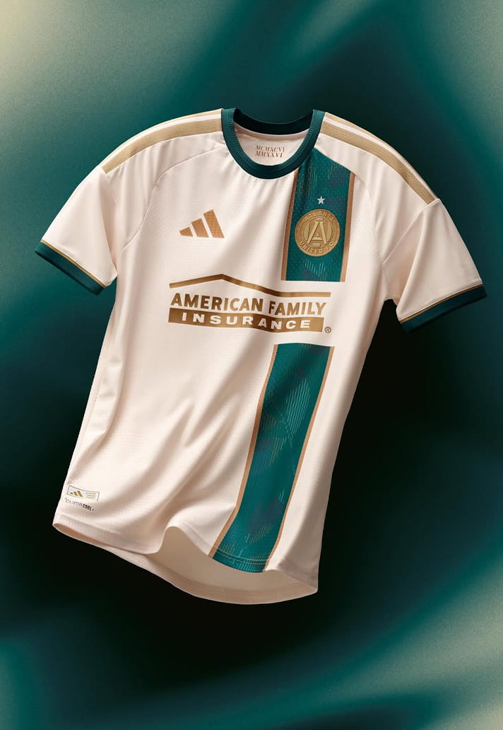
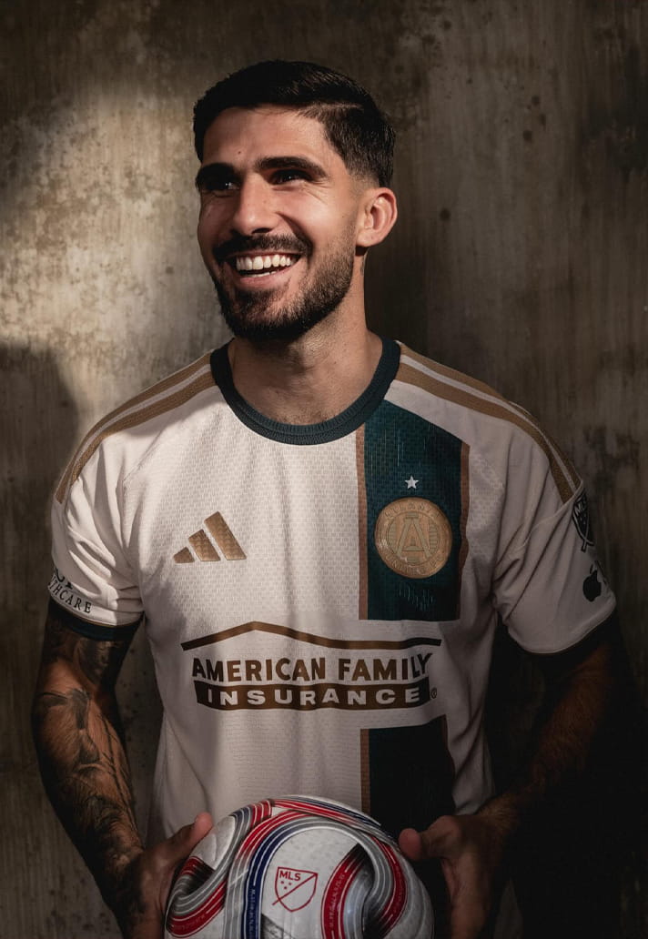
Atlanta United
Historic cues are appreciated, but visually it feels heavy. There’s a lot happening and not all of it harmonises. Sponsor is an issue, for me.
Style Notes: Needs clean trousers to calm it down.
Wearability Grade: C
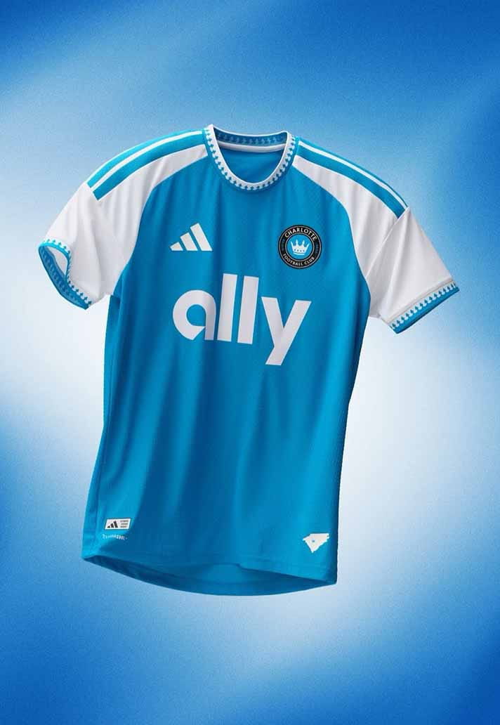
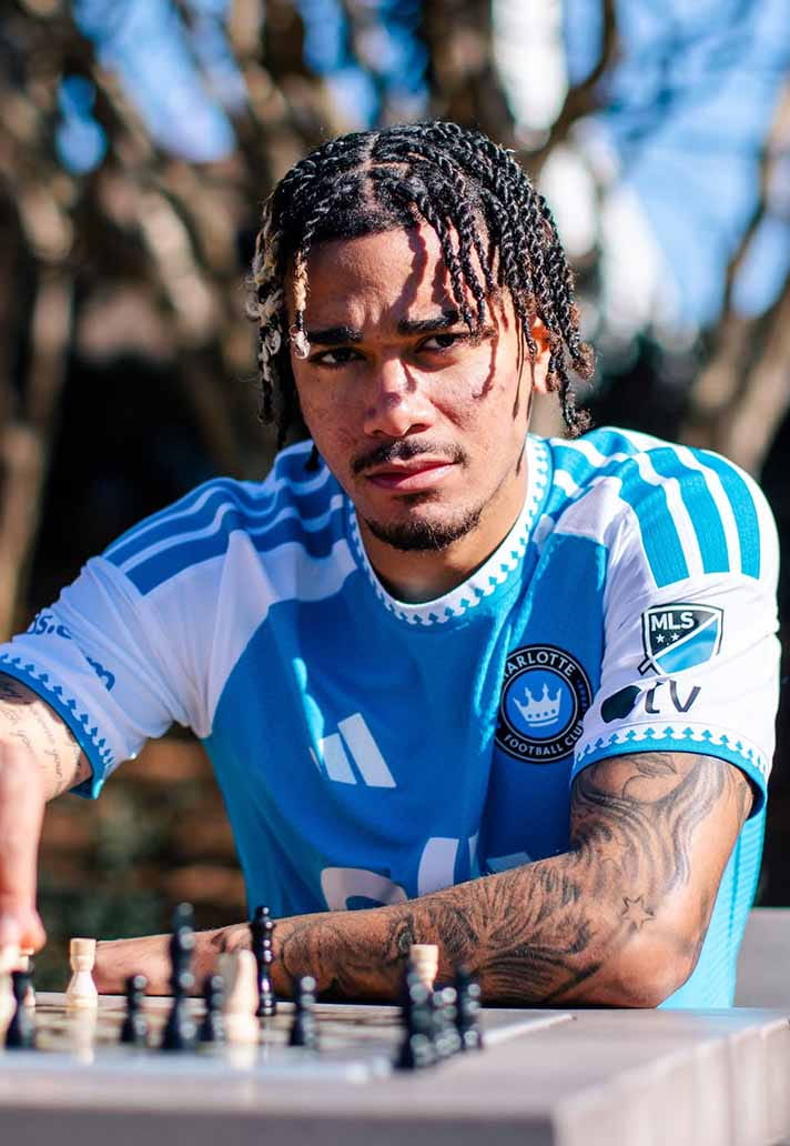
Charlotte FC
Blue and white. Crisp enough, sure, but slightly anonymous. You’d wear it, but you wouldn’t build an outfit around it.
Style Notes: Safe, neutral rotation piece.
Wearability Grade: C
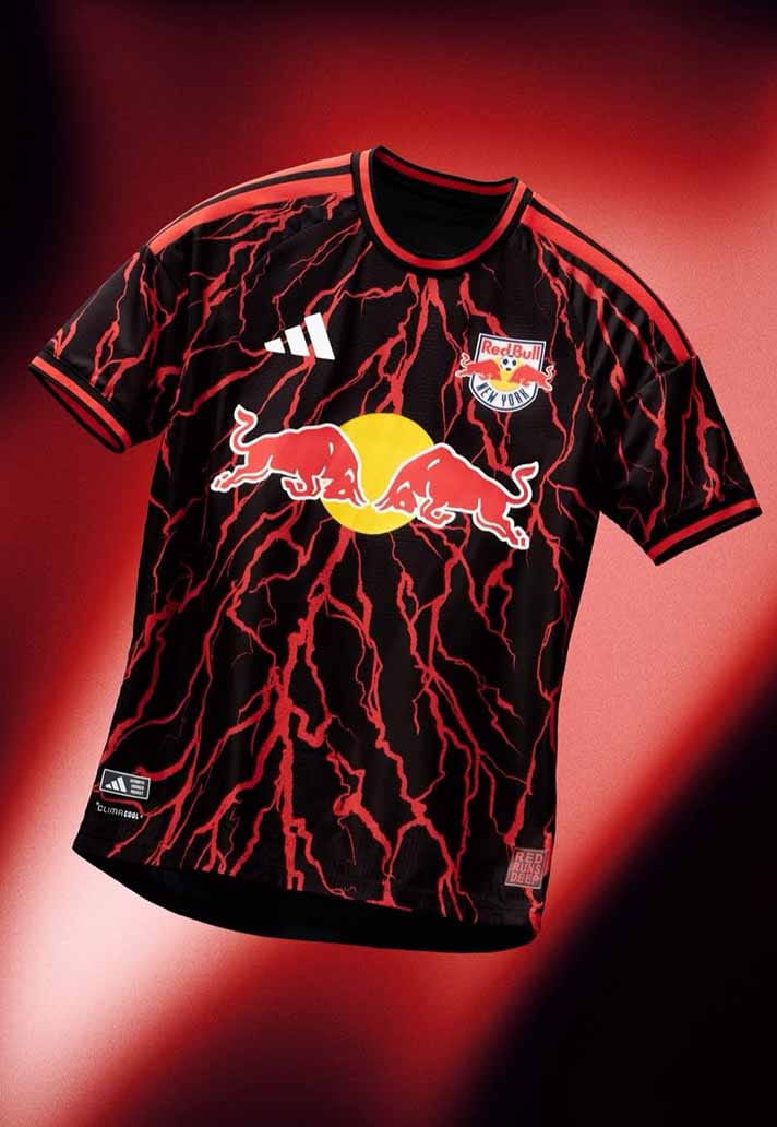
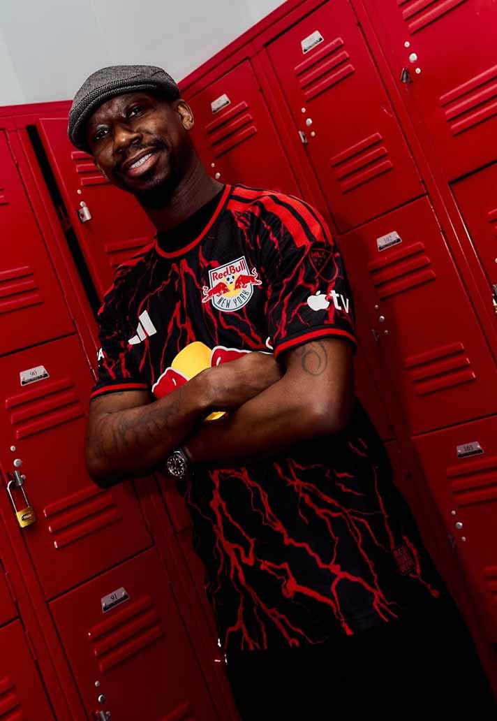
New York Red Bulls
The legacy nod is doing the heavy lifting. The rest feels corporate. More training ground than terrace classic.
Style Notes: Sporty styling only.
Wearability Grade: C
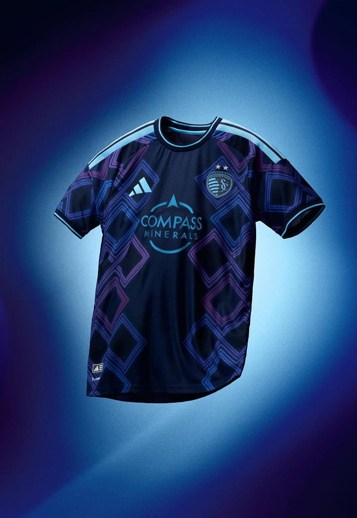
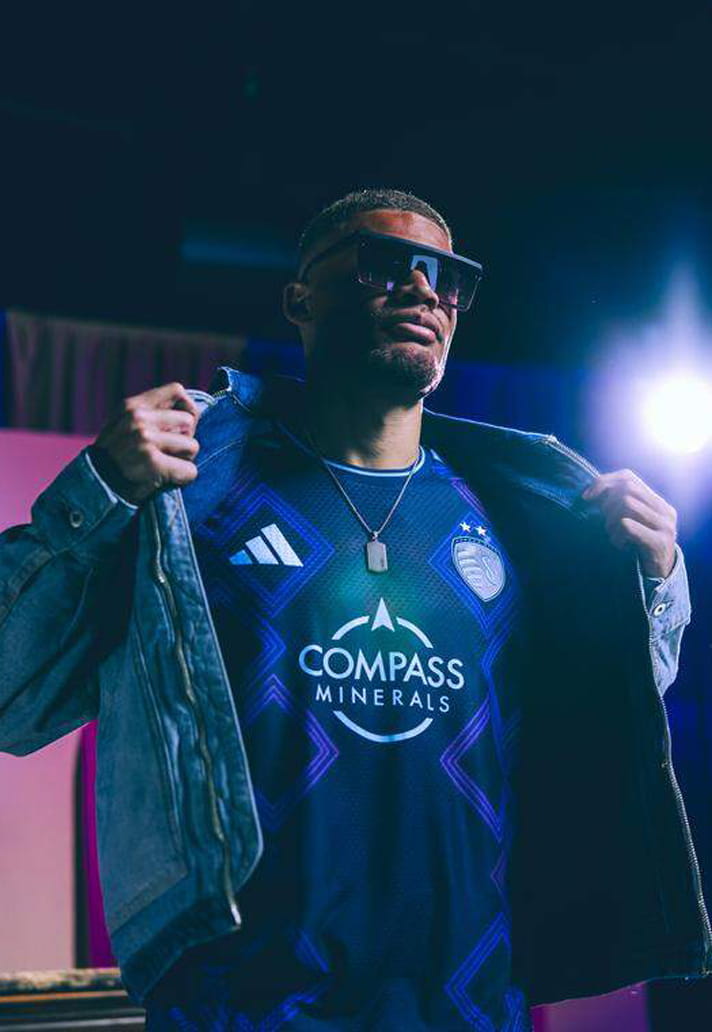
Sporting Kansas City
There’s texture and detail here, but it never quite lands cohesively. Slightly fussy.
Style Notes: Harder to style than it should be.
Wearability Grade: C+
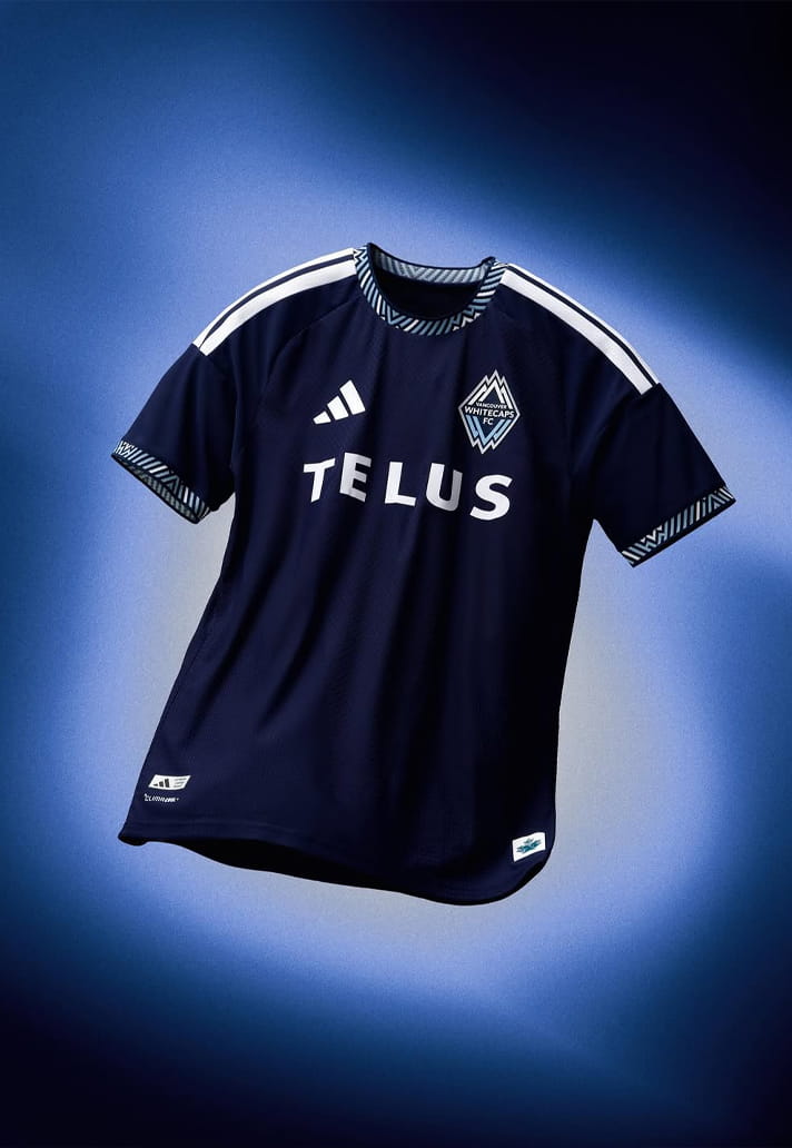
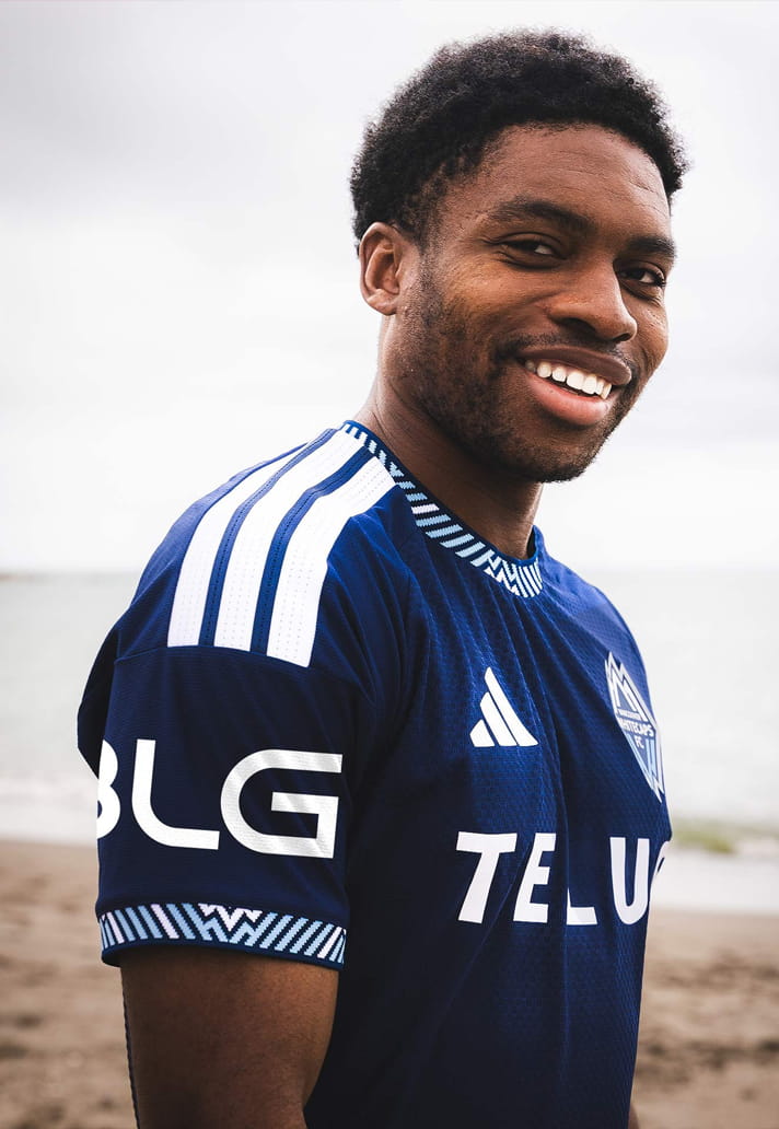
Vancouver Whitecaps
Navy minimalism is dependable, just not especially exciting. It’s neat, polite, and quietly functional. Does the job.
Style Notes: Office-casual football shirt energy.
Wearability Grade: C+
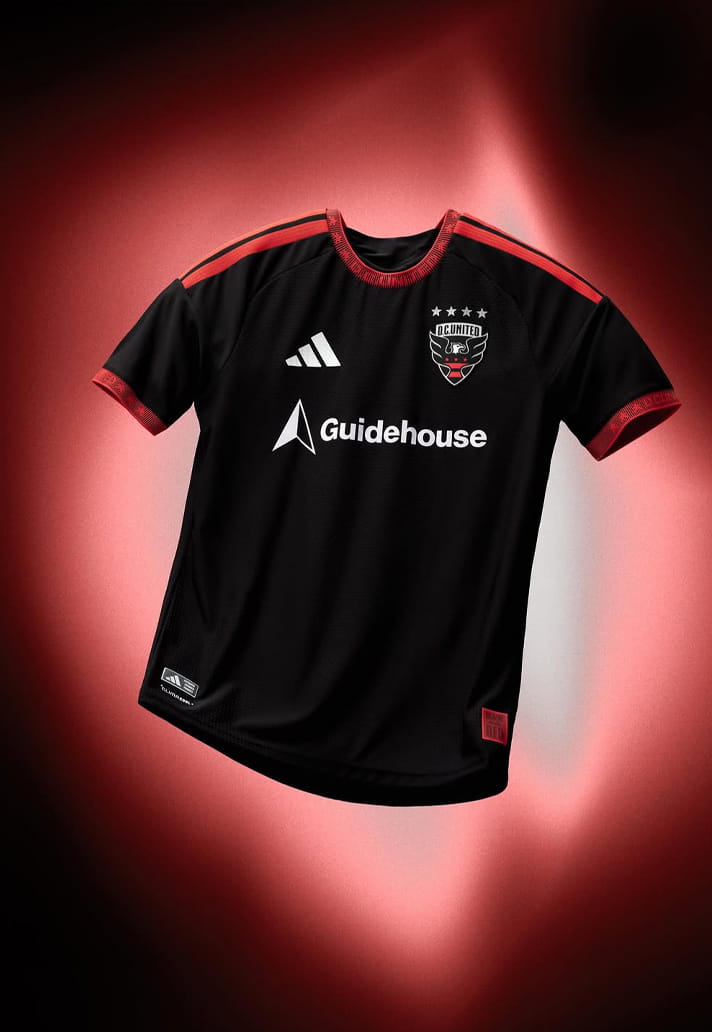
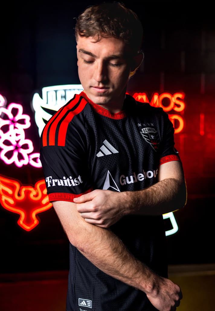
D.C. United
Black and red is tough by default. The execution is solid, if not a little predictable.
Style Notes: Works best if you lean fully monochrome.
Wearability Grade: C+
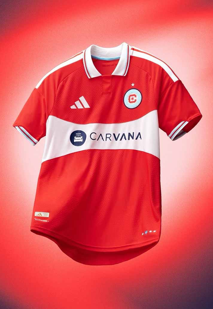
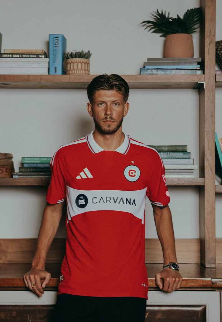
Chicago Fire
Red and white, back to basics. It feels heritage-driven. Safe, but in a reassuring way.
Style Notes: Clean, classic, easy to rotate.
Wearability Grade: B-
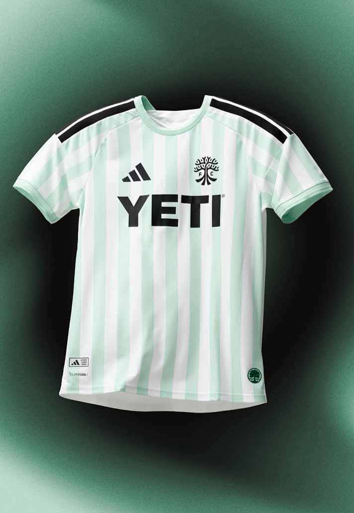
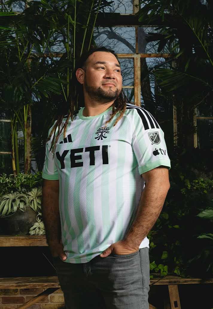
Austin FC
Green done properly is rare. This keeps things balanced and fairly grown-up, which we like.
Style Notes: Strong with black cargos or relaxed tailoring.
Wearability Grade: B-
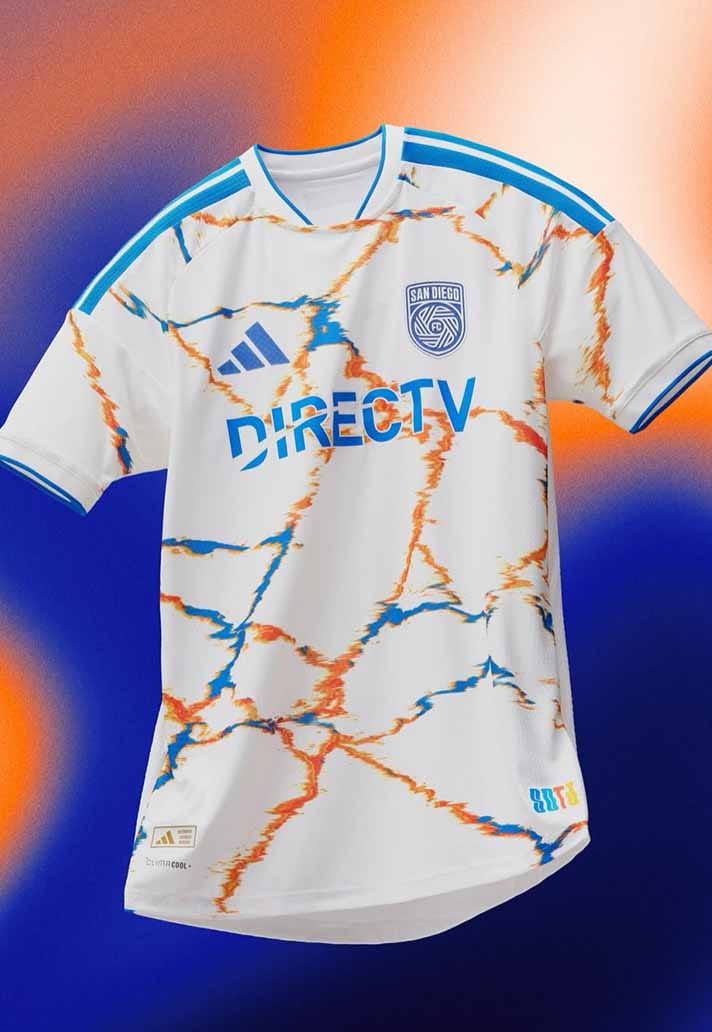
San Diego FC
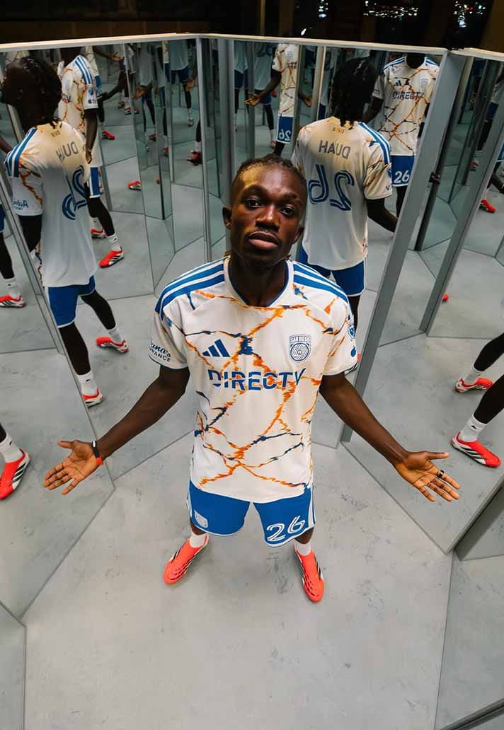
New club energy. The palette pops. Identity still forming, but there’s ambition here.
Style Notes: Looks better oversized than tailored.
Wearability Grade: B-
Toronto FC
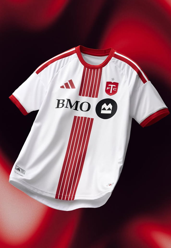
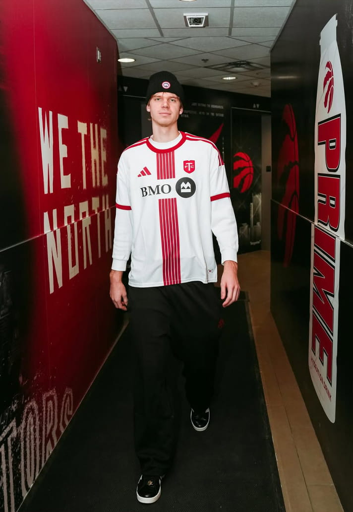
The crisp white base is strong and the detailing sharp. Slight sponsor bulk stops it climbing higher.
Style Notes: Excellent half-zipped under a track jacket.
Wearability Grade: B
Real Salt Lake
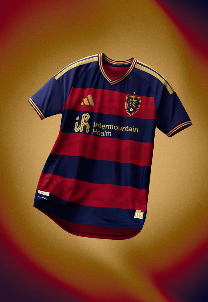
Claret hoops are dependable. Slight terrace nostalgia without trying too hard.
Style Notes: Dark denim pairs well.
Wearability Grade: B
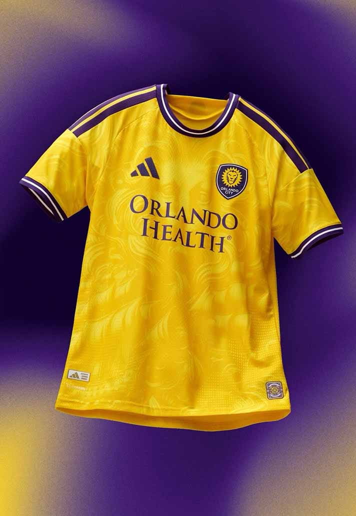
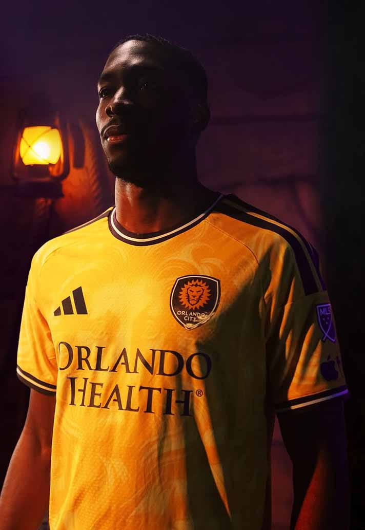
Orlando City SC
Yellow with confidence. It avoids novelty and feels modern.
Style Notes: Let the colour carry the look.
Wearability Grade: B
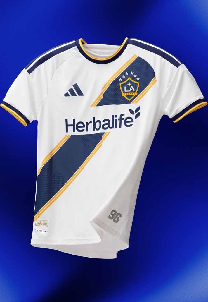
L.A. Galaxy
White base (shock!), iconic sash. The sash gives it shape and story.
Style Notes: Summer-ready. Clean lines, white socks.
Wearability Grade: B+
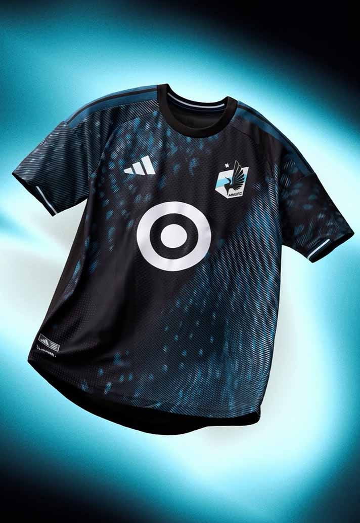
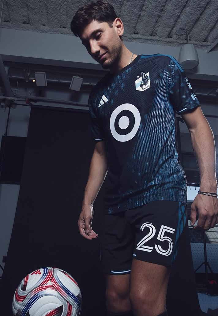
Minnesota United
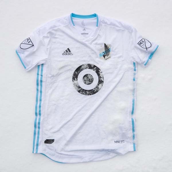
Quietly clever. Nothing excessive. Just thoughtful restraint.
Style Notes: Minimalist football shirt done right.
Wearability Grade: B+
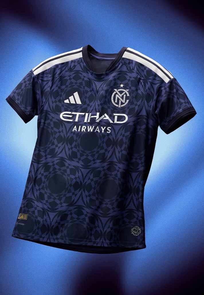
New York City FC
Navy done properly never fails. Calm, grown-up, endlessly wearable.
Style Notes: Easiest throw-on in the league.
Wearability Grade: B+
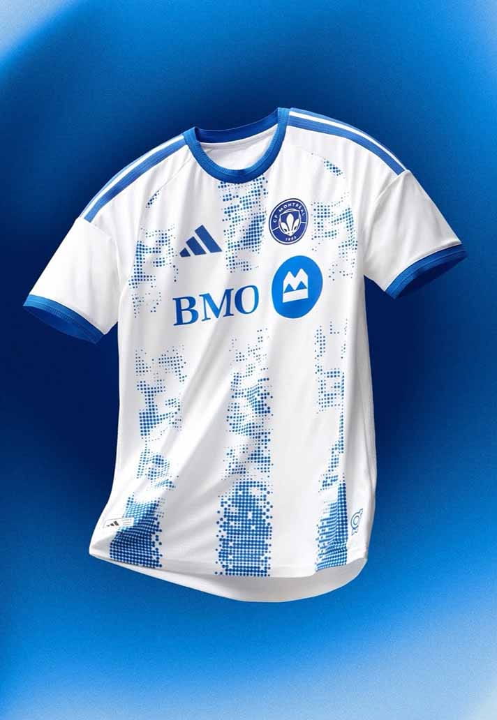
CF Montréal
Moody and layered. It feels like it was designed with real-world outfits in mind.
Style Notes: Perfect under a dark work jacket.
Wearability Grade: B+
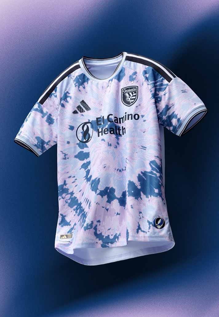
San Jose Earthquakes
Tie-dye, handled properly. It leans into personality without tipping into costume.
Style Notes: Oversized fit suits it best.
Wearability Grade: B+
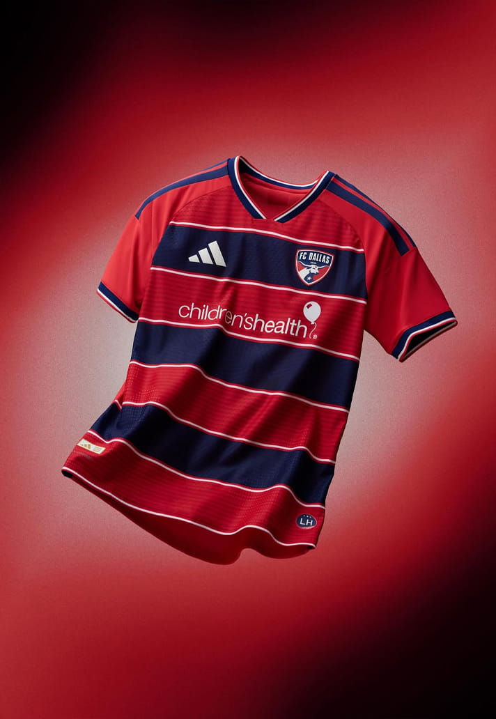
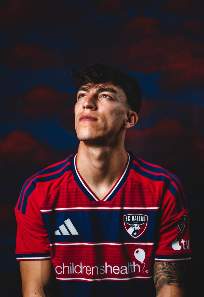
FC Dallas
Hoops with rhythm. Athletic without straying into rugby cosplay – which would be a travesty!
Style Notes: Slight preppy undertone.
Wearability Grade: A-
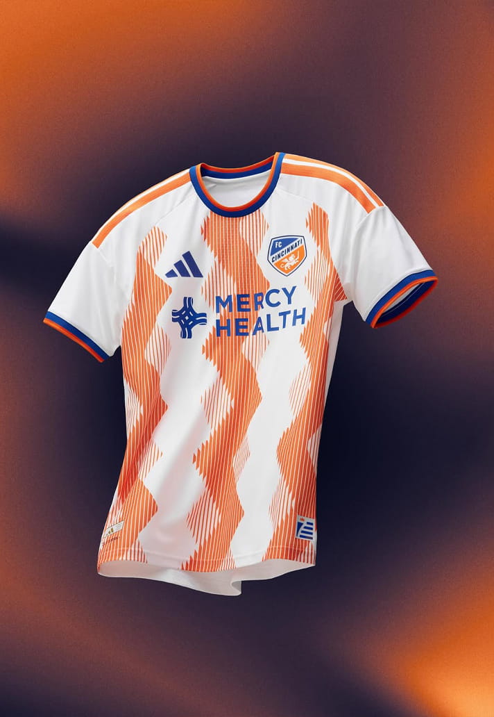
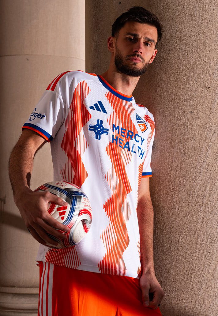
FC Cincinnati
Orange and white verticals that actually feel refined. Graphic, confident, balanced. A winner, in our eyes.
Style Notes: Orange detailing elevates neutral layers. What’s not to love?
Wearability Grade: A-
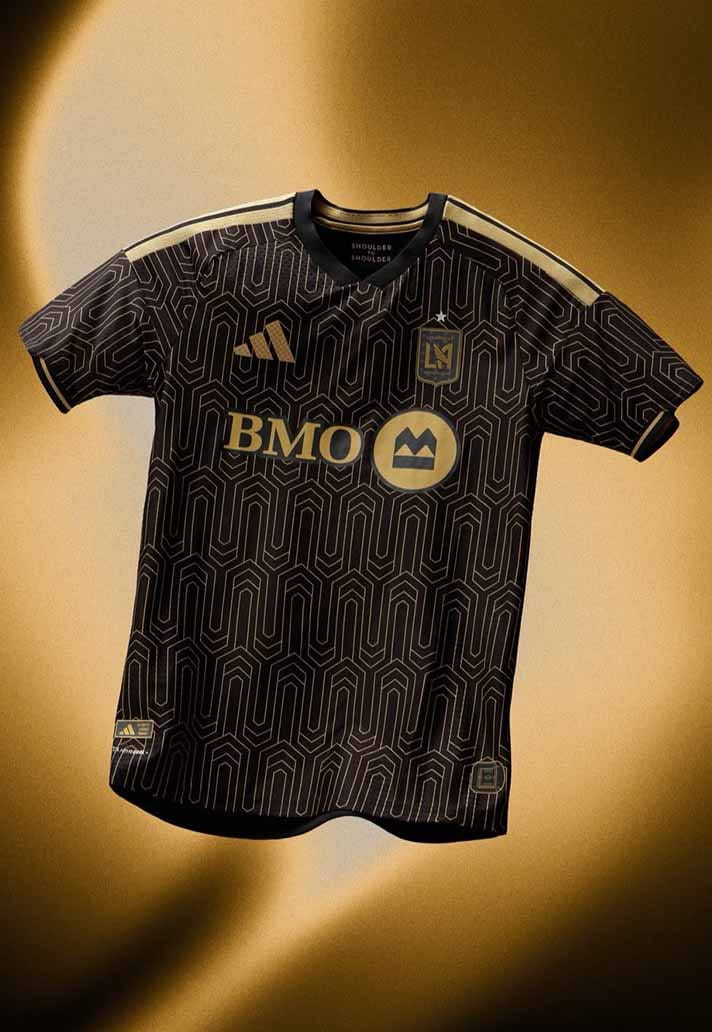
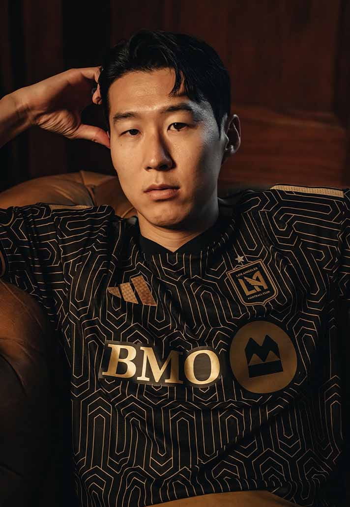
Los Angeles FC
Black and gold remains undefeated in the style stakes. Sleek. Slightly sinister. Very LA.
Style Notes: Monochrome styling only.
Wearability Grade: A
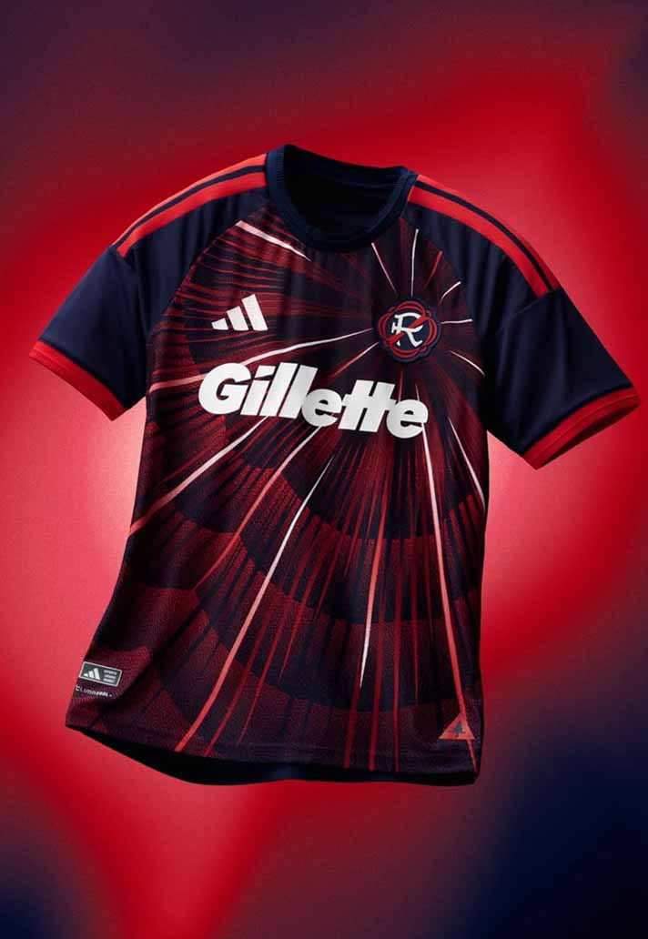
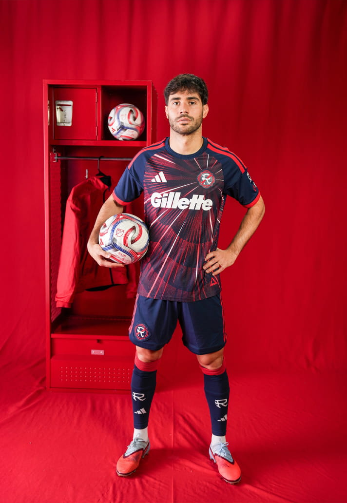
New England Revolution
The best of the bunch. Nostalgic without being kitsch. Bold without being brash. It feels like a football shirt and a proper garment at the same time, which is rarer than it should be.
Style Notes: Faded denim. Vintage trainers. Let it speak.
Wearability Grade: A*
