Player logos aren’t just decoration anymore — they’re identity systems. When done right, they tell a story in a split second. And in a game where attention is the most valuable currency of all, that kind of clarity is priceless. Here we check out the best in the game right now.
There was a time when the badge came first. Club over everything. Identity defined by crest, colours, and community. But football has shifted. Today’s elite players aren’t just assets to teams — they’re standalone brands, operating in a landscape where relevance, resonance, and recognition stretch far beyond 90 minutes.
Building a personal brand now is about owning the narrative. It’s about commercial leverage, cultural impact, and longevity once the boots are hung up. In a market flooded with world-class talent, the players who cut through are the ones who know exactly who they are — and can communicate it clearly.
And few tools do that better than a logo.
Stripped back. Instantly recognisable. Often reduced to initials or numbers. The best player logos balance personality with precision, ego with elegance. They’re simple because they have to be — stamped on boots, apparel, billboards, Instagram avatars. But simple doesn’t mean basic.
With new player logos dropping this week for Cole Palmer and Alexia Putellas, we took that as our cue to look at the best player logos currently in use in the game.
Because while there have been plenty of abstract efforts — the kind that feel like eye tests you have to stare at for five minutes before anything clicks — these are the ones that just work.
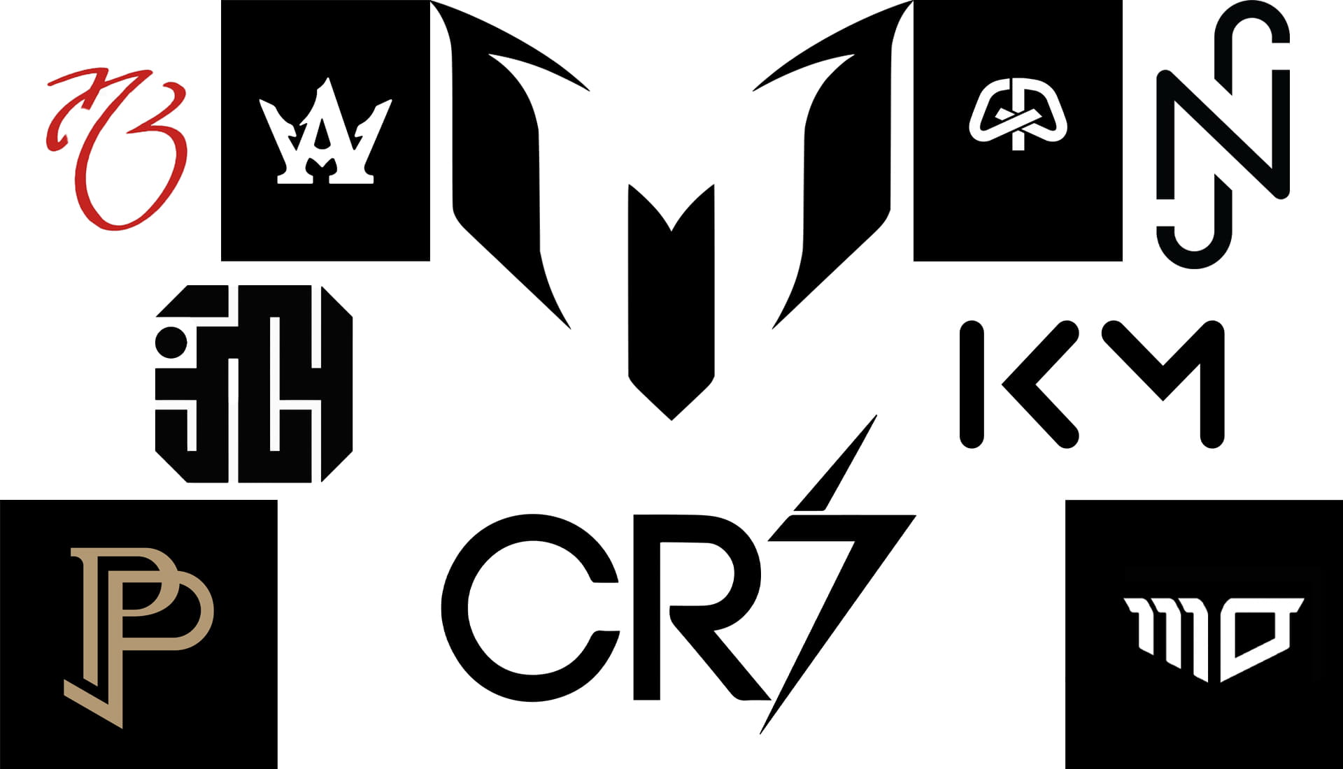
Lionel Messi
Instant recognition. That’s the brief — and Messi’s logo nails it. Built using adidas’ iconic Three Stripes, the negative space cleverly forms a stylised ‘M’. Outward-extending serifs suggest speed and agility, while the overall shape subtly echoes a traditional football crest. Minimal, elegant, and unmistakably Messi.
Cristiano Ronaldo
The blueprint. The gold standard. CR7 is arguably the most powerful player brand football has ever seen. Coined when Ronaldo arrived at Manchester United and inherited Beckham’s No.7, the term did all the heavy lifting. The logo itself stays deliberately simple — because when the name is that strong, overdesign would only get in the way.
Neymar
Neymar’s branding journey has evolved alongside his boot deals, but his current PUMA-era logo is stripped back and sharp. A dynamic fusion of ‘N’, ‘J’, and ‘R’, it reflects movement and flair — even if, arguably, it doesn’t fully capture the flamboyance of the man himself. Clean to the point of being almost clinical.
Paul Pogba
Minimalist initials, maximalist personality. Pogba’s logo sits at the intersection of football, fashion, and culture. The clever twist? The flick on the second ‘P’ creates a backwards ‘L’, nodding to his middle name, Labile. Subtle, smart, and very on-brand.
Kylian Mbappé
A masterclass in long-term thinking. Mbappé’s logo is sleek, modern, and number-free — a conscious decision not to go down the CR7 route. No shirt number means flexibility, future-proofing, and total autonomy as he moves clubs. Simple initials, serious strategy.
Mohamed Salah
At first glance, it’s just “MO”. Look closer and it’s far more layered. The ‘M’ is formed from three number ones — a reference to his No.11 shirt, the Arabic meaning of “Salah” (success/righteousness), and a relentless No.1 mindset. Not to mention another link to his brand, visually represented as three stripes. Minimalism with meaning. Exactly how it should be.
Jude Bellingham
A signature-style execution of his initials. Clean. Confident. No gimmicks. Sometimes less really is more — especially when the performances do most of the talking.
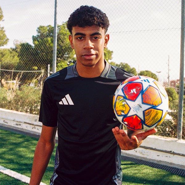
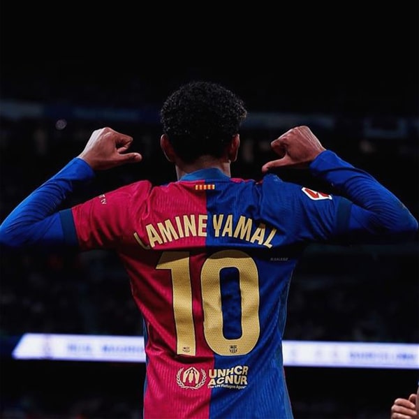
Lamine Yamal
One of the most interesting new additions. adidas’ Yamal logo blends ‘LY’ with ‘304’ — the final digits of the postcode of Rocafonda, the neighbourhood in Mataró where he grew up. A rare case where a number adds genuine emotional weight. Roots, identity, and future all wrapped into one mark.
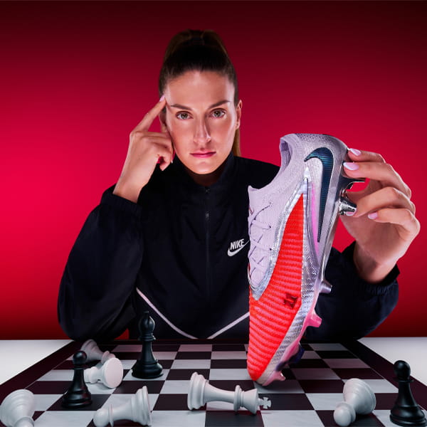
Cole Palmer
Playful. Smart. Perfectly him. Palmer’s new logo cleverly combines his initials with the shape and flow of his now-iconic “Chilly” celebration. It feels natural, youthful, and expressive — exactly where Palmer is right now in his career.
Alexia Putellas
Layered brilliance. Nike’s design for Putellas draws on her ‘La Reina’ nickname, framing a bold ‘A’ between split No.11 digits that form a crown-like silhouette. Royal without being overbearing. Iconic without shouting. Football royalty, indeed.
Got a favourite? Course you have. So who else deserves their own logo?
